
What is a vertical stress in typography? Anatomia dei caratteri tipografici, impariamo a conoscerli. L’alfabeto di Pacioli. — Realizzare un carattere tra pensiero e progetto — on Behance. L3 Typography Part1. Vi presentiamo Eugenio. Repubblica ha un nuovo carattere. La video-guida alla terminologia tipografica - Frizzifrizzi. 20 great free resources for learning typography. Whatever design discipline you work in, a decent knowledge and understanding of typography is one of the most important things you need to develop.
Luckily, the web is packed with free, quality resources for learning about typography – if you know where to look. Whether you’re a newbie starting from scratch, or want to build on your existing typography skills, you’re sure to find plenty to sink your teeth into with the following offerings. 01. Typography rules and terms every designer must know Typography is, quite simply, the art and technique of arranging type. 02. This free online book by Matthew Butterick, author of Typography for Lawyers, is a great introduction to everything you need to know about typography. 03.
Behance. How to design a font: A step-by-step guide. This feature includes advice from type designers at Monotype and Fontsmith for designers wanting to create a typeface for the first time.
Although the guide covers tools, software, concepts and pitfalls to look out for, we don’t pretend to cover everything in this complex discipline. Treat it as an informed starting point. While this is primarily a guide on how to design a typeface for those who haven’t done it before – covering the basic steps and things to look out for – there are also handy tips for more experienced type designers. This step-by-step feature covers what tools and software to use, advice on turning concepts into prototypes and what pitfalls to watch out for. You’ll learn from Monotype designer and lettering artist Terrance Weinzierl (who we spoke to for Monotype’s Font Marathon), senior Fontsmith designer Fernando Mello, and graphic designer, type designer and calligrapher Seb Lester.
Una guida alla terminologia tipografica, da scaricare gratis - Frizzifrizzi. Nata nel 1997 e considerata tra le più interessanti fonderie digitali a livello internazionale, Fontsmith ha una lunga e interessante libreria di font, una quasi altrettanto fornita bacheca di premi vinti e clienti del calibro di Nike, BBC, Sky e Xerox.
Negli uffici londinesi dell’azienda, ovviamente si parla spesso in quell’oscuro (per i non “iniziati” alla tipografia) gergo che talvolta, con le sue spalle, braccia, occhi, orecchie, persino becchi, ricorda quello anatomico. Bodoni through the ages – Creative Review. From a New Order album cover to cigar packaging by Paul Rand, a new exhibition from paper company Fedrigoni showcases some outstanding uses of Italian typeface Bodoni.
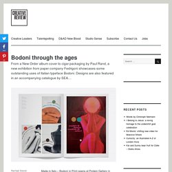
Designs are also featured in an accompanying catalogue by SEA… Made in Italy – Bodoni in Print opens at Protein Gallery in Shoreditch on June 10. Organised by paper company Fedrigoni, the show presents a look at posters, packaging, book covers and album art created using Italian typographer, printer and typesetter Giambattista Bodoni’s most famous typeface. It also features previously unseen material from the Bodoni Museum in Parma and the Monotype archives, including matrices, lead type and sketches. Born in the Alps, Bodoni was one of the most celebrated typographers and compositors of the 18th century.
Fedrigoni says the exhibition aims to highlight Bodoni’s influence on contemporary graphic design and celebrate great Italian craft. Storia di un font creato per lavorare meglio. Storia di un font creato per lavorare meglio Nel 2000–2001 ho lavorato molto come web designer.Il linguaggio HTML, che dominava la programmazione dei siti Internet, era un linguaggio semplice ma programmare con i fonts disponibili in quegli anni era veramente snervante!
Aliasing e tre fonts monospaziati. Project Faces Typography – Adobe MAX 2015 – Fubiz TV. A Beautifully Illustrated Glossary Of Typographic Terms You Should Know. The world of typography often seems like it has its very own language, full of serifs, strokes, and swashes.
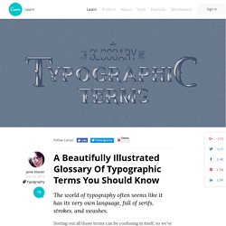
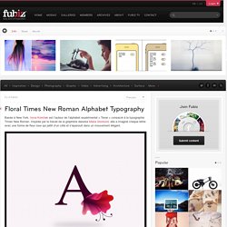
Sorting out all those terms can be confusing in itself, so we’ve compiled a visual glossary that will guide you through the lingo — whether you’re an aspiring typeface designer or just a general typography enthusiast. Learning the building blocks of typography will help you better understand how to pick a suitable font and apply it effectively within your design projects. Floral Times New Roman Alphabet Typography. Basée à New York, Iryna Korshak est l’auteur de l’alphabet expérimental « Tenar » consacré à la typographie Times New Roman.
Inspirée par le travail de la graphiste danoise Maria Gronlund, elle a imaginé chaque lettre avec une forme de fleur rose qui jaillit d’un côté et s’épanouit dans un mouvement élégant. Da Carlomagno in poi. La mano che scrive e l’occhio che legge. Il numero 49 del nostro periodico La Crusca per voi è uscito con un prezioso inserto, intitolato "Da Carlomagno a noi.
La mano che scrive e l'occhio che legge" scritto dal noto paleografo Attilio Bartoli Langeli. Behance. La struttura geometrica del carattere tipografico on Behance. Modulator. Eric Gill got it wrong; a re-evaluation of Gill Sans by Ben Archer. Eric Gill got it wrong; a re-evaluation of Gill Sans by Ben Archer This article is intended for an audience of contemporary designers and students who are at least one step removed from mid-century British typographic culture; it is a critique of the Gill Sans typeface and the idiosyncrasies of its creation from a contemporary perspective.
The central argument is that an earlier typeface by Eric Gill’s mentor, Edward Johnston, is a superior piece of type design. Gill Sans: Pride of England? Gill Sans is the Helvetica of England; ubiquitous, utilitarian and yet also quite specific in its ability to point to our notions of time and place. Icons of the British mid-20th century. So to pick an argument with something that is akin to a typographic national monument might appear unwise; it is so very much ‘ours’.
The older Gill Sans MT appellation and Monotype icon set. 80 top-quality typography tutorials. The web is brimming with typography tutorials, but many are low quality and others are very out of date.
So we’ve trawled the internet to uncover the diamonds in the rough, in the form of 50 top-quality typography tutorials, to bring your knowledge and skills up to speed. Get Creative Cloud. La tipografia. Die 100 Besten Schriften. Designing with Type. Ellen Lupton: Thinking w/Type. Caratteri Tipografici.
Helvetica.