
How David McCandless makes beautiful visualizations that go viral over and over. David McCandless makes data visualizations.
Beautiful, informative, whimsical, extremely popular data visualizations. He's published hundreds of them in a pair of books — the 2000 book Information is Beautiful and the long-awaited sequel Knowledge is Beautiful, published last month — but also allows them to be disseminated across the web, where they spread like wildfire. Pas cinq mais dix compétences à maîtriser pour être numériques d’ici 2020 !
Je rebondis ici sur un billet paru sur le blogue de l’ami Philippe Martin où il cite un jeune de chez Google :«Aditya Mahesh est une jeune recrue depuis un an chez Google avec le titre de product marketing manager.
Dans un article de TechCrunch il partage son expérience et pointe vers ce qu’il estime les compétences essentielles que toute personne devrait acquérir pour être totalement en phase dans ce nouveau monde numérique qui se met en place.» Je dois avouer que je ne suis guère impressionné par les cinq compétences qu’il juge essentielles et que Philippe a reproduites comme suit : Journalists, Designers, and Clients: Best Practices for Working as a Team. Visual.ly has a vibrant, dynamic marketplace full of clients from a staggering variety of industries.
As a result, journalists and designers have to be versatile above all else: able to craft a narrative image that perfectly meets the expectations of the clients. Here is a user’s guide for the Visual.ly journalist or designer – a how-to for successfully navigating the marketplace to deliver excellent client experiences alongside excellent visualizations. Articulating the Vision Every project is an exercise in vision actualization. Each client has a vision. Use your research to suggest specific ideas that the client can accept or reject. Constant, Clear Communication. Startups, This Is How Design Works – by Wells Riley. @joelmatriche » Le blog de jo. Je suis souvent frustré de voir sur le net des services, applications, bons exemples d'utilisation que je ne sais pas reproduire ou alors difficilement, faute d'explications détaillées.
Avec, dans le meilleur des cas, de nombreuses heures perdues et une grande frustration. Je me suis dit que ce serait bien, avec une motivation beaucoup plus grande que mes compétences, de mettre en ligne quelques tutoriels détaillés. Pour commencer, voici une introduction à TableauPublic avec une cartographie des aides de la PAC en 2012 en Belgique. Ces aides agricoles - une des dépenses majeures de l'Europe - ont, pour la Belgique, été récemment mises en ligne par Belpa et sont téléchargeables ici sous la forme d'un dossier csv.
Five tools to extract "locked" data in PDFs. Journalists and researchers are used to encountering--more often than they would like--"locked" data in Adobe Acrobat PDF files.
The format is a nightmare for someone who wants to manipulate or reference large quantities of information because it functions like an image file and is not readable by many computer programs. Extracting data from PDFs for open use is not a simple task, as ProPublica reporter Jeremy B. Merrill, one of the contributors to the "Dollars for Docs" project, can attest. The Knight Center for Journalism in the Americas asked programmers and specialists in data journalism, including the ex-editor of the Guardian Datablog, Simon Rogers, for their recommendations and identified some free tools to facilitate the conversation from PDFs to an open format, like CSV tables.
Social Network Analysis for Journalists Using the Twitter API. A tutorial by Michael Bauer, instructor at the School of Data, based on his workshop, Social Network Analysis for Journalists Using the Twitter API.
The workshop is part of the School of Data Journalism 2013 at the International Journalism Festival. Social network analysis for journalists using the Twitter API. Clever Uses for Reverse Image Search. Color Theory and Mapping. Originally published by Miranda Mulligan, executive director of Northwestern University Knight Lab, and formerly design director for digital at the Boston Globe, on Source under a Creative Commons Attribution 3.0 licence.
Of all the forms of non-verbal communication, the most instantaneous method of conveying messages and meaning through visual cues is color. The Dark Side of Visual Storytelling: 5 Mistakes You Should Avoid. Visual storytelling is quickly emerging as one of the big buzz words of 2013.
There’s absolutely nothing wrong with that. In fact, when done right, visual storytelling can add immense value to your marketing strategy or PR campaign — or it could play a key role in impressing your manager with that “visual” performance report and help you get a promotion. Communicating a message through an infographic or data visualization can reach more viewers and have a stronger impact than doing it the old-fashioned way, with words, numbers and spreadsheets. We recently talked about these advantages with a case study of A Tale of Two Cows, a Visual.ly infographic that has been seen by more than 105,000 people on our site alone and hundreds of thousands more across other platforms. But if it isn’t done right — or if it’s approached with the wrong expectations — visual storytelling can, at best, fail to produce the results you want. 1. How to Build Your Career Master Plan with a Mind Map. This past week, I worked with one of my clients from the career coaching program to create her career master plan.

She is a young, smart, and motivated entrepreneur finding her way in this world. She has lots of great ideas with plenty to offer the world. What we needed to do for her was to build her career master plan with a mind map through brainstorming, idea organization and categorization. A Guide to Infographic Elements. When it comes to visualizing data, it’s important to pick the right graph and the right kind of data range.
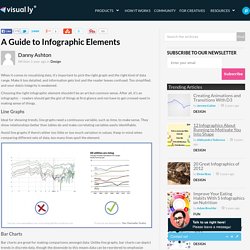
Make it too detailed, and information gets lost and the reader leaves confused. Too simplified, and your data’s integrity is weakened. Choosing the right infographic element shouldn’t be an art but common sense. MM-color.pdf. Using Color in Maps. The 10 Commandments of Typography. How to make infographics: a beginner’s guide to data visualisation. As a growing number of international NGOs are using infographics, charts and interactive maps to share success and highlight disaster, how can organisations with less resources create high quality visualisations without having to pay to outsource them?
We’ve put together a beginner’s guide for visualising development data. Organising your data The first thing you need to do is have a clear idea of the data you want to visualise. The 24 Elements Of Design You Should Pay Attention To. 1.jpg (JPEG Image, 800 × 2818 pixels) - Scaled (35%) Disposer des bonnes données pour décider. 25 Epic Design Tips for Non-Designers. Get your graphic design game-face on with these inspiring tips! Whether you’re a creating graphics for social media or designing an invitation for an upcoming event, the application of graphic design is vast and versatile.
From font pairing and scale, to alignment and white space, the facets of the design world are complex. Let these twenty five epic design tips help you through the pits and the peaks of the creative process. Click on the images throughout this post to create your own designs with a remix link. Happy designing! 01. Use easy to read fonts for simple and effective graphic design. 02. Apply scale to type, shapes or compositional features that need proportionate emphasis. Full.jpg (JPEG Image, 1458 × 4155 pixels) - Scaled (24%) The 10 Most Important Work Skills in 2020.
Innovation au New York Times, la version française. Il y a quelques semaines, le New York Times a laissé fuiter l’un des documents les plus passionnants de l’année sur la révolution numérique et la difficile mutation du journalisme, des journalistes et des titres qui les font travailler. J’ai déjà dit ici tout ce que nous avions à gagner, à L’Express mais pas seulement, à une lecture attentive des 96 pages de ce rapport. Mes chefs m’ont entendu et commandé une synthèse, de 13 pages et en français, que j’ai enrichie de quelques remarques sur les leçons applicables au journal et au groupe. C’est cette synthèse que vous consulterez ci-dessous si ça vous chante. J’ai laissé quelques une de mes remarques, naturellement expurgée de nos secrets de fabrication. Bonne lecture. Journalisme et code : 10 grands principes de programmation expliqués.
Infographic: The Impact Of Color In Logo Design