
In Pieces - 30 Endangered Species, 30 Pieces. Single Element CSS Spinners. Zero element loading animations · MadebyMike. 05 Jan 2015 With a "zero element" loading animation, a loading state can be applied to any element with just the addition of a class name.
CodyHouse. Give ’n’ Go. CSS 3D Editor. HowTo: "Self-Drawing" SVG animation by Max on CodePen. There are a couple of options to give users a great experience on your website.
The most comon would be text and images/illustrations. A Pen by Jack Filose. Sketching A New Mobile Web. Advertisement The mobile Web has gotten a bum rap.
It spends most of its time either in the shadow of the desktop or playing the role of the native app’s frumpy friend. Luckily, we’ve got the tools to change that. Progressive enhancement, mobile-first and responsive design can help lead us towards a more unified, future-friendly Web. That’s the good news. What’s holding us back, in many cases, is our clients and the conceptual models they cling to. The Promise Of The Mobile Web Is a Tough Sell. Learn HTML5, CSS3, Javascript - video style tutorials. Sprite sheet animation with steps(). There is an.
Animatable: One property, two values, endless possiblities. GroundworkCSS ♥ A Responsive HTML5, CSS & Javascript Toolkit. CSS3Ps - free cloud based photoshop plugin that converts layers to CSS3 styles. Codrops. Pixels to Ems Conversion Table for CSS. A companion reference to the article, The Incredible Em and Elastic Layouts With CSS.
The em values in the table assume that the generic browser default setting of 16px font size has not being changed. It also assumes that the <body> has font size set to 1em or 100%. Learn CSS Layout. 40 Powerful CSS Tools And Generators To Automate Your Workflow. Showcase of 40 useful and powerful CSS tools and generators.
These tools can really relieve developers work in many ways – I understand you like always to do everything by yourself but it’s not the best way in the most cases, because it really takes time and such liberty we don’t always have. This is considered to be really complete list about everything CSS related, as CSS lover myself I really evaluate good automated ways so I can focus on things I enjoy the most – creating elegant, usable and optimized website!
I just hope you will find some relief in this list as well! Enjoy your time and test these tools for best results! 1. Showcase of 40 useful and powerful CSS tools and generators. 2. Simple CSS allows you to easily create Cascading Style Sheets from scratch, and/or modify existing ones, using a familiar point-and-click interface. #124: A Modern Web Designer's Workflow. Flexible Google-style loader with CSS. So, for a while I had noticed the nice sutble loader Google apps use and I was wondering if it would be easy to make with CSS and CSS animations: Yesterday, I realised that you can get this effect by increasing border size until about the middle of the element, as long as the total width stays the same (by using box-sizing: border-box): However, as you can see above, after the midpoint, the border is not curved any more, so does not produce the desired effect.
However, what if we split the background colour in half, and animated border-left until 50% of the width and then border-right from 50% of the width? That worked, but only gave us 25% of the effect. This is the finished result: The dimensions are all set in ems so that you can change the size in one place: Just change the font-size and the loader scales perfectly.
After: float. Continuing in my series of “why is this so hard in CSS or HTML?”
Type articles, here I want to discuss the process of dealing with floated elements. Before I get started, let me just disclaim: I’m not talking here about using CSS float as an approximation forlayout structure, things like columns. In this other article, I cover what the differences are, IMO, between layout and positioning. 10 Infographics for Learning About Responsive Web Design. Responsive web design, a technique that allows web designers to create flexible web page layouts that change depending on the screen size of the site visitor, allows us to optimize user experiences for the increasingly variable ways people are accessing the Web.

If you’d like to learn a bit about this new web design technique, or if you need some basic educational resources to present to your clients, check out these responsive web design infographics. Note: Click on the Go to Source links at the end of each infographic to find the full size of the infographic. 1. Blue Website Design: Why Twitter and Intel use it? 35 Best Responsive Framework for Web Design. There are two types of frameworks front-end and backend.
Frontend frameworks usually use for web design and layouts consist of a package made up of a structure of files and folders of standardized code (HTML, CSS, JS documents etc.) which are using to developed front-end design. 31 CSS Code Snippets To Make You A Better Coder. Creating Different CSS3 Box Shadows Effects. In this tutorial we are going to be creating box shadow effects with just CSS.
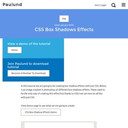
Below is an image created in photoshop of different box shadows effects. CSS Box Shadow Generator. Css.maxdesign.com.au - CSS resources and tutorials for web designers and web developers. Cssarrowplease. Mastering CSS Coding: Getting Started. Advertisement CSS has become the standard for building websites in today’s industry.
Whether you are a hardcore developer or designer, you should be familiar with it. JavaScript.