
Chemtrails the secret war. These Maps Show How Vast New Infrastructure Is Bringing the World Together. American Panorama is an Interactive Atlas for the 21st Century. For many of us, the word “atlas” evokes memories of tattered roadmaps stuffed into a glove compartment.
And while atlases are technically just collections of maps (be they of roads, outer space, the world wide web, or the human body), the good ones also have a way of presenting a more holistic picture of the things they document. American Panorama, a cool new project from the University of Richmond’s Digital Scholarship Lab, is a great example. American Panorama aims to be an internet-era update to Charles’ Paullin’s sweeping Atlas of the Historical Geography of the United States from 1932. It recounts America’s history through interactive cartography, letting users drag sliders and click on bubbles to take an even deeper dive into specific moments in history.
American Panorama comprises four maps created by design studio Stamen. Paullin’s atlas examined the country’s social, economic and political history through a hyper-focused lens. Go Back to Top. This great map lets you explore the history of migration for every country in the world. Cartography: The true true size of Africa. LAST month Kai Krause, a computer-graphics guru, caused a stir with a map entitled "The True Size of Africa", which showed the outlines of other countries crammed into the outline of the African continent.
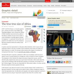
His aim was to make "a small contribution in the fight against rampant Immappancy"—in particular, the fact that most people do not realise how much the ubiquitous Mercator projection distorts the relative sizes of countries. A sphere cannot be represented on a flat plane without distortion, which means all map projections distort in one way or another.
Some projections show areas accurately but distort distances or scales, for example; others preserve the shapes of countries but misrepresent their areas. You can read all the gory details on Wikipedia. Gerardus Mercator's projection, published in 1569, was immediately useful because it depicts a line of constant bearing as a straight line, which is handy for marine navigation. Memoria_Carte-de-lAmerique-Meridionale1.jpg (JPEG Image, 3198 × 4987 pixels) - Scaled (20%) Memoria_Carte-de-lAmerique-Meridionale1.jpg (JPEG Image, 3198 × 4987 pixels) - Scaled (20%) The 500 Year Old Map that Shatters the Official History of the Human Race. 8 mapas increíbles que cambiarán su visión del mundo. Hm-2014__1_ 38 maps that explain the global economy. This is what Pangaea would look like with modern borders.
40 Maps That Will Help You Make Sense of the World. If you’re a visual learner like myself, then you know maps, charts and infographics can really help bring data and information to life.
Maps can make a point resonate with readers and this collection aims to do just that. Hopefully some of these maps will surprise you and you’ll learn something new. Mapas animados recrean la historia de la fuga de talentos en Norteamérica y Europa – RT. Instituto Ciência Hoje — Viagem no tempo on-line e de graça Mapas não são... Géographie. Iberoamérica Digital. 8 Maps That Will Change the Way You Look at Africa 1.
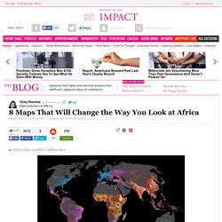
Where the world's 7 billion live This National Geographic map illustrates where and how the world lives. Not surprisingly, the areas with the highest income levels have greater life expectancy (77 for males, 83 for females compared to 58 and 60 in low income levels), access to improved sanitation (99 percent compared to 35 percent), among other human security factors. The need for development is critical in sub-Saharan Africa, where nearly 1 billion people live, many on $995 or less a year. 2. Using data from the World Bank Development Indicators, this map from Global Finance shows us what the world will look like in 2015 if it were inflated to the size of their economic wealth. 3.
We know the African continent is pretty big. 4. To quote Rajiv Narayan from Upworthy, "Sure 12 Years a Slave won an Oscar, but we all deserve to win Best Actor for pretending slavery doesn't exist anymore. " Mapa da Europa: 1000 DC até hoje. Magnificent Maps: Cartography as Power, Propaganda, and Art. By Maria Popova What the feats of Marco Polo have to do with medieval political propaganda and the history of tea.
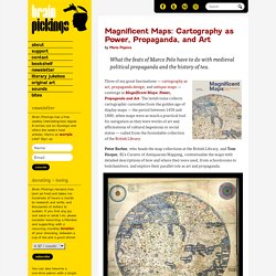
Three of my great fascinations — cartography as art, propaganda design, and antique maps — converge in Magnificent Maps: Power, Propaganda and Art. The lavish tome collects cartographic curiosities from the golden age of display maps — the period between 1450 and 1800, when maps were as much a practical tool for navigation as they were works of art and affirmations of cultural hegemony or social status — culled from the formidable collection of the British Library. Peter Barber, who heads the map collections at the British Library, and Tom Harper, BL’s Curator of Antiquarian Mapping, contextualize the maps with detailed descriptions of how and where they were used, from schoolrooms to bedchambers, and explore their parallel role as art and propaganda.
Fra Mauro World Map, 1450. 40 more maps that explain the world. Maps seemed to be everywhere in 2013, a trend I like to think we encouraged along with August's 40 maps that explain the world.
Maps can be a remarkably powerful tool for understanding the world and how it works, but they show only what you ask them to. You might consider this, then, a collection of maps meant to inspire your inner map nerd. I've searched far and wide for maps that can reveal and surprise and inform in ways that the daily headlines might not, with a careful eye for sourcing and detail. I've included a link for more information on just about every one. Enjoy. 1. Data source: Oak Ridge National Laboratory, World Bank.