background preloader

Maps

Facebook Twitter

Inglehart-Wenzel Values_Map. Moby Dick Map. Why do so many people love making maps? - bookforum.com / omnivore. Follow us omnivore Why do so many people love making maps? Aug 30 2013 3:00PM From Wired, Betsy Mason and Greg Miller introduce the Map Lab: A quest to find, explore, and make maps; meet Anthony Robinson, the man who wants to teach the world to make maps; and why do so many people love making maps?

Here is a map of places actually discovered by Europeans — the tiny islands that European explorers really did discover. Kohr Principles: Frank Jacobs on how borders can have a profound effect on how you think about your country and its place in the world. Stefany Anne Golberg on a World without Borders: What if boundaries as we know them disappeared? Advertisement top of page. 2011 Language Mapper Tool - U.S Census Bureau. ATLASES: Poetics, Politics and Performance - An online Exhibition from Special Collections and School of Geographical Sciences.

David Rumsey Historical Map Collection | The Collection. Post-war_moral_new_world_order.jpg (3972×2832) Global Incident Map - Outbreaks. Wanderlust: GOOD traces the most famous trips in history. The 15 Maps That Explain The World In 2012. Jewish Population by County (The Economist) Cartography: The true true size of Africa. LAST month Kai Krause, a computer-graphics guru, caused a stir with a map entitled "The True Size of Africa", which showed the outlines of other countries crammed into the outline of the African continent. His aim was to make "a small contribution in the fight against rampant Immappancy"—in particular, the fact that most people do not realise how much the ubiquitous Mercator projection distorts the relative sizes of countries. A sphere cannot be represented on a flat plane without distortion, which means all map projections distort in one way or another.
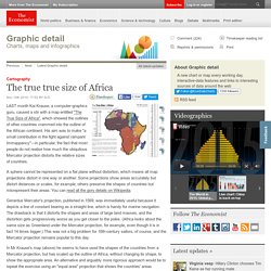
Some projections show areas accurately but distort distances or scales, for example; others preserve the shapes of countries but misrepresent their areas. You can read all the gory details on Wikipedia. Gerardus Mercator's projection, published in 1569, was immediately useful because it depicts a line of constant bearing as a straight line, which is handy for marine navigation. True size of Africa. True-size-of-africa.jpg 1241×878 pixels.

Colonialists' Map of Tribes of Africa. MapofEmergingUSMegaregions.png 1,200×800 pixels. Welcome to the USGS - U.S. Geological Survey. Are the Richest Americans Also the Best Educated? More Infographics on Good. USA Today: More kids are failing AP | Education articles blog on schools in Florida & Tampa Bay: the Gradebook. Electoral college reform (fifty states with equal population) – fake is the new real.

The electoral college is a time-honored, logical system for picking the chief executive of the United States. However, the American body politic has also grown accustomed to paying close attention to the popular vote. This is only rarely a problem, since the electoral college and the popular vote have only disagreed three times in 200 years.
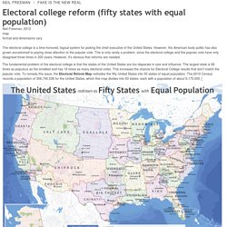
However, it's obvious that reforms are needed. The fundamental problem of the electoral college is that the states of the United States are too disparate in size and influence. Poster A poster version of the map is for sale. The poster is $35 and ships first class to your door, safely packed in a sturdy tube. Consult the shop for more about shipping. Advantages of this proposal Preserves the historic structure and function of the Electoral College. Disadvantages Some county names are duplicated in new states. Methodology The map began with an algorithm that grouped counties based on proximity, urban area, and commuting patterns. Lives on the Line. Vaccine-Preventable Outbreaks.

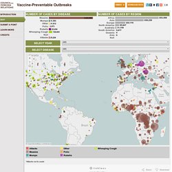
This interactive map visually plots global outbreaks of measles, mumps, whooping cough, polio, rubella, and other diseases that are easily preventable by inexpensive and effective vaccines. Red triangles indicate attacks on vaccinators and healthcare workers, as well as announcements from both governments and non-state actors that have had an impact—either positive or negative—on the successful implementation of vaccination programs. The Global Health Program at the Council on Foreign Relations has been tracking reports by news media, governments, and the global health community on these outbreaks since the fall of 2008. This project aims to promote awareness of a global health problem that is easily preventable, and examine the factors that threaten the success of eradicating preventable illnesses such as polio.
Learn more about Global Health. On to the Vaccine-Preventable Outbreaks map. Income inequality, as seen from space. Last week, I wrote about how urban trees—or the lack thereof—can reveal income inequality. After writing that article, I was curious, could I actually see income inequality from space? It turned out to be easier than I expected. Below are satellite images from Google Earth that show two neighborhoods from a selection of cities around the world. In case it isn’t obvious, the first image is the less well-off neighborhood, the second the wealthier one. Rio de Janeiro Rocinha Zona Sul Oakland West Oakland Piedmont Houston Fourth Ward River Oaks Chicago Woodlawn Hyde Park Beijing Fengtai Chaoyang Boston metro area, Massachusetts Ball Square, Somerville West Cambridge Your examples Do you have other cities or neighborhoods in mind? Be sure to include the names of the cities and neighborhoods you’re highlighting and if you’d like me to mention your name.
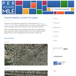
Your examples are now posted! Related posts: Urban trees reveal income inequality Income inequality in the Roman Empire Ghosts of geography. If the world’s population lived like… Shortly after I started Per Square Mile, I produced an infographic that showed how big a city would have to be to house the world’s 7 billion people. There was a wrinkle, though—the city’s limits changed drastically depending on which real city it was modeled after. If we all lived like New Yorkers, for example, 7 billion people could fit into Texas. If we lived like Houstonians, though, we’d occupy much of the conterminous United States. Here’s that infographic one more time, in case you haven’t seen it: What’s missing from it is the land that it takes to support such a city. It turns out that question is maddeningly difficult to answer.

But what we can do is compare different countries and how many resources their people—and their lifestyles—use. Sources: Global Footprint Network. 2011. Wackernagel, M., Kitzes, J., Moran, D., Goldfinger, S. & Thomas, M. (2006). Related posts: If the world’s population lived in one city… 7 billion Spare or share? Balloon Mapping From the Ground Up: Public Lab's Field Techniques.

Public Lab’s balloon- and kite-based mapping approach is a new way to take aerial images from the ground. However, there are some considerations and things that can be learned from a few map stories. Each map project has distinct characteristics in its time, place, and local atmospheric conditions. Here are several examples of how those factors make each balloon and kite map unique.

Lake Merritt (Oakland, Calif.) This map was created on a late July morning. In some cases, the balloon is lowered all the way back to the ground to get around or under things. UC Davis Campus (Davis, Calif.) This map was made on a foggy November morning in California’s Central Valley. After the first hour, the sun started to burn through, and we were able to fly at our goal altitude of 500 feet.

Sunol Ag Park (Sunol, Calif.) While doing a scheduled flight at a community agricultural park, we encountered clear weather with high winds. Chandeleur Islands (Louisiana) Maps of all kinds. New York Public Library Puts 20,000 Hi-Res Maps Online & Makes Them Free to Download and Use. When I was a kid, my father brought home from I know not where an enormous collection of National Geographic magazines spanning the years 1917 to 1985.
I found, tucked in almost every issue, one of the magazine’s gorgeous maps—of the Moon, St. Petersburg, the Himalayas, Eastern Europe’s ever-shifting boundaries. I became a cartography enthusiast and geographical sponge, poring over them for years just for the sheer enjoyment of it, a pleasure that remains with me today. Whether you’re like me and simply love the imaginative exercise of tracing a map’s lines and contours and absorbing information, or you love to do that and you get paid for it, you’ll find innumerable ways to spend your time on the new Open Access Maps project at the New York Public Library. The NYPL announces the release with the explanation below: The Lionel Pincus & Princess Firyal Map Division is very proud to announce the release of more than 20,000 cartographic works as high resolution downloads.

Related Content: Mapoteca. Argentina Virtual. Census Maps Using Word Frequency From 19 Million Dating Website Profiles. Chicago area Each decade the United States government embarks on a census of its entire population in order to update population numbers and demographic information that aids in the allocation of Congressional seats, electoral votes, and government program funding.

But as helpful and interesting as this data is, what does it really tell us about who we are? What about our likes, dislikes, feelings, and the ways we choose to define ourselves? In his project A More Perfect Union , artist R. To join a dating site you have to, quite literally, “put yourself out there”, describing yourself for the express purpose of being liked. I joined twenty-one dating sites in order to make my own census of the United States in 2010. These maps contain 20,262 unique words, based on the analysis of online dating profiles from 19,095,414 single Americans. Below are some examples of maps where locations are substituted with words people used to describe themselves. Central Texas California Michigan. How We Use Maps and Globes: An Illustrated Guide from 1968.

By Maria Popova A charming reminder of how far we’ve come — and what we’ve given up along the way. Yesterday, we traced the birth of our modern obsession with maps. But in today’s age of cartographic entitlement — the kind that causes an epidemic of panic and outrage at having one kind of Earth-in-your-pocket over another — it’s hard to believe we once had to be taught how to use maps and why they mattered. That’s precisely what the delightful vintage grade school primer How We Use Maps and Globes (public library) does. Originally published in 1968 as part of the same Social Studies Program series that gave us How People Live in the Suburbs, the slim 48-page book explores the basics of distance, scale, direction, and orientation through vibrant illustrations, black-and-white photographs, and simple words.
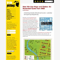
One of the most beautiful illustrations in the book is this map of bird migration patterns: Donating = Loving Bringing you (ad-free) Brain Pickings takes hundreds of hours each month. Book Buying Nations and Connections.