
Liora Zakai
בניית אתריםwebmaster for 12 years teaching site building ceo of my company - zakai.com
15 Best Bootstrap Design Tools. Don't Forget to participate in a contest where you can win an amazing e-Commerce template from TemplateMonster.
In this post, we have gathered 10 best bootstrap design tools for the coming year. Bootstrap is the most commonly used front end framework in 2013 and many of you must have played with it. Therefore, we thought to compile a list of some useful bootstrap design tools for you. As a designer, it is always useful to look for some more design tools and options to make designing and developing tasks easier. Here, we are presenting 10 best bootstrap tools for 2014. Bootstrap Designer. Tutorials. HTML5/CSS3. LiveCity בניית אתרים - דוגמאות. 28 HTML5 Features, Tips, and Techniques you Must Know. The 30 CSS Selectors you Must Memorize. Interactive Layout Diagram. Creating a CSS layout from scratch. CSS Swag: Multi-Column Lists. One of the minor holy grails of XHTML and CSS is to produce a single, semantically logical ordered list that wraps into vertical columns.
The ideal situation, in my view, would be a single XHTML list whose wrapping is controlled entirely by CSS. Further, the wrapped list should tolerate text resizing (easily accomplished by styling everything in ems). CSS and the browsers that support it don’t yet provide us with “vertical wrap,” so we have to augment basic list markup with additional attributes and styling rules to achieve the effect. I’ll take you there—or as close as we can get using today’s browsers—but along the way let’s look at a variety of ways to accomplish a similar effect. We’ll be shooting for something that looks a bit like this: (Why, you’ve doubtless been pondering, is this article entitled “CSS Swag”?
Watch your step#section1 I’ll warn you up front. The reality is not so ideal. So why do we bother? To work, then. First, expunge all white space#section2. Lablalock. CSS Play. Below is a list of CSS demonstrations that range from the simplest for beginners, to the most complex for advanced users.

If you do not find what you are looking for then please contact me with your requirements and I will let you know if it is possible using just CSS. Avatar ParadeSimple image display using :hover. What's on TVAnother method of displaying images using :hover. A photograph galleryA photo gallery using thumbnail images.
A photograph gallery - with links » 20-02-2009A photo gallery using thumbnail images amd linking to large images. A photograph gallery - using <object> » 06-06-2009A photo gallery using the object element. CSS examples. Dynamic Drive CSS Library. Learn CSS Positioning in Ten Steps: position static relative absolute float. 1. position:static The default positioning for all elements is position:static, which means the element is not positioned and occurs where it normally would in the document.
Normally you wouldn't specify this unless you needed to override a positioning that had been previously set. 2. position:relative If you specify position:relative, then you can use top or bottom, and left or right to move the element relative to where it would normally occur in the document. Let's move div-1 down 20 pixels, and to the left 40 pixels: Notice the space where div-1 normally would have been if we had not moved it: now it is an empty space. Formalize CSS - Teach your forms some manners! HOW TO: Get Started with Less Framework. The Web Development Series is supported by Rackspace, the better way to do hosting.
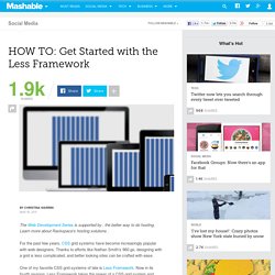
Learn more about Rackspace's hosting solutions here. For the past few years, CSS grid systems have become increasingly popular with web designers. Thanks to efforts like Nathan Smith's 960.gs, designing with a grid is less complicated, and better looking sites can be crafted with ease. One of my favorite CSS grid systems of late is Less Framework. Now in its fourth revision, Less Framework takes the power of a CSS grid system and adds in support for CSS media queries to support multiple design and typography layouts. In May 2010, Ethan Marcotte's "Responsive Web Design" helped spur a movement of building websites designed to fluidly adapt to various platforms and device sizes — think mobile optimized sites and tablet-specific layouts — without the need for an entirely different design or special URL. Knowing the Basics Visit LessFramework.com and resize your browser to see the implementation in action.
CSS. Positioning. CSS Layout Generator. About the CSS Layout Generator The CSS Layout Generator was first released by Tony Aslett in October 2003, since then over 871,000 layouts have been generated.

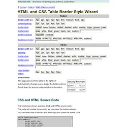
Updated in November 2010, HTML5 doctype can now be selected and a simple HTML5 template with appropriate tags will be created. Other HTML and XHTML doctypes are still available. The generator helps you create the structure of your website template using valid HTML and CSS. You can create a fluid or fixed width floated column layout, with up to 3 columns and with header and footer. The generator requires a modern DOM capable browser with JavaScript enabled. Instructions To create your layout select the structural elements your site requires (header, footer, columns). HTML and CSS Table Border Style Wizard. Compatibility Notes If you are using Internet Explorer 6, you should be able to use this wizard with only minor limitations.
This page does not work with Opera 8 or IE 5 on Mac. Internet Explorer 6 does not support the border-spacing CSS2 table property. Css_grid_calc. CSS Layout Generator. CSS Layout Generator.
Help.