
Understanding CSS Filter Effects. This article discusses APIs that are not yet fully standardized and still in flux.

Be cautious when using experimental APIs in your own projects. Introduction Filters are a powerful tool that web authors can use to achieve interesting visual effects. In this article we’ll cover the history of filter effects, what they do and how to use them. We’ll cover examples of all the predefined filters defined for CSS with some examples. The past, present and future of filter effects Filter effects originated as part of the Scalable Vector Graphics (SVG) specification. A new life for the ‘filter’ CSS property Deja Vu sometimes strikes a web developer when seeing ‘filter’ in CSS styles. How filters work So what does a filter do exactly? When a browser loads a web page it needs to apply styles, perform layout and then render the page so there's something to look at. Filters defined using SVG and CSS Since filters originally came from SVG there are different ways to define and use them.
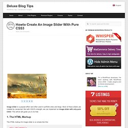
Grayscale(amount) Howto Create An Image Slider With Pure CSS3. Image slider is a popular effect and often used in portfolio sites and blogs.

Most of these sliders are created by Javascript. But with CSS3′s strength, we can implement an image slider with only pure CSS3. This article will guide you to do that. 1. The HTML Markup The HTML markup for image slider is so simple like this: <div id="images"><img id="image1" src="1.jpg" /><img id="image2" src="2.jpg" /><img id="image3" src="3.jpg" /><img id="image4" src="4.jpg" /><img id="image5" src="5.jpg" /></div><div id="slider"><a href="#image1">1</a><a href="#image2">2</a><a href="#image3">3</a><a href="#image4">4</a><a href="#image5">5</a></div> We list all images in a div with id="images" and the slide control in a div with id="slider". 2.
We will style the images and slide control with some basic CSS to make them beautiful: In this code, we specify fixed width and height for both #images element and its images. Notice the negative left attribute. Responsive Grid System. Media Queries. Screenfly by QuirkTools — Test Your Website at Different Screen Resolutions. CSS3 Media Queries. CSS2 allows you to specify stylesheet for specific media type such as screen or print.

Now CSS3 makes it even more efficient by adding media queries. You can add expressions to media type to check for certain conditions and apply different stylesheets. For example, you can have one stylesheet for large displays and a different stylesheet specifically for mobile devices. It is quite powerful because it allows you to tailor to different resolutions and devices without changing the content. Continue on this post to read the tutorial and see some websites that make good use of media queries. CSS3 Media Queries (demo) Check my demo and resize your browser window to see it in action.
Max Width The following CSS will apply if the viewing area is smaller than 600px. If you want to link to a separate stylesheet, put the following line of code in between the <head> tag. Min Width The following CSS will apply if the viewing area is greater than 900px. Multiple Media Queries Device Width For iPhone 4 Colly. Using CSS3 Transitions, Transforms and Animation.