
25+ Best Colorful Websites Never Seen Before. C olorful websites are always a good source of design inspiration.
These 25+ showcase designs make excellent use of color. Hopefully you’ll find at least a few for your own inspiration. Anam Hanif is a 18 year old girl from Pakistan. She is a student of Political Sciences at LCWU. She is also Founder of Smashingspy.com. 13 Important Resources for Learning How to Design Typefaces and Full Fonts.
If you're serious about creating a typeface design, then you'll need some solid resources to get started.
Examples of Fresh Effects in Web Design. Having some fresh and maybe even unexpected effects on a website, can juice up the experience for the user.
Be it a whole new and experimental way of navigating through the website or just a tiny surprising hover effect - fresh effects can spice up your design and bring some life to it. Having some fresh and maybe even unexpected effects on a website, can juice up the experience for the user. Be it a whole new and experimental way of navigating through the website or just a tiny surprising hover effect – fresh effects can spice up your design and bring some life to it.
We’ve collected some wonderful examples of such effects for your inspiration. Dive in! Edits Quarterly × Ian Coyle. Responsive Design with CSS3 Media Queries. Screen resolution nowsaday ranges from 320px (iPhone) to 2560px (large monitor) or even higher.
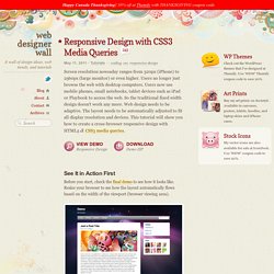
Users no longer just browse the web with desktop computers. Users now use mobile phones, small notebooks, tablet devices such as iPad or Playbook to access the web. So the traditional fixed width design doesn't work any more. Responsive Web Design Demystified. Tutorial by Matt Doyle | Level: Intermediate | Published on 30 September 2011 Categories: What exactly is responsive design, and how do you create a responsive website?
This tutorial explains the concepts, and walks you through the basic steps for creating a responsive website layout. Responsive web design is a hot topic these days, especially as websites need to adapt to the growing number of mobile devices with their relatively small screens. Many designers and developers want to create new websites with responsive layouts, or modify their existing sites to incorporate responsive elements. However, the whole topic can be somewhat bewildering at first glance. 45+ Free Lessons In Graphic Design Theory. Sep 15 2011 Considering how many designers are self-taught, either in whole or in part, the importance of a solid foundation in graphic design theory is often overlooked.
New designers often want to jump right into creating websites, rather than learning the basics of why some designs work and some don’t. The most popular fonts used by designers. There are usually two camps among designers when it comes to typeface choices.
One group has a handful of favorite typefaces they adapt to every design they create, believing that these handful of typefaces can be suitable for every situation. The other camp believes in using a huge variety of typefaces, picking and choosing each one based specifically on the project at hand. Regardless of which camp you fit into, the typefaces below should interest you.
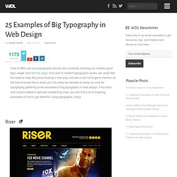
They have proven popular among designers the world over, and are used in designs for everything from multi-national corporations to individual books or journals. 25 Examples of Big Typography in Web Design. Here at WDL we love typography and we are constantly showing our readers good typo usage, from print to logos, from web to random typographic works, we really feel the need to keep the juices flowing in that area, and we could not forget to mention all the free fonts we like to show you!
Designing Effective Websites - 80 Articles Summer 2011. This post presents a collection of articles on how to develop an effective website which were retweeted at @htmlcut this summer.
The roundup can be especially useful if you are planning to start a new web development project and need to refresh your knowledge, “shake up” creativity or find new ideas. In fact, there are a lot of resources about different aspects of effective web design on the Internet. However, the web industry is changing very fast, and new trends appear here almost every day. Some of the articles listed below describe exactly such new tendencies. But even if an article doesn’t provide something absolutely new, it can be still helpful. Please note: Most of the articles include a list of additional resources – don’t forget to check them out too. Hope you’ll find this compilation interesting for you. Periodic Table of the Elements - Josh Duck. 20 Excellent Examples of Icon Usage in Web Design.
Here on WDL we love icons!
From Icon Tutorials to a list with the Best Free Icon Sets of 2010 and a 15 Must-Have Minimalist Icon Sets, we already showcased a lot of great icons around here to boost your inspiration. Today we decided to gather some examples of icon usage in web design to show you how icons can make a difference in a layout, giving a page a nice touch, in both interface and experience. Web Design Templates: Get Inspired to Create Your Own Design. 33 Flares Twitter 32 Facebook 0 Google+ 0 StumbleUpon 1 Pin It Share 0 33 Flares × Tools for Web Design and Evaluation. Every web designer aspires to create websites that attract millions of users and provides them the right information, products and services that will keep them coming back for more. In order to make this aspiration into a reality, the designers should use the available technology that will help to bring out their creativity and talent in a big way.
One aspect of technology that can have a profound impact on the outcome of web design is web tools. There are hundreds of free and paid tools available online that can do a whole lot of things like analyzing traffic patterns on the website, evaluating the performance and speed of the website, act as a bridge between the website’s technology and any other legacy system that is in use, and to even interact with users.
Web design inspiration from the history of art. When it comes to the creative arts, a fundamental way to better understand the trade is to look to the past. People in every trade do this, including those in photography, painting, sculpture and architecture. Why should web designers be any different? Of course, we look to the very recent past through our countless web design showcases. But we can go much further back for inspiration, to the masters of old. Let’s review some key art movements and the fundamental design principles they embraced.
We’ll focus on Western art before the 20th century, and we will highlight only a few movements from among the many that took place. The Renaissance We’ll begin our journey in the mid-15th century, with one of the most well-known eras: the Renaissance. While many things shaped this period of art history, a few fundamental principles stand out: the use of perspective, the attempt at stability and balance in compositions, and the relentless push towards realism. Perspective. Web Design Theory. The Gestalt Principle: Design Theory for Web Designers. The way that people see our designs strongly effects the meaning that they take away from them. The Gestalt Principle examines this phenomena; As such, it’s one of the fundamental principles that each and every web designer should consider when moving through the design process. We’ll also examine how understanding gestalt will improve your own workflow! Trying to come up with a good and creative design may seem easy for someone who has attended a design school, but for the 90% of web designers out there who never attended any design course or school coming mostly from either development or generally non-design backgrounds.
The question still remains… what really defines a good web design? Is it just talent? Using the Law of Attraction in Web Design. What is it that makes a brand, product and/or website so appealing that you can’t resist the urge to indulge? How can something on my computer screen garner so much of my attention and intrigue me enough to buy into that particular product or service? Most brand marketers understand the needs of the customers they’re marketing to, and work to drive them to purchase. I’m also convinced these customers are fueled to buy into a product by the Laws of Attraction. Appeal The first theoretical Law of Attraction is that of Appeal. Know Your Audience. Basic Tips for Getting Started with jQuery Development. The jQuery programming library has dramatically changed the way we work online. Unity in Web Design. Spend your time innovating, not replicating.
960 Grid System. Web Design Library — One-stop Web Design Resource.