
Awesome tutorials to master responsive web design Create an adaptable website layout with CSS3 media queries With the rise of both very large screens and mobile devices, web developers have to be able to create websites that display correctly and look good whatever the device is. Sure, you can use good old techniques like fluid layouts, but I’ve got something better to show you today. This tutorial will teach you how you can create an adaptable website layout using CSS3.→ Read tutorial: Create an adaptable website layout with CSS3 media queries Fluid images This tutorial will shown you how to make your image scales down when the browser is resized or when your website is viewed through a smaller screen.→ Read tutorial: Fluid images Elastic videos Nowadays, videos are widely used on the web. Optimizing your emails for mobile devices As mobile devices are more and more used, more people are receiving their emails on their phones instead of their computer. Images that match text height Hiding and revealing portions of images
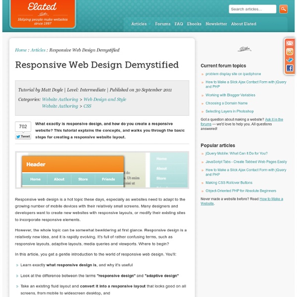
Responsive Web Design for WordPress Theme Designers Responsive web design really took off in 2011 and I can see it becoming the standard by the end of 2012 – there really is no reason not to include it in your planning and build of new web sites these days. I have previsously looked at free responsive WordPress themes and Premium Responsive WordPress themes so today we’re going to look at how you build your own. If you feel daunted by the process or feel you are being left behind by this new technique then dont worry – bookmark this post as it contains everything you need to get up and running. Responsive Web Design Demystified Responsive design is a relatively new idea, and it is rapidly evolving. Responsive Web Design Demystified » Awesome tutorials to master responsive web design In a few month, responsive web design has become a very important part of designing and developping a website. Awesome tutorials to master responsive web design » Responsive Web Design: What It Is and How To Use It Responsive Web Design Guidelines and Tutorials
Responsive Web Design: Tailored Layouts For All Screen Sizes | DT Blog Until a few years back, mobile phones were not in vogue and therefore the need to customize screen layouts for mobile phones was not a priority item for web designers. When mobile phones came into being, they were used as calling devices and their functions extended to internet access only in the past seven or eight years. This has changed the scenario in web designing completely. Now, when website or a screen is designed, it has to possess flexibility to adapt to both desktop and laptop screens as well as to androids and iphones. In short, this means a screen should be clear to the user irrespective of the size of his browser. This is what responsive web design is all about. This the feature that is able to add flexibility to web page and screen layouts, so as to conform them to the right size to improve legibility. Main sides to Responsive web design There are three main faces to responsive web design: The flexible grid, flexible images and the media queries option. Thumbnail
WordPress theme - The Anatomy, an Infographic index.php – home The index file controls what the homepage of your WordPress theme looks like. By default it is a loop that queries and then displays the most recent blog posts, with a link in the bottom to view previous posts. Alternately, you can specify in wp-admin -> settings -> reading to have the home page be a page you created yourself in WordPress. In that case, you specify a different page/URL for the regular blog posts to appear on, and that page is generated by index.php. single.php – individual posts The display of individual posts in your WordPress theme is controlled by a little file called single.php. You can specify if you want sidebars (and which you want), if you want it to look different than the other pages on the site. page.php – individual pages Page.php controls what pages look like. WordPress also allows you to create different page templates within your WordPress theme for different types of pages. archive.php, category.php, tag.php – archives The Loop comments.php
Responsive Web Design Toolbox: 50 Handy Tools and Services inShare53 Earlier we’ve posted some materials on Responsive web design – How to Make a Website for All Devices (Responsive Web Design) and Responsive Web Design: Helpful Articles, Techniques & Tutorials, and some examples of really cool designs in 70 Examples Of Modern Responsive Web Design. And now, we would like to present to your attention some fresh data on this topic that is about grids, frameworks, JavaScript Libraries and jQuery Plugins, online services and testing tools. Responsive Design Templates and Frameworks BluCSS Framework BluCSS is a CSS framework designed with ease of use and simplicity in mind. Demo | Download Tiny Fluid Grid Seamless Responsive Photo Grid Demo | Download Less Framework 4 Less Framework is a CSS grid system for designing adaptive websites. Download Adapt.js Adapt.js is a lightweight (826 bytes minified) JavaScript file that determines which CSS file to load before the browser renders a page. Download Gridless Demo | Download Hardboiled CSS3 Media Queries Download
55 jQuery Navigation and Menu Plugins Navigation is one of the most important elements in web design. It has to be neat, usable and creative at the same time in order to not scare your visitors away. jQuery is one of the most powerful tools to enhance your navigation and make it stand out. With jQuery you can bring together both the creative and usable. This article will cover 55 fresh and superb jQuery plugins that will make your menus look awesome. Note that all of the listed plugins have been released in the last six months. 1. mb.verticalSlider jquery.mb.verticalSlider lets you show a long list of elements managing pagination, it can work with elements already in the DOM of your page or load them via Ajax when needed, it also works with a mouse wheel. Demo 1.1. With this script you can make nice and interactive drop down menus. View Demo 2. Fly SlideShow is a jQuery Slideshow script to present images as an automatic slideshow with a nice “fly” effect. It also features: Demo 3. Demo 4. Demo 5. Highlighted features: Demo Demo Demo
jquery responsive web | @stildv what is it? it is a simple jquery plugin helping design more responsive and adaptive websites and web applications with almost no setup. what does it do? it adds dynamic classes to the <body> depending on the operating system, browser and resolution. why? because for ideal responsive web design css is just not enough. it chokes at some point, or has cross-browser and cross-platform issues much more than the wonderful jquery framework. and also mobile websites don’t have to be ugly, or boring with bulky iphone buttons and very trimmed content, a similar mobile version of the website can be done with this plugin easily. check out the New York Times Global Edition example in the zip or after the jump. compatibility I have tried it with microsoft internet explorer v7 and v8, firefox, google chrome, safari, opera on windows, and also with an android device. works perfectly on all of them. on the android device (samsung galaxy s) handles the orientation change nicely too. examples how to use?
Best Responsive WordPress Themes This is a collection of the best responsive WordPress themes. These responsive, fluid, or adaptive WordPress themes, automatically adapt to the screen size, resolution and device on which they are being viewed for on. This means your website will look great whatever the screen size or device your visitors uses to visit your site, from desktop computers to tablets to mobile phones. Responsive designs solve the problem of making a website work for the endless number of new mobile devices and resolutions being used to access the web. In particular the growing popularity of interfacing with the web on mobile devices. Everything from iPhones, smartphones, iPads and tablets, mobile phones, video game consoles, TVs, netbooks, Kindles and other e-readers are used to access the web. Collections Pretty much every new WordPress themes these days is mobile friendly with a responsive design. The Best Responsive WordPress Themes Divi WordPress Theme Some of the possibilities with Divi Responsive Design
25 jQuery Plugins to help with Responsive Layouts The most popular topic of discussion at the moment is undoubtedly responsive layouts in web design. Without going into it too much, a responsive layout allows you to offer a specific and optimised screen size based on whatever device (mobile, tablet…) the visitor uses. You would typically use Media Queries to resize the overall layout, but what about all of those individual elements and features that make your page unique? Navigation, forms, images, sliders, carousels… they all need to be optimised as well. That is were this post comes in, by highlighting 25 jQuery plugins that will help you optimise and resize those trickier web elements. Response.js Response JS is a lightweight plugin that gives you the tools for producing performance-optimized, mobile-first responsive websites. Response.js Responsly The Responsly plugin is a set of simple responsive widgets written using CSS3 transformations. Responsly Menu to a Dropdown for Small Screens Menu to a DropdownDemo Responsive Menu Doubletake
Stowe Boyd — Responsive Web Design, Mobile First, and the Future of Content Consumption - Lindsey Kirkbride A different form of creative destruction … The result of a survey on how many times people kiss when they greet a friend in France Mobile web content adaptation techniques Introduction This article will help you pick from amongst the many techniques for building a mobile website. It doesn't describe how to do it, rather it instead tries to help you to pick the right approach. trying to make an existing website work passably well on mobile devices or, building a mobile experience from the ground up These two goals are quite different and tend to result in different approaches and solutions. In order to distinguish between the techniques available this article will use the terms resolution independence and content adaptation respectively. Evolution of content adaptation For the first decade or so of the mobile web there was a clear distinction between the mobile web and the desktop web, and there was really only one technique available to make content work well across multiple devices: server-side adapation. The following table lists the main techniques in use today. Responsive Design Responsive design, as orginally outlined is based on three core techniques:
Responsive Web Design in #highered: eduStyle Awards founder on converting your website to RWD I’ve just completed my article about responsive design in higher education. It will be published in University Business in a couple of months (February 2012 issue). I did a few extensive interviews with early adopters as part of my research for this piece. As usual, I could only use a fraction of what I found. I only had 1400 words. But, thanks to the Web, I can make sure you get to see the rest of what these early adopters in higher education had to say about responsive web design (RWD) – and long before the article is published! So, let’s start this series of posts about responsive web design in higher ed with Stewart Foss, founder of the eduStyle gallery and the eduStyle Awards. Stewart worked on a few projects involving RWD conversions – and will walk students of the course through their own over a period of 4 weeks, so that’s why I wanted to hear what he had to say about the process. 1) You went through several RWD conversions. It doesn’t have to be.
A Look at Responsive Web Design | Web development blog, news and reviews - Developer Drive Responsive web design is widely thought of as a design trend, but it’s much more than that. It is an approach to web development that allows a website to break itself down smoothly across multiple monitor sizes, screen resolutions, and platforms, be it a computer, tablet or mobile device. It allows the developer to create a site that is optimized for each platform, both in navigation, readability and load time. In this tutorial, we take a look at what responsive web design entails for the developer. Using Multiple Image Sizes There’s no need for a mobile device to be loading an image that is 1920 px wide by 1200 px tall and a quarter mb. Another approach to quickening load times and determining how things should be displayed on different devices is to completely drop your main image. Navigation Text links are another thing to take in to consideration when developing a responsive website. Flexible Dimensions
10 Incredible Examples of Responsive Web Design With more people surfing the web from their mobile devices, designers and developers have been trying to figure out the best way to cater to visitors on both mobile devices and computers. When internet capable phones first began gaining popularity the method was to have two separate sites, a mobile site and a “full” site. But that would limit the mobile viewers experience because the site would be so basic it would cause you to wonder if it was coded by chisel and stone. That was then, now everyone is jumping on the “Responsive Web Design” bandwagon and finding it to be a rather happy median. Responsive web design refers to a site that is developed to degrade nicely across multiple screen sizes and resolutions, from the largest Mac display down to the minutest mobile device. Sony Sony is a big brand that has embraced responsive web design. Gravitate Design It’s no surprise that a design studio such as Gravitate Design features a responsive website design on their own site. Spark Box