
Untitled. What the World Eats. This interactive was built in conjunction with National Geographic’s Future of Food series.
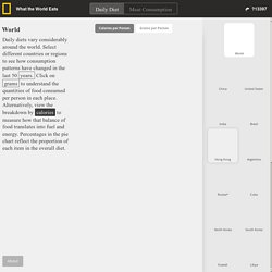
The data was sourced from FAOSTAT. Values reflect domestic utilization for food consumption in each country or region from 1961 to 2011. Food groupings and units of measure vary slightly from those depicted on the FAOSTAT site. Download the data from here. Values for China refer to FAO’s "China, mainland. " *Measures for Russia preceding 1992 are represented with U.S.S.R. data. **"Pulses" refers to lentils, beans, and peas. This project was made possible with support from the Grace Communications Foundation. Built and designed by Fathom Information Design © National Geographic Magazine close.
We Mapped the Uninsured. You'll Notice a Pattern. States That Expanded Medicaid Are Outlined in Black Two years into Obamacare, clear regional patterns are emerging about who has health insurance in America and who still doesn’t.

The remaining uninsured are primarily in the South and the Southwest. They tend to be poor. They tend to live in Republican-leaning states. The rates of people without insurance in the Northeast and the upper Midwest have fallen into the single digits since the Affordable Care Act’s main provisions kicked in. These trends emerged in an analysis we undertook with the help of two organizations that are closely monitoring the progress of the health law. The Best and Worst Places to Grow Up: How Your Area Compares. How much extra money a county causes children in poor families to make, compared with children in poor families nationwide.
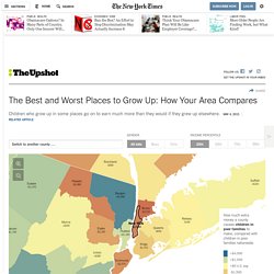
Manhattan is very bad for income mobility for children in poor families. It is better than only about 7 percent of counties. Location matters – enormously. If you’re poor and live in the New York area, it’s better to be in Putnam County than in Manhattan or the Bronx. Not only that, the younger you are when you move to Putnam, the better you will do on average. But even Putnam County is below the national average. Who Hogs the World's Wealth? An interactive infographic by Our Own Thing. Mapping Poverty in America. Overview-of-global-poverty_545dc22f211a0_w1500.jpg (JPEG Image, 1500 × 2479 pixels) - Scaled (40%) World-hunger-facts_50290f755a7ae_w1500.gif (JPEG Image, 1500 × 6946 pixels) - Scaled (14%)
@komox37. 2014-MNCH-Infographic-web-800px.jpg (JPEG Image, 800 × 533 pixels) The-global-face-of-poverty_53145a7111e34_w1500.png (JPEG Image, 1500 × 4232 pixels) Food-waste_5314e5e18173f_w1500.jpg (JPEG Image, 1500 × 4596 pixels) - Scaled (14. Habitat-we-build_52f536d89700a_w1500.png (JPEG Image, 1500 × 1125 pixels) - Scaled (59. Broke-and-broken-the-psychological-effects-of-poverty_52e11f09570e1_w1500.jpg (JPEG Image, 1500 × 9432 pixels) - Scaled (7. Global Food Index. GlobalSlavery_0.png (PNG Image, 900 × 1207 pixels) - Scaled (55%) Hungryplanet.jpg (JPEG Image, 750 × 7856 pixels) Modern Slavery - knoema.com. According to Walk Free Foundation there are an estimated 29.8 million people enslaved around the world.

The countries with the highest numbers of enslaved people are India, China, Pakistan, Nigeria, Ethiopia, Russia, Thailand, Democratic Republic of Congo, Myanmar and Bangladesh. Taken together, these countries account for 76% of enslaved people around the world. In 2013, modern slavery takes many forms, and is known by many names: slavery, forced labour or human trafficking. Whatever term is used, the significant characteristic of all forms of modern slavery is that it involves one person depriving another people of their freedom: their freedom to leave one job for another, their freedom to leave one workplace for another, their freedom to control their own body.
Access database: Global Slavery Index 2013 Loading... Spare-a-thought-for-the-millionaires-infographic_5284d6f30a130.jpg (JPEG Image, 595 × 3715 pixels) Decline-of-the-middle-class_510fd4a26fff1.jpeg (JPEG Image, 840 × 2596 pixels) Wealth Inequality in America.
Where Does Foreign Aid Go? The different countries that U.S. foreign aid has gone to, from 1960 to 2010. Liked by 2 People. 2013-global-hunger-index-by-severity_525d99c98b348.png (PNG Image, 2516 × 1790 pixels) - Scaled (35. Australian-income-and-wealth-distribution_50291968a91b4.jpg (JPEG Image, 2339 × 1969 pixels) - Scaled (35. Cost-of-feeding-a-family-of-four_517fcec9b6a43.jpg (JPEG Image, 3333 × 5333 pixels) Global-malnutrition_518d4a185deb6.jpg (JPEG Image, 760 × 2143 pixels)
Health Needs Around the World. Canada Federal Budget 2013 Scorecard. Growing-up-american-and-undocumented_519352500c467. Academic-profile-of-collegebound-undocumented-students_519353abb3119. Waterrichvswaterpoor.jpg (JPEG Image, 500 × 2398 pixels) Uninsured_518bdd9a3ae05.jpg (JPEG Image, 800 × 3512 pixels) Education-vs-income-level-in-the-usa_51b8b294ed74e.jpg (JPEG Image, 1000 × 9201 pixels) Us-minimum-wage-change_5176ac3b0fefd.jpg (GIF Image, 760 × 1595 pixels)
What-is-a-childs-life-worth_51a7a2399ee8e.jpeg (JPEG Image, 900 × 2975 pixels) - Scaled (23. The-future-of-baby-making_51a4fa40233be.png (PNG Image, 975 × 3331 pixels) - Scaled (20. Female-literacy-educating-girls-in-poverty_52af1ef74fd73.jpg (JPEG Image, 1500 × 1130 pixels) - Scaled (59. Expensive-health-care-cost-in-america_51763c9cd0516.jpg (JPEG Image, 700 × 4740 pixels) Home - Poverty Over - Christian Aid. One-the-fight-against-malnutrition_51937f6fda284. Al Jazeera America: Where would 7 million displaced Syrians fit? Since the start of the Syrian conflict in 2011, at least 2.5 million refugees have fled the country and more than 6.5 million have been displaced internally.

But what do 9 million people look like? Using U.S. Census data, this interactive shows where 9 million people live in your area to illustrate the scope of this regional humanitarian crisis. Click anywhere on the map, enter your address or select from a location. You can also save your map and submit it to the gallery below. Source: UNHCR, 2010 Census population by tract. UPDATE 12/10/2013: The UN has updated its estimate of internally displaced people from 4.25 million to 6.5 million people, raising the total number of those displaced from roughly 7 million to 8.8 million. UPDATE 3/16/2014: The number refugees has surpassed 2.5 million, bringing the total to over 9 million.
Gender Pay Equality. Iib_death_wellcome_collection_fullsize.png (PNG Image, 4722 × 1846 pixels) - Scaled (27%) Richest-postal-codes-in-canada_5151b9ca59a7e_w1134.jpg (JPEG Image, 1134 × 1940 pixels)