

How Big Is That Box? Understanding Sizing In CSS Layout — Smashing Magazine. CSS Cheat Sheet. CSS Flexible Box Layout - CSS. CSS Flexible Box Layout is a module of CSS that defines a CSS box model optimized for user interface design, and the layout of items in one dimension.
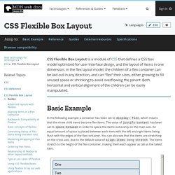
In the flex layout model, the children of a flex container can be laid out in any direction, and can “flex” their sizes, either growing to fill unused space or shrinking to avoid overflowing the parent. Both horizontal and vertical alignment of the children can be easily manipulated. Basic Example In the following example a container has been set to display: flex, which means that the three child items become flex items. The value of justify-content has been set to space-between in order to space the items out evenly on the main axis. Reference. Bootstrap All CSS Classes. 5 Cool Design Examples that Demonstrate the Power of Divi’s New Font Options. The way you represent the written content on your website is a big part of how the message will be received by your visitors.
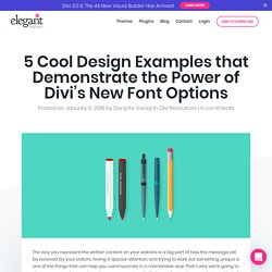
Giving it special attention and trying to work out something unique is one of the things that can help you communicate in a memorable way. That’s why we’re going to show you some of the cool results you can create with Divi’s new font options on whatever kind of website you are creating. A Complete Guide to Grid. CSS Grid Layout is the most powerful layout system available in CSS. It is a 2-dimensional system, meaning it can handle both columns and rows, unlike flexbox which is largely a 1-dimensional system. You work with Grid Layout by applying CSS rules both to a parent element (which becomes the Grid Container) and to that element’s children (which become Grid Items).
Get the poster! 50 of Our Favorite CSS Libraries, Frameworks and Tools from 2017. With all of the trend changes and advancements that CSS goes through, we shouldn’t be surprised at the volume of free resources and tools that have been released recently.
These time-saving CSS libraries and tools have been built to make your lives that little bit easier and also offer a clear learning window into CSS properties that you may not have adopted yet, or fully understand quite yet. In this collection we have collected 50 of our favorite CSS libraries, frameworks, and tools that have all been released this year. All of the tools and libraries have been categorized into the following categories: Flexbox Tools & Libraries, CSS Grid Tools, CSS Button Libraries, CSS Components, CSS Animation Tools, CSS References, Guides & Checklists, Atomic CSS Frameworks,CSS Web Frameworks, Lightweight CSS Frameworks, and finally, a bunch of Miscellanous CSS Tools.
Trowel - Trowel - The most evolved way to write scss code. Understanding CSS Variables – YoungInnovations’ Blog. Muuri - Responsive, sortable, filterable and draggable grid layouts. How to make your HTML responsive by adding a single line of CSS. Mixins that make it possible to use CSS Grid in IE 10/11 as well as in modern browsers. Based on mixins by Sascha Fuchs at. FooTable - A jQuery Responsive Table. Form Styling with HTML/CSS3. In this blog post we provide you 5 different form styles, created in HTML/CSS3. just follow our codes or download it to use in your form styles.
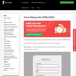
Form Style 1:- if you want to put icons in input fields of your form then following style is for you. HTML File: form1.html <! The Ultimate Guide to Styling Forms. 10 CSS Form Examples. 10 CSS Form Examples Forms can be greatly enhanced with a touch of CSS, making them more usable and far more visually attractive.
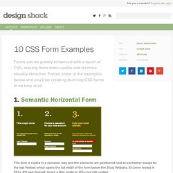
Follow some of the examples below and you’ll be creating stunning CSS forms in no time at all. 1. Semantic Horizontal Form This form is coded in a semantic way and the elements are positioned next to eachother except for the last fieldset which spans the full width of the form below the 3 top fieldsets. 2. 30 Useful Responsive Web Design Tutorials. So we’ve reached the end of our “Responsive Web Design week”, tonight’s post will be the last of the series.
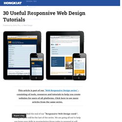
We are going all out to help you hone your skills in manipulating those codes to respond at will when displayed on different devices. And to do this, we are featuring 30 Responsive Web Design Tutorials found online. This list is not meant to be an exhaustive one but it will get you started on understanding the basics of designing an adaptive website that will cater to all sorts of screen sizes. Report and Form Builder. Refills - Patterns. Filamentgroup/select-css: Cross-browser styles for consistent select element styling.
Raphaelfabeni/css-loader: Simple loaders for your web applications using only one div and pure CSS. Family.scss. Kazzkiq/balloon.css: Simple tooltips made of pure CSS. Surface - Material Design, CSS only framework. 10 Snippets for Creating Split Screen Layouts. Split screen UIs have become a popular way to showcase content.
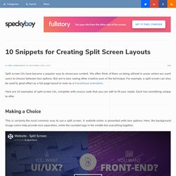
We often think of them as being utilized in areas where we want users to choose between two options. But we’re also seeing other creative uses of the technique. For example, a split screen can also be used to great effect as a full page layout or even as a transitional animation. Here are 10 examples of split screen UIs, complete with source code that you can edit to fit your needs. Each has something unique to offer. A Practical Guide For Creating the Best Website Color Schemes. One of the first questions you’ll need to address when you begin to create a website is which colors to choose for the design.
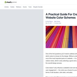
Without a doubt, a website’s color scheme is one of the most important parts of a website — it’s one of the first things that site visitors notice, which is why selecting a good color palette is such an important part of the overall design process. Color doesn’t only influence a website's look and style, it also plays a significant role in user engagement — the colors you choose for your website can impact its success in terms of visit duration, click rates, and sales.
Did you know that 90 percent of our assessment of a product is made on color alone? While color is one of the most powerful tools in a designer’s toolkit, it’s a tricky concept to master — with an infinite number of possible color combinations out there, it can be hard to decide what colors to use on your site. You might also like: 6 Tools to Create Beautifully Designed Mood Boards. 10 Free CSS Tooltip Snippets To Save Time On Your Web Projects. Adding a simple tooltip into your page isn’t hard.
You can find a bunch of free tooltip plugins and JS scripts that can help with this. But pure CSS is another option, and it’s quickly becoming the preferred choice for many web designers. If you’re looking for CSS tooltips, then this collection should have something for you. All of these snippets come from CodePen, and they’re freely available to fork, copy, and restyle for your website. 1. Stylable. Are We Ready to Use Flexbox? Flexible adjective 1. capable of bending or being bent, able to be easily modified to respond to altered circumstances or conditions. box noun 1. a rigid typically rectangular container.
The Flexible Box Module, a.k.a. flexbox, is all the latest and greatest at the moment. It digs into the fundamentals of the CSS box-model, providing us with a powerful and highly useful module for layout configurations. HTML5 Cross Browser Polyfills · Modernizr/Modernizr Wiki.
The No-Nonsense Guide to HTML5 Fallbacks So here we're collecting all the shims, fallbacks, and polyfills in order to implant HTML5 functionality in browsers that don't natively support them. The general idea is that: We, as developers, should be able to develop with the HTML5 APIs, and scripts can create the methods and objects that should exist. Developing in this future-proof way means as users upgrade, your code doesn't have to change but users will move to the better, native experience cleanly. Webdesign.tutsplus. CSS Reference - A free visual guide to CSS.
Osseous - A bony CSS framework without guts. Forms Forms are essential to any website. Osseous gives you enough styling for each input type, and using columns. Forms can be structured with row and columns to easily group fields together. You can make nice box forms with additional layout classes, such as offset-by columns, borders, and padding. More utility classes are explained in the Utility section. StyleGuides.io - Articles. Examples. Grid System. Mastering CSS Layout with Flexbox. All You Need To Know About CSS-in-JS. What is CSS-in-JS? JSS is a more powerful abstraction over CSS. It uses JavaScript as a language to describe styles in a declarative and maintainable way. It is a high performance JS to CSS compiler which works at runtime and server-side. This core library is low level and framework agnostic. It is about 6KB (minified and gzipped) and is extensible via plugins API. — source. How to Use CSS Gradients on the Web.
Untitled. Using CSS Grid: Supporting Browsers Without Grid. Advertisement Many of us have started to approach design in a more modular way recently. We experiment with pattern libraries and style guides. And yet, only some succeed, most of us fail. That’s why we’ve teamed up with Alla Kholmatova to find out what makes a design system effective and what works and what doesn’t work in real-life products. Get the book now → When using any new CSS, the question of browser support has to be addressed. You Don’t Need a Framework: Understanding the Fundamentals of Responsive Design – Tania Rascia.
Responsive web design is an approach to creating websites in which the layout adapts to fit the device’s screen – whether it’s a phone, tablet, laptop, desktop, TV, or hologram. That sounds like a daunting task. MoOx/postcss-cssnext: PostCSS plugin to use tomorrow's CSS syntax, today. Koala - a gui application for LESS, Sass, Compass and CoffeeScript compilation. Breakpoint. Understanding CSS Flexbox. HTML5 Cross Browser Polyfills · Modernizr/Modernizr Wiki. The No-Nonsense Guide to HTML5 Fallbacks So here we're collecting all the shims, fallbacks, and polyfills in order to implant HTML5 functionality in browsers that don't natively support them.
Polyfill (programming) What makes a polyfill different from the techniques we have already, like a shim, is this: if you removed the polyfill script, your code would continue to work, without any changes required in spite of the polyfill being removed. HTML5 Shiv In IE versions prior to 9, unknown HTML elements like <section> and <nav> would be parsed as empty elements, breaking the page's nesting structure and making those elements impossible to style using CSS. One of the most widely used polyfills, html5shiv, exploits another quirk of IE to work around this bug: calling document.createElement("tagname") for each of the new HTML5 elements, which causes IE to parse them correctly. It also includes basic default styling for those HTML5 elements. CSS-Crush ~ CSS pre-processor.
Edit ‘API functions’ on Github. 6 Current Options for CSS Preprocessors. Using CSS3: Older Browsers And Common Considerations. Advertisement. Modernizr: the feature detection library for HTML5/CSS3. Using Flexbox: Mixing Old and New for the Best Browser Support. By Chris Coyier On. [Solved] Flexbox with fallback - CSS-Tricks. # March 5, 2014 at 12:59 pm Now that flexbox has begun to be accepted across all major browsers, I’m happily getting to know it and love it. Flexbox-fallback.css. Using Flexbox: Mixing Old and New for the Best Browser Support. CSS3.0 Generator. Online Interactive CSS Cheat Sheet. Layer Styles. 25+ CSS Animation Libraries. The Ultimate Collection of 500+ CSS Generators. 100+ Best CSS Frameworks for Responsive Design. NatUIve Kitchen. A powerfully light, responsive, and lean front-end UI framework built with Less.
Mini.css - Minimal, responsive, style-agnostic CSS framework. CSS Grid Layout for Event List Widget with Flexbox Fallback. Flexbox-fallback.css. Color Palette Generator (Image to Hex Conversion) Responsive Organization Chart [updated] 3D accordion. Best CSS books, tutorials & courses 2017. Styled-components: Documentation. JSS. Gradientify - Best gradients in one place. Bootstrap CSS Form Builder and Generator. Edwardtufte/tufte-css: Style your webpage like Edward Tufte’s handouts. JQuery Templates. Fibonacci – Flexbox Composer. Ceaser - CSS Easing Animation Tool - Matthew Lein. Flexy Boxes — CSS flexbox playground and code generation tool. 7 Free Tools For Testing Responsive Layouts. ColorZilla - Eyedropper, Color Picker, Gradient Generator and more. Ultimate CSS Gradient Generator - ColorZilla.com. Jquery-rsButton plug-in.