

Salesmachine - Product Hunt. Good Email Copy: Email copy from great companies. Submit.co - Product Hunt. The Ideal Design Workflow — Prototyping: From UX to Front End. Design & UX Trends to Boost Conversions [INFOGRAPHIC] If you’re like me, you’re a sucker for trends.
![Design & UX Trends to Boost Conversions [INFOGRAPHIC]](http://cdn.pearltrees.com/s/pic/th/design-conversions-infographic-132993889)
I wear my denim with massive holes in the knees (much to the dismay of my grandmother). I change my hair constantly (much to the dismay of airport security). And I prefer my lunch served fresh from a food truck (ain’t nobody got beef with that). But trends are not always a good thing — for digital marketers, jumping on the latest and greatest design and UX trend can hurt campaigns. On the other hand, they may boost conversions. The folks at The Deep End Design have compiled a comprehensive list of design and UX trends that have been shown to boost conversions. We suggest using this list as a jumping off point if you’re not sure what to test. Dominant and Strong Color Inspiration — Muzli -Design Inspiration.
How Not to Do Customer Service. I recently took my family to the beach.
On the way home we stopped off for ice cream. We went to Baskin Robbins. Baskin Robbins was my childhood favorite and since there’s not one near our house, I was excited to find one near the beach. How users understand new products. When you’re building a new product, you need to help customers understand the value your product delivers – fast.
But what your product is, and what it does, can mean very different things for different people. Take Snapchat. At one time it’s a photography app, an augmented reality app, and a social network, all for very different customers. These different assumptions and observations of what your product can do build up over time, and form different mental models. Boarding Pass Design Inspiration — Muzli -Design Inspiration. Sans titre. Leaderboard UI Inspiration — Muzli -Design Inspiration. Iconset:miu-flat-social icons - Download 71 free. AEREA - FREE UI KIT on Behance. Dropdown UI Inspiration. TenXList website animation by Lukas Kus - Dribbble. Subscribe UI Inspiration — Muzli -Design Inspiration. 50 Essential Books Every Graphic Designer Should Read — Prototyping: From UX to Front End.
50 Essential Books Every Graphic Designer Should Read When it comes to seeking inspiration and learning, graphic designers are spoilt for choice.
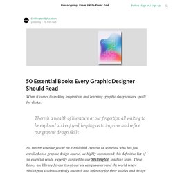
There is a wealth of literature at our fingertips, all waiting to be explored and enjoyed, helping us to improve and refine our graphic design skills. No matter whether you’re an established creative or someone who has just enrolled on a graphic design course, we highly recommend this definitive list of 50 essential reads, expertly curated by our Shillington teaching team.
These books are library favourites at our six campuses around the world where Shillington students actively research and reference for their studies and design briefs. 1. This monograph is the first major publication devoted to Lance Wyman’s entire output. 2. Eye is the world’s most beautiful and collectable graphic design journal. 3. 40 Mobile Apps Onboarding Designs for Your Inspiration. The very first thing users see when downloading an app these days is an onboarding screen.
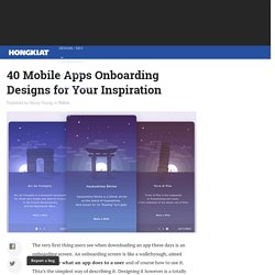
An onboarding screen is like a walkthrough, aimed to introduce what an app does to a user and of course how to use it. Thta’s the simplest way of describing it. Designing it however is a totally different thing. An onboarding screen needs to be designed in the most simple, welcoming and user-friendly way possible. Onboarding screens like empty state pages created to inform and educate users. 4 Common Mistakes With Error Messages (and How to Fix Them) Your users will make mistakes.
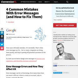
It’s inevitable. That’s what error messages are for – but so many companies are doing them poorly, and they’re pissing off potential customers in the process. So, how can we better design error messages to increase user experience, and therefore, increase conversions? Error Message Errors and How They Affect UX Error messages can be so frustrating. Twitter is Testing Material Design for its Android App. Better Interface Design: Logins, Menus, Toggles And Other Fancy Modules. CodePen has become the playground for developers.
The sandbox where you can build whatever your imagination fancies. Practical things, experimental concepts — it’s a treasure chest, bound to fuel your ideas. A Simple Web Developer's Guide To Color. In this article, Laura Elizabeth shares a simple color workflow that you can use in your next web project.
I’ve never been a fan of color theory. I think it’s because I’ve always been a bit hopeless at it. I’d love to be able to sit there, color wheel in hand, and pick out complementary, split-complementary and triad color schemes, impressing all of my friends, family and clients in the process. But the theory has always eluded me, and, truthfully, I’ve never found it useful when trying to use color in my projects. Somewhat ironically, I’ve been finding that the better I get at choosing and using color, the better I become in the theory behind it.
Improve User Experience With Real-Time Features. Real-time technology delivers information to your users as it happens.
But how does it help improve your product and align with your customers’ expectations? Only a few years ago words like WebSockets, low latency and real-time functionality were at the forefront of bleeding-edge development. UI Interactions of the week #17 — Muzli -Design Inspiration. 6 User Onboarding Flow Examples (With Critiques) Are you familiar with the user experience quote, “User interface is like a joke.
If you have to explain it, it’s not that good.”? While clever, that statement is far from true. User interfaces shouldn’t be complicated, but you can’t expect a new user to understand a new interface without any sort of direction. Similarly, you can’t expect an existing user to understand an updated interface or a new feature without any sort of direction. RICE: Simple prioritization for product managers. Prioritization is a perennial challenge when building a product roadmap.
How do you decide what to work on first? If you’ve put the effort into brainstorming new ideas, finding opportunities for improvement, and collecting feedback, you’ll have a solid product roadmap full of good ideas. But the order in which you tackle those ideas deserves just as much thought. You need to take the time to prioritize well. Can you Code this UI Concept? Vol. 3 — Design, Code and Prototyping — Medium.
Can you Code this UI Concept? Vol. 3 New UI concepts and their CodePen implementation. We’ve had fun lately shared at UpLabs, collecting awesome UI concepts turned into CodePen, not once but twice! Since all things come in threes, enjoy this new series of perfect UI concepts picked up and coded by developers. Once again, kudos to the talented designers and developers behind them! Google’s Nifty New Tool Helps Designers Pick the Right UI. Adobe is on a mission to make life easier for designers, and its latest undertaking on that front is something it calls Project Comet.
The software-turned-creative-app company debuted it at this week’s annual Adobe MAX Conference, and from what we can tell, it looks like a godsend for UX designers. It’s early days for Project Comet, which will roll out in 2016, but it’s essentially a website- and app-building tool with WYSIWYG (what-you-see-is-what-you-get) capabilities, so that designers can glide between wireframing, working on interface design, and prototyping, all in one digital place.
Right now, that’s not what they’re doing. According to a survey conducted by Khoi Vinh, a principal designer at Adobe, designers currently use an array of programs. For wireframing, they tend to use Sketch by Bohemian Coding or Illustrator. Go Back to Top. How Words Build A Product. We’ve always cared about words at Intercom. This blog, our books, and our product marketing attest to that. But words within the product itself have followed a more evolutionary path. Decoding The Product Dialect Words in a product evolve. They start with the people who first invent the product and name its parts. It reminds me of the Ship of Theseus, a 2,500-year-old thought experiment about the nature of identity. Pop-up Inspiration — Muzli -Design Inspiration. Material Design Signup Interation. Efficient Responsive Design Process. What’s your responsive design process like? Do you feel that it’s efficient? The following article is an excerpt from Ben Callahan’s chapter “Responsive Process,” first published in the Smashing Book 51 (table of contents2).
We’ve collected some useful techniques and practices from real-life responsive projects in the book — and you can get your hard copy3 or grab the eBook4 today. You will not be disappointed, you know. —Ed. “The successful respondent to this RFP will provide three static design options for our team to evaluate.” “Each of these options will provide design for three unique layouts: home page, listing page, detail page.” “Each of these unique page designs should take mobile, tablet, and desktop sizes into account.” Beautiful Concrete Aesthetics and City Shapes. The Inside Story of Uber's Radical Rebranding. Today, millions of people around the world will power on their smartphones and scan their screens for the black-and-white Uber icon, only to find it missing.
In its place, they’ll see a colorful geometric shape—hexagonal if they drive, circular if they’re a rider—surrounding a small, bit-like square. The colors and patterns will vary from country to country—red in China, turquoise in India, dark teal in the United States—but everywhere, the app will open with an elegant, patterned animation, welcoming users to the new Uber. Go check for yourself, if you haven’t already. The Vital Guide To User Experience (UX) Design Interviewing. Style Guide Inspirations — Muzli -Design Inspiration. UX Timeline, back to the past!
How to Hook Users With Habit-Forming UX Design. Apple. Facebook. Twitter. Google. Pinterest. These companies all have one thing in common — they create habits among their users. But creating habits is easier said than done. 10 Animators & Illustrators That You Must Follow On Dribbble. 5 Design Tools to Help You Build Your App. Comet officially arrives in 2016, and a lot of people are excited for it.
The Vital Guide To User Interface (UI) Design Interviewing. While UX Designers are in charge of the overall functionality of the product, User Interface (UI) Designers are mainly concerned about how the product is laid out, and what the product’s visual communication elements are. For example, a UI designer will make sure every page, screen or other step that a user will experience is designed within the path that the UX designer has created. They are also responsible for maintaining the overall consistency and implementing style guides across the whole visual communication of the product.
Aristotle: The OG of Landing Page Optimization. The Top 10 Product Design Lessons for 2016. Free Guide: Interaction Design Trends 2015 & 2016. The 11 digital tools I use every week as Head of Product. Color - Style - Google design guidelines. User Analysis Before Diving Into Design (Part 1) A great product experience starts with a good understanding of your users. Not only do you want to know who they are, but you want to dive deeper into their motivations, fears, mentality, and behavior.
Web Development Reading List #121: The Illusion Of Completeness, Client Hints, CSS Subgrids. Free: The Definitive 2016 UX Design Trends Bundle. Don’t Overlook These 7 Website Style Guide Sections. The Vital Guide to Interviewing Mobile Application Designers. The "Blur Up" Technique for Loading Background Images. What I Learned at Slack, Part 4: The Six Forces of Product Development — What I Learned at Slack. How To Streamline User Onboarding. Design is a conversation. Geometric Animal Home Decorations. Design Principles: Choosing the Right Patterns.
What's The One Thing That Creates High User Engagement?