
Saying it with Charts. Follow this set of tips to ensure all your powerpoint presentations have an impact There are some great resources on the web for improving your chart quality: Extreme Presentations site by Andrew Abela, dedicated to designing presentations of complex or controversial information in ways that drive people to action.
Of particular use: A 10 step process to designing your presentationDownload the Chart Chooser pdf to help you decide which chart is right for different comparisonsLayout options for different charts to make the layout help convey the message Creative presentation tools here at Robin Good’s site Say it with charts from Gene Zelazny, the Director of Communications at McKinsey FT Chart Doctor The FT does good charts. 10 Really Cool Mind Mapping Examples You Will Learn From. Let’s have a look at mind mapping examples together.
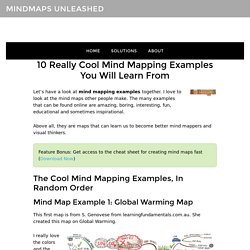
I love to look at the mind maps other people make. The many examples that can be found online are amazing, boring, interesting, fun, educational and sometimes inspirational. Above all, they are maps that can learn us to become better mind mappers and visual thinkers. Feature Bonus: Get access to the cheat sheet for creating mind maps fast (Download Now) Mind Map Example 1: Global Warming Map This first map is from S. I really love the colors and the images she uses. And that is probably because of the many branches that this map uses, she uses 9. When you combine a number of them you can reduce the overwhelm and make it an even better map.
What I always take away from this map is to realize that you can use small and simple drawing to create a nice looking image easily. Mind Map Example 2: Time Management Map Map number 2 is the map from MindTools.com on time management. Again a map with many branches and now with a lot of text. iMindMap Gallery. 8 Classic storytelling techniques for engaging presentations. Periodic Table of Storytelling. 7 Data Presentation Tips: Think, Focus, Simplify, Calibrate, Visualize. Advanced Guide To Writing McKinsey-Style Presentations. FREE eBook Advanced Guide to McKinsey -style Presentations - Over 60 pages of killer advice!
Introduction to Business Presentations Why we wrote this guide 350 PowerPoint presentations are given per second. The vast majority of them suck. They are too long, too dull, too full of useless detail, too generic. They are how we represent ourselves and our work to the world, they are the culmination of our analysis and our thinking. And they are terrible. The disturbing challenge for many of us is that 'terrible' simply isn't good enough. We wrote this guide in the hopes that, in our own way, we can have a disproportionate impact on your success - your success in presenting yourself, your ideas, and your value add. Our goal was to create the most comprehensive online guide to writing business presentations on the web. Here you'll find a business presentation writing resource overflowing with value and depth. Log In - CEB Market Insights Leadership Council. Latest News on Content Marketing - CMA - SEVEN STEPS TO THE PERFECT STORY.
30 Days Data Storytelling. Aerogramme Writers' StudioPixar's 22 Rules of Storytelling. These rules were originally tweeted by Emma Coats, Pixar’s Story Artist.
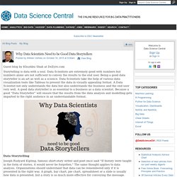
Number 9 on the list – When you’re stuck, make a list of what wouldn’t happen next – is a great one and can apply to writers in all genres. You admire a character for trying more than for their successes.You gotta keep in mind what’s interesting to you as an audience, not what’s fun to do as a writer. They can be very different.Trying for theme is important, but you won’t see what the story is actually about til you’re at the end of it. Now rewrite.Once upon a time there was ___. Every day, ___. Storytelling with data. Why Data Scientists Need to be Good Data Storytellers.
Guest blog by Khushbu Shah at DeZyre.com Storytelling is data with a soul.
Data Scientists are extremely good with numbers but numbers alone are not sufficient to convey the results to the end user. Being a good data storyteller is an art as well as a science. Data Scientists take the help of various data visualization tools like Tableau to present the data in visually appealing format. A Data Scientist not only understands the data but also understands the business and the end user very well.
Data Storytelling Joseph Rudyard Kipling, famous short-story writer and poet once said “If history were taught in the form of stories, it would never be forgotten. " Shawn Callahan, world’s leading business storytelling consultant rightly said- “The best stories contain data. Harvard Business Review Blog Network published a blog titled –“Data is Worthless if you don’t communicate it.” 75% of the human population considers data to be dry and boring, however everybody loves a good story.