
Till Nagel. HD Planning - City Analytics. Networked Urbanism. Visualizing different aspects of reality using georeferenced data available through various channels and geolocating user-generated inputs.
Mapping makes reading the city at different scales with different layers and filters possible, and is also an intuitive and powerful channel for participation. The problem is the future strain on Portland’s transportation infrastructure, due to the expected population growth of 1 million people by the year 2040. Portland is expecting to become denser, and though Portland’s population has increased, the congestion of traffic has not.
This is due to Portland’s predominant bike culture. Portland is America’s biking capital, with a bicycle commuter rate of 6.3% vs. the national average of 0.61%. Our intent is to help Portland reach the modal split goal of 25% bicycle trips taken by the population inside the metro area. Graphing New Yorkers' Lives Through the Open Data Portal. Ben Wellington is the man behind I Quant NY, a blog dedicated to telling the stories hidden in New York City’s Open Data Portal, a clearinghouse of more than 1,300 data sets from city agencies.
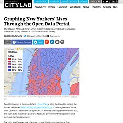
Started by the city government in 2011, the open data initiative’s goal is to facilitate government transparency and increase civic engagement. The blog itself comes out of a stats course Wellington teaches at Pratt Institute’s graduate program for city and regional planning, where he uses these data sets in coursework. Covering everything from gender divides in Citi Bike usage to finding the farthest point away from a Starbucks in Manhattan, Wellington’s larger mission is to get people thinking critically about the numbers that, if analyzed right, can be the key to understanding New York City. He spoke to CityLab about his blog, his hope for the open data movement, and some of his favorite data sets.
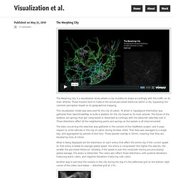
Your statistics course at Pratt uses material that’s not in any textbook. Urban tapestries. The Art of Mapping. Planet Geospatial. Visualization et al. The Morphing City is a visualization study where a city mutates its shape accordingly with the traffic on its main arteries.
RStudio Blog. Accidental aRt. GIS and Agent-Based Modeling. GIS and Agent-Based Modeling. Xiaoji Chen's Design Weblog » Map of Paris: Visualizing Urban Transportation. Urban Demographics. New map design: best for traffic and transit - HERE Three Sixty. Our new map design is all about supplying the right information at the right time.
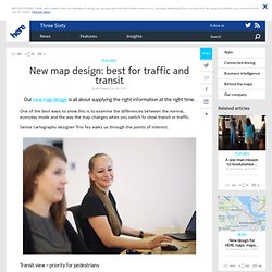
One of the best ways to show this is to examine the differences between the normal, everyday mode and the way the map changes when you switch to show transit or traffic. Senior cartography designer Trixi Fey walks us through the points of interest. Transit view – priority for pedestrians. New maps design: your questions answered - HERE Three Sixty. Two weeks ago, we announced our new, cool and colourful, redesign for HERE maps, currently available at here.com and on Yahoo!
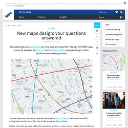
Maps, and spreading to other platforms over coming months. You had questions, of course, and we took them to Astrid Dawson, who leads the HERE cartography design team. She has kindly answered them, below. Please note that we have edited the questions a little, in some cases, to keep them brief and improve readability. Favela tem que voltar ao mapa do Brasil. He geography of Tweets. Give every Twitter user a brush and they will paint you the world — if they geotag their Tweets.
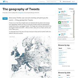
Those of us on the Visual Insights team are obsessed with the patterns that emerge from aggregated Tweets over time. A continuing curiosity is about the geographical shapes that surface in geotagged Tweets. The images we’re sharing here use all of the geo-tagged Tweets since 2009 — billions of them. (Every dot is a Tweet, and the color is the Tweet count.) I’m especially fond of this view of Europe, because it shows all the maritime traffic from different cities and countries.
Seeing the clarity of the regional images led me to work up images for cities, too. Real-Time Media Map. Maps of Babel at Human Cities Symposium. FolkMapping with FoundCity. How Citizen Mapmakers are Changing the Story of our Cities. By Christine McLaren - resident blogger for the BMW Guggenheim Lab, a mobile think tank investigating solutions to urban problems.
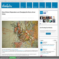
It launched this fall in New York and will travel next to Berlin, Mumbai, and six other cities over six years. We see them every day, popping up on our Twitter feeds, filtered through blogs, or even scattered throughout the New York Times: maps portraying not the usual locations or destinations, but data. From people’s kisses in Toronto, to the concentration of pizza joints in New York, to the number of women who ride bikes, to the likelihood of being killed by a car in any given American city, the list of lenses through which we can now view our cities and neighborhoods goes on, thanks to data-mapping geeks.
Milestones in the History of Thematic Cartography, Statistical Graphics, and Data Visualization. Leveraging OpenStreetMap for Pedestrian Experience Modeling and Analysis. Day: Saturday Time: 2:00pm The experience of pedestrians and wheelchairs users is different from the experience of motorists, transit riders, and bicyclists.
The pedestrian experience depends on the conditions of sidewalks, curb ramps, and other features that are frequently missing from maps. Analysis for urban planners and individualized services for pedestrians require an accurate and detailed walkway network model. Microsoft’s GeoFlow Lets Spreadsheet Jockeys Tell Stories with Maps.
When Curtis Wong was a kid growing up in Los Angeles, he knew that the Milky Way existed. But like most urban-dwellers, he’d never seen it. “It was just this mythical thing in books,” says Wong, who is now a principal researcher at Microsoft. “It wasn’t until after high school that some friends and I drove an hour north of LA and got to see the Milky Way, and it was unbelievable. After that, I always wanted to make it possible for everybody to see it.” Which he eventually did, through a virtual planetarium program from Microsoft called the WorldWide Telescope . It’s a long and sinuous road that connects Wong’s youthful amateur-astronomy experience to the Worldwide Telescope and then to GeoFlow , a new geospatial visualization tool in Microsoft’s widely used Excel spreadsheet program.
GeoFlow, which Microsoft unveiled in preview form back in early April, is an add-in for Excel 2013 that turns spreadsheet jockeys into mapmakers. DynaMapper for iPad - "There's an app for that" Our Favorite Maps of 2013. The digital maps we loved in 2013 didn't simply illustrate novel or useful information (how people travel, where they live, what it means to live without much money).
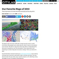
They did it in ways we'd never seen before, manipulating time, dimensions, perspective, even the atmosphere. Flowing City, Urban Data visualizations of the city. Flowing city was designed and maintained by me -> Margarida Fonseca, a Project Manager at PT Sistemas de Informação, Portugal.
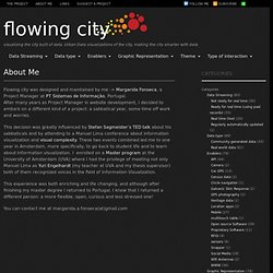
After many years as Project Manager in website development, I decided to embark on a different kind of a project: a sabbatical year, some time off work and worries. This decision was greatly influenced by Stefan Sagmeister’s TED talk about his sabbaticals and by attending to a Manuel Lima conference about information visualization and visual complexity. These two events combined led me to one year in Amsterdam, more specifically, to go back to student life and to learn about Information visualization.
Saiba mais sobre gps. O segundo semestre acabou de começar! Para aqueles que iniciaram a rotina ainda no clima de descanso ou já morrendo de saudades das férias que acabaram, tenho uma ótima notícia: até dezembro teremos muitos feriados! E a maioria próxima dos finais de semana! Em 07 de setembro, uma aguardada sexta-feira, temos o feriado da Independência do Brasil. O dia de Nossa Senhora Aparecida, em 12 de outubro, também será na sexta. Em novembro, mais uma sexta-feira de folga: dia 02, Finados. All Questions - OSM Help. Google Maps Mania. Visualizing the city built of data.
Mapping. In 1932, Charles O. Paullin and John K. Wright published Atlas of the Historical Geography of the United States, a reference of almost 700 maps about a varied set of topics, such as weather, travel, and population. The Digital Scholarship Lab at the University of Richmond brought the atlas to digital life. In this digital edition we've tried to bring—hopefully unobtrusively and respectfully—Paullin and Wright’s maps a bit closer to that ideal. Flows, Behaviour and Networks in the City. Mapping Millions of Dots. I’ve made a lot of maps out of dots before, but the ones we made from Gnip’s Twitter archives, which were featured in Wired Design a few days ago, were my first experience trying to make dot maps that would work at any scale, anywhere in the world. Here are some of the lessons I learned in the process about making dot maps look good on the web.
Scaling and brightness The first thing that becomes clear when you start drawing the same dots at different scales is that it doesn’t look right if you just scale the dots proportionately as you scale the area. Each time you zoom in on a web map, only a quarter of the area that was visible before is still visible, but if you match that and draw the dots four times as big as you did at the previous zoom level, the image is very crowded and fuzzy by the time you get zoomed in all the way. The Gnip maps instead double the area of the dots for each level you zoom in. Doubling the dot size looks pretty good, but it still isn’t quite right.