
Urban Flow Networks. Jon Reades, Joan Serras, Ollie O’Brien and Martin Austwick in CASA have done a good job recently in visualising urban flow systems which are central of course to our science of cities.
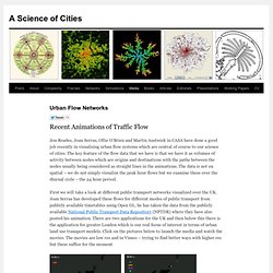
The key feature of the flow data that we have is that we have it as volumes of activity between nodes which are origins and destinations with the paths between the nodes usually being considered as straight lines in the animations. The data is not on spatial – we do not simply visualize the peak hour flows but we examine these over the diurnal cycle – the 24 hour period. First we will take a look at different public transport networks visualized over the UK. Joan Serras has developed these flows for different modes of public transport from publicly available timetables using Open GL. he has taken the data from the publicly available National Public Transport Data Repository (NPTDR) where they have also posted his animation.
Weather statistics for London, England (United Kingdom) Average temperature per month Graph explanation.

Hide explanation Explaination to the graph: Max temperature: Average max daily (24h) temperature per monthMinimum temperature: Average minimum daily (24h) temperature per monthAverage temperature: Average daily (24h) temperature per month.The temperature normals are measured in the period 1961–1990.Les mer om normaler herSource: WMO. Weather and Climate: London, United Kingdom, average monthly , Rainfall (millimeter), Sunshine, Temperatures (celsius), Sunshine, Humidity, Wind Speed. The climate of London is temperate, with modest daily high temperatures during summer and winter lows that seldom fall below freezing.

Rainfall is fairly regular, occurring throughout the year. Snow occurs sometimes in winter but rarely settles more than a few millimetres deep. Rainwater harvesting - Designing Buildings Wiki. To help develop this article, click 'Edit this article' above.

The Watercycle at the Milennium Dome 2000 Rainwater harvesting (RWH) is a process of collecting and storing rainwater that falls on a catchment surface (typically a roof, although almost any external surface could be suitable) for use, independent from, or supplemental to the mains water supply. This reduces demand on the mains supply, offers some resilience from local supply problems and reduces the amount of energy used for water treatment and transportation. Collection and diversion of surface run-off can also mitigate flood risk and control drainage as part of a sustainable drainage system (SuDS).
Rainwater a relatively clean water source, needing only minimal treatment (generally UV filtration). Rainwater harvesting at the Millennium Dome. Rainwater harvesting is increasingly important in urban water management strategies in the UK. There are three main types of rainwater harvesting system: Where: GCSE Bitesize: Climate graphs. The Living City. This is a transcript of a talk delivered at Cognitive Cities, a conference on the future of cities held in Berlin on 26th Feb 2011.

Hello. I’m going to show you some research projects by myself and other colleagues at CASA, which concern what I call the living city. Oyster Card Touch Ins & Touch Outs (Map Animation) Visualize London's Underground With This Mesmerizing Interactive 3-D Map. STYLEJUICER on LONDON. Our feeds - Transport for London. Live traffic camera images (CCTV) Our live traffic camera images feed ('Jam Cams') gives you a bird's eye view of what's happening on London's streets.

It provides images from 344 cameras across the Capital, providing an up-to-date view of traffic at key locations. All images are TfL branded, telling users they're from an official source. The images are date and time stamped and refreshed every three minutes - sometimes more often. All images have a location description. Note that images are not captured when a camera is in use for managing traffic, when a camera is being maintained or in the event of a camera or system fault. London Map, Map of London City, UK. London Tourist Attractions London is the largest financial hub in the world, rivaled only by New York City.
London boasts the highest GDP of any European city, and over 65% of Fortune’s Global 500 companies are headquartered there. Inequalities in London. By Benjamin Hennig and Danny Dorling London has fascinated people for centuries.

The city survives by drawing people in. Far too few are born in London to sustain its population. London has always relied on in-migration to survive. Inequalities in London. Just another WordPress.com site. Map-3d-32.jpg (JPEG Image, 1024 × 722 pixels) Maps of the Greater London National Park* Maps of the Greater London National Park* Greater-London-National-Park-Land-Areas-2005.png (PNG Image, 3508 × 2481 pixels) - Scaled (29%) High line for london : me & sam. London markets map, showing Portobello Market, Brick Lane Market, Brixton Market and 17 others. Encountering Urbanization. This week’s City Beautiful starts from a post on BLDG Blog about a forthcoming book, Short Stories: London in Two-and-a-Half Dimensions.
Authors CJ Lim and Ed Liu create a new genre of “architectural fiction” where fantastical environments built in paper are inspired by actual sites in London meshed with stories ranging from the Three Little Pigs to Alice in Wonderland. This and the other works below tell stories of what is most durable – our built environment – using fragile, ephemeral paper. As a medium, 3D paper collage lends itself nicely not just to telling kid’s stories of the pop-up book variety, but the intricacies of cities, tales of how they change over time and even what they could be with a little imagination. Hong Kong Kit Lau, an animator by trade and dubbed Hong Kong’s “first pop-up book artist“, combines personal narrative, architectural history, and rapid urban growth in his 2009 book Hong Kong Pop Up.
A few pages from Hong Kong Pop Up: A Changing City – OS Open Data Reveals a Dynamic London. Since launching the data store in early 2010, the Ordnance Survey have been releasing a number of updates to an interesting dataset – VectorMap District – which is a generalisation and simplification of their MasterMap “gold standard” dataset for Great Britain.
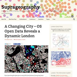
The updates have been appearing roughly every 6-12 months, and by comparing them in a GIS, you can start to see how places change – at least in the eyes of the Ordnance Survey surveyors tasked to keep the map current. Roads occasionally get built, but building footprints evolve more rapidly – as office blocks and housing developments get taken down and rebuilt with higher capacities or more glass windows. I’ve taken three of the VectorMap District dataset releases – April 2012, September 2013 and March 2014 – combined the data together and used QGIS’s layer compositing operations to show the geographical differences. Important Note As such, my map slightly overemphasises changes between 2012 and 2013.
The Mapping London Blog. Duncan Smith, a colleague of ours, has written a great review of the “Shaping London” book for his City Geographics blog. He has kindly let us share it with you here. I have recently been enjoying Terry Farrell’s book “Shaping London: the patterns and forms that make the metropolis”. Farrell is one of the UK’s best known and respected urban planners, and his passion for place-making and urban culture shine through in this accessible discussion of the development of the capital. Rather than an analysis of planning politics and economics, Farrell considers the historic features that underlie London’s structure and continue their influence to the present day- the Thames, village centres, estates and major transport infrastructure. The Mapping London Blog. The above extract is from a map that we’ve wanted to feature for a long time, ever since an fascinating talk was given at UCL CASA by Adam Towle, who included this map which was created by himself and others in the Design for London team at the Greater London Authority overseen by Mark Brearley, now guest professor at The Cass, Aldgate.
It is a map quite probably inspired by the Map of London Social and Functional Analysis 1943. There is something wonderfully organic about a map of a city that is made up of circles, ovals and other assorted lozenge shapes, instead of the normal straight lines and distinct corners of network or boundary maps. The use of curves, and “buffer” of white space, also serves to reinforce that the boundaries are not rigid – they don’t run along a road or river, but rather their location is only approximate.
The Mapping London Blog. Dr Ed Manley (@EdThink), a research associate on the Mechanicity project here at the Centre for Advanced Spatial Analysis, created this dramatic, colourful graphic (excerpt above) of popular routes used by one of the major private hire cab companies in London, using Gephi. The work was created using data from over 1.5 million journeys. Distinct zones, within which many journeys start and finish, form out of the network, and have been coloured to distinguish them from adjacent zones.
Some zones are based within a particular small neighbourhood, within which short cab journeys are popular, such as Soho and Knightsbridge. The Great Inflow – Where the Commuters Go. The Mapping London Blog. The Mapping London Blog. The Mapping London Blog. The Mapping London Blog. The Mapping London Blog. This is the first of a few maps that we will feature over the next few months, that use the new DataShine mapping platform developed here at UCL CASA by the Mapping London editors, to show Census (and in due course other) datasets for London. Defining where “Cool London” is, or specifically will be soon, seems to be a preoccupation for marketing types, property salespersons, small catering business owners, and other people seeking to discover where the trendsetters are moving to.
There are a few possible Census metrics that might reveal this. Let’s look at three – housing structure, occupation and travel mode. Houseshares. Foursquare Checkin Maps. The Foursquare social network has always been very focused on place – its key element being the “checkin” to the pub, restaurant or park you are in. Adaptive Architecture, Collaborative Design, and the Evolution of Community. Density and Urban Neighbourhoods in London.