
Leaf 0.1 ALPHA - CSS Framework. Ideas to Keep in Mind When Designing User Interfaces. I will talk about a few interaction design concepts and best practices that when applied will result in the creation of great UIs.
What is a good user interface? As you read through the following ideas, you will see two reoccurring themes: Ease of use and simplicity. Ockham’s Razor and KISS Ockham’s razor (or Occam’s razor) can be summarized as follows: When solving a problem that has more than one possible solution, the simplest solution is better, and most likely to be the correct one. In the context of user interface design (UID), this means the user should be able to do what needs to done with the minimum amount of actions required, and that a simple interface is better than a more complicated one. A closely related principle is the KISS principle.
The 2014 Guide to Responsive Web Design. UX Crash Course: User Psychology. Basic UX Psychology: How to get started The following list isn’t everything about designing behavior.

It’s a quick overview, so you can go from zero-to-hero as quickly as possible. You will get lots of practical ideas and techniques to use in your designs and strategies. A Maintainable Style Guide - Ian Feather. Parallax Done Right. Some Do’s Only use properties that are cheap for browsers to animate.
Those are, more or less: translate3d, scale, rotation and opacity. Anything else and you’re probably not going to be running at 60fps. Use window.requestAnimationFrame when firing the animations in JS. This basically tells the browser animate stuff before the next repaint. Window.requestAnimationFrame(animateElements); Round values appropriately. Art-Directed Adaptive Images With SVG and JavaScript.
There is a design truism that has been largely avoided in the web development industry to this point: not every image responds well to scaling.
I’m not referring here to image quality – a relevant issue, but one that should eventually be addressed by advances such as the srcset attribute – but to aesthetics, particularly the visual relationship of pictures with other elements on the page. As an example, take a fairly wide-aspect image used as a banner image, particularly one with a strong focal point. The image will work well on a desktop monitor with the browser maximized, but narrowing the window causes the responsive image to look increasingly out-of-balance with page content at smaller sizes: Ideally, we would prefer the image to be dynamically cropped as it scaled down, narrowing to the picture’s central point of interest: Current Solutions & Their Drawbacks Bitmap Images In SVG.
Automatically Exporting Assets from Sketch into Xcode. — Matt Zanchelli. Today, Bohemian Coding released SketchTool.
It’s “a command-line app for exporting pages and slices out of .sketch docs.” Many people use Sketch in their Mac and iOS development workflow. Previously, the process involved making changes in Sketch, exporting them, moving them into Xcode Asset Catalogs, then running. However, with SketchTool, this can all be done automatically. 16 Brilliant jQuery Slider Demo Plugins. 1.
Draggable Infinite Grid with Lightbox Pure OOP JavaScript code, no usage of jQuery or other libraries, in this way there will be no incompatibilities with HTML pages that might be using jQuery or other JavaScript libraries. Great performance on mobile devices, you can see in the video demo that it runs just like a native app! , It was coded and optimized for mobile devices and it is 100% mobile compatible and of course it will run just as great on desktop computers including on older browsers like IE7 and IE8. Watch demo running on Samsung Galaxy S3 (android) or Watch demo running on IPAD (IOS). Easy Color Contrast Testing. We have plenty of considerations to design for when crafting websites.
Web accessibility is not a new design consideration, but is still very important, no matter the size or speed of device we’re testing on. The Web Content Accessibility Guidelines (WCAG) tells us our content should be distinguishable and requires we “[m]ake it easier for users to see and hear content including separating foreground from background.”
We know that our color contrast ratio should be 3:1 for non-decorative text, sized larger than 18 point or larger than 14 point if bold. Text smaller than that should meet a contrast ratio of at least 4.5:1.
Typekit. Make charts in seconds. How to Choose the Right Icons. Icons are nothing new when it comes to web design, but that doesn’t mean selecting the right icons to use is an easy task.
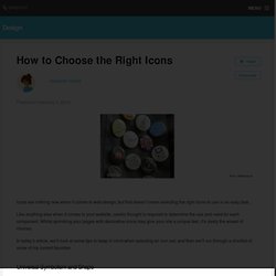
Like anything else when it comes to your website, careful thought is required to determine the use and need for each component. Whilst sprinkling your pages with decorative icons may give your site a unique feel, it’s rarely the wisest of choices. In today’s article, we’ll look at some tips to keep in mind when selecting an icon set, and then we’ll run through a shortlist of some of my current favorites. Universal Symbolism and Shape Mondrian.io uses a typewriter icon to denote the text tool First and foremost, your icons need to be easily and instantly recognizable. At times, it can be easy to become enchanted by a particularly beautiful icon set — despite the fact the icons available may not be suited to your intended messages. Present & annotate design concepts. Stock photos that don’t suck.
Interview Questions and Exercises About CSS. If you're in the position of needing to interview someone about their skill and knowledge about CSS, it can be a little hard to think of things to ask on-the-fly.
I thought I'd think up and round up some ideas for reference. Exercises To Do. Techniques for Responsive Typography. When it comes to responsive type on the web, there's more to do than just resizing the text's container and having the text reflow inside of it.
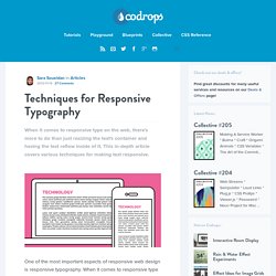
This in-depth article covers various techniques for making text responsive. One of the most important aspects of responsive web design is responsive typography. Responsive images – end of year report. It’s nearly two years since I suggested a <picture> element as a strawman proposal as a way to solve the problem of responsive images, so let’s have a look at how we’re doing.
In September there was a big meetup at Mozilla’s Paris office organised by Mozilla’s Marvellous Mr Marcos who’s been very active in the Responsive Images Community Group and did the hard work of actually turning the <picture> strawman into a spec. Such is the combined allure of Marcos and Paris that a rep from Apple showed up – kudos to Edward O’Connor. The outcome of the meeting was that <picture> isn’t a viable option. 12 amazing tools for online collaboration. Individuals in design teams don't always work together in the same office. You may be positioned in distributed groups, or working from home, and clients can come from all over the world. This is where collaboration tools come in – they make it easier and faster for designers to get feedback and approve artwork in a professional manner, and they come in all sort of forms, from free Android apps to Chrome extensions. Here we gather together some of the best available online tools to allow designers to collaborate together in real time.
Some are created specifically for designers, some serve as a concept crafting whiteboard, and we've also included some more full-on project management tools for when you need to take your collaborative project to the next level. 01. GoVisually. Draw on any webpage. Share thoughts. Move ideas. - Markup. Gradient Animation Trick. You can’t animate gradient colors in CSS. No, really. There are a lot of animatable properties, but the one used for gradients, background-image, is not on the list.
Tim Severien. Posted on: October 21st, 2013 Photo: Wikipedia Alignment Horizontally and vertically Dynamic sized elements. Static sized elements. Twitter/twui. 16:9 Aspect Ratio Calculator for content area width. Latest typography samples. Webflow - Responsive Web Design Tool. Style Tiles. Foundation: The Most Advanced Responsive Front-end Framework from ZURB. Skeleton: Beautiful Boilerplate for Responsive, Mobile-Friendly Development. The Goldilocks Approach to Responsive Web Design. Display and present responsive web designs. Tips, Resources and Patterns for Responsive Web Design.
Designing for a Responsive Web. The web as we know it is changing. In the past, designers and developers only had to concern themselves with one medium: the computer screen. In recent years, however, a plethora of fully internet-enabled devices with scores of different shapes and capabilities have cropped up, meaning that we now have to design our websites to fit comfortably in as many screen sizes, shapes, and resolutions as you can possibly think of. Our old fixed-width layout approach is out of the question now. So what do we do? The answer, my dear reader, lies with Responsive Web Design. Library. Css3-mediaqueries-js - css3-mediaqueries.js: make CSS3 Media Queries work in all browsers (JavaScript library)
Css3-mediaqueries.js by Wouter van der Graaf is a JavaScript library to make IE 5+, Firefox 1+ and Safari 2 transparently parse, test and apply CSS3 Media Queries. Firefox 3.5+, Opera 7+, Safari 3+ and Chrome already offer native support. UPDATE: Google discontinued the downloads section. A tale of two viewports — part one. Page last changed today In this mini-series I will explain how viewports and the widths of various important elements work, such as the <html> element, as well as the window and the screen. This page is about the desktop browsers, and its sole purpose is to set the stage for a similar discussion of the mobile browsers. Choosing A Responsive Image Solution.
Responsive Retina Ready Google Maps - Rob and Lauren. So I was working on a responsive wedding website last week, and one of the requirements was an inline google map with important locations plotted on it. The requirements also stated that I provide a key with info about each, and a link for the full directions, and the style needed to match the look of the site. Proto.io - Silly-fast mobile prototyping. Calendario: A Flexible Calendar Plugin. A jQuery calendar plugin for creating flexible calendars. View demo Download source. Codrops.
50 Useful Responsive Web Design Tools For Designers. Nifty Modal Window Effects. A set of experimental modal window appearance effects with CSS transitions and animations. View demo Download source. Blueprint: On-Scroll Animated Header. Loading Effects for Grid Items with CSS Animations. Some inspiration for loading effects of grid items using CSS animations. ❍ IcoMoon. Skeleton: Beautiful Boilerplate for Responsive, Mobile-Friendly Development.
Combining meta viewport and media queries. Media Query Snippets - list of media queries. CSS-Tricks. Viljamis/ResponsiveSlides.js. 80 Awesome Twitter Bootstrap Templates To Get You Started. Bootstrap Form Builder. Date Picker Input - Bootstrap Form Helpers. Country List - Bootstrap Form Helpers. Bootstrap - Lightbox. Fuel UX. Tablecloth.js. Gregoryloucas/Fontstrap. Font Awesome Icons. Bootstrap Magic : Generate simply your own bootstrap theme. Divshot: Interface Builder for Web Apps.
Simple as Milk Design Studio. Designers Rejoice, Froont Wants To Keep Developers Out Of The Responsive Web Design Process. Flat UI. 10 Developer Tips To Build A Responsive Website [Infographic] – ReadWrite - Aurora. Responsive Nav — Responsive Navigation Plugin. HTML5Pattern.
CSS. Jetstrap - The Bootstrap Interface Builder. Gallery of free HTML snippets for Twitter Bootstrap. Filamentgroup/Responsive-Images. Cross-browser testing, mobile. Screenfly by QuirkTools — Test Your Website at Different Screen Resolutions. Bootstrap switch - by Mattia Larentis. Bootstrap toggle buttons 2.8. Twitter Bootstrap Button Generator. Bootstrap Tour, easy product tours with Bootstrap from Twitter. FitVids.JS - A lightweight, easy-to-use jQuery plugin for fluid width video embeds. FitText - A plugin for inflating web type. jQuery Masonry.