
Create Infographics. How To Create Outstanding Modern Infographics. In this tutorial you will learn that data doesn't have to be boring, it can be beautiful!

Learn how to use various graph tools, illustration techniques and typography to make an accurate and inspiring infographic in Adobe Illustrator. Start by using the Rectangle Tool (M) to draw a shape. Give it a subtle radial gradient too. The entire design is based on a grid of four columns. To make the columns first select the rectangle and drag a guide onto the centre of the shape. Condense the shape so it fits within the left-most guide and centre guide. Move the shape over to the right and add another guide to the centre here. Using the Rectangle Tool (M) draw a thin white box on the centre line that will be the width of the gap between the columns. Repeat the process for the other columns with your final result being below. I like to place the most important graphics first and work-in the ancillary charts and graphs afterwards.
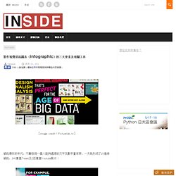
Give the circles a variety of gradients. That's it! 製作視覺資訊圖表(infographic)的三大要素及相關工具. [image credit:Picturelab.tv] 資訊爆炸的年代,不難發現一個人能夠處理的文字及數字量有限,一天就形成了15億條資訊,140萬個Tweet及2百萬個Youtube影片: 這些資訊如果沒有經過完善的分類及分析,是絕對讀不完的。

因此上次Inside介紹了資訊圖表(infographics),這次要介紹的除了一些資訊圖表的Startup外,還要來談一下要用甚麼工具去做出一個視覺資訊圖表。 先來看看這個新的視覺資訊圖表startup - Visual.ly,目前服務還沒有對外公開,但是從一些小地方看的出來他們是一間有趣的Startup,這個Startup是由Mint的視覺資訊圖表設計師Stewart Langille 和 Lee Sherman創辦的,背後由Dave McClure的500 Startups支持,目的應該是要做一個連結視覺資訊圖表設計師和需要資訊圖表分析公司的平台,也許日後也會有分享製作圖表的論壇在Visual.ly上。 其實之前visualizing.org就有類似的服務,之前對infographics有興趣的讀者可以到該網站看看。 故事(idea),數據及設計三個元素特別代表了那些人會比較容易入門視覺資訊圖表? 分別是是工作領域在設計,傳播媒體及數據分析這三個類別的人,好的視覺資訊圖表必須要具備這三個領域的專長,因為要擅長收集及分析數據才能產生一個有內容的圖表,另一方面要有良好的設計能力,擅長使用圖像編輯軟體,加上好的邏輯才能把大量的資訊整理成一個主題式的圖表。 姑且不論自己原本是屬於那一個類別的人,其實以infographic入門來説,只要懂得基本繪圖軟體,加上以下的一些網路協助工具,其實就可以做出一個視覺資訊圖,只是不一定會是一個好的視覺資訊圖。 主要步驟是: 1. 2. 3. 4. 如果不想用以上的工具,也可以將就使用Excel、numbers及Google Doc上輸入數據產生圖表。 Data Visualizations, Challenges, Community.
翻译:如何设计信息图示(infographic) 信息图示的设计是一个灰常复杂的过程,这篇文章展示的只是整个过程的冰山一角,准确的说,是所有工作都完成得差不多了之后的收尾部分。 看完了你只会有更多的困惑,诸如“这图怎么来的?” 、“怎么想到这样安排的?” 但至少这篇文章清晰地展示了信息图示设计需要注意的一个核心原则和三个关键要素: 核心准则:一切都是为了让读者与内容更好地沟通。 三个关键要素:布局、色彩、文字设计。 欢迎勘误! ———————————-废话与翻译的分界线————————————– 信息图示能够以比普通文本牛B得多的方式呈现信息。 这幅信息图示展示了计算机编程领域的先锋,内容基于对各种编程语言的历史和现状所进行的分析。 图示上所有先驱者都对编程有巨大影响力。 你也许还会注意到,一些重要的算法——诸如dynamic programming、brute force 和 hash tables——没有出现在图示中,是因为在单独一幅信息图示里解释这些算法实在是太困难了。 信息图示是信息、数据和知识的视觉化呈现,因此,布局、用色和文字设计对于读者的理解来说都至关重要。 根据现有资料,我决定将图示分为三个主要部分: 在计算机编程历史中最重要的人. Applying Mathematics To Web Design - Smashing Magazine. Advertisement “Mathematics is beautiful.” This may sound absurd to people who wince at numbers and equations. But some of the most beautiful things in nature and our universe exhibit mathematical properties, from the smallest seashell to the biggest whirlpool galaxies.
In fact, one of the greatest ancient philosophers, Aristotle, said: “The mathematical sciences particularly exhibit order, symmetry and limitation; and these are the greatest forms of the beautiful.” Because of its beautiful nature, mathematics has been a part of art and architectural design for ages. Layouts featured in this post were created specifically for the purpose of this article. Golden Ratio and Golden Rectangle. Infographics. Infographics & Data Visualizations - Visual.ly.
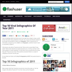
Infographics Library - Biggest Infographics Collection on the Internet Infographics Library. Top 10 Viral Infographics Of Year 2011. Top 10 Viral Infographics Of Year 2011 We’re knowledge addicts and there’s just not enough time to digest or keep up with all the information being published on the web.

So, an easy and attractive solution to go through the abundance of data is an infographic. When a huge amount of information is wrapped up into a chart or an infographic, suddenly it doesn’t seem so impossible to digest it. What would a day without Facebook be like? What are the craziest Black Friday states? So, go ahead and check out the top 10 infographics of 2011 that people shared on the web. Top 10 Infographics of 2011 A World Without Facebook Many people check their Facebook accounts the minute they wake up. Source: singlegrain.com An Average Day on Facebook Curious to see what your friends do on Facebook on a regular day? Source: jess3.com Facebook vs. We all know about the launch of Google Plus and the rumors that went around claiming it would take Facebook down. Source: singlegrain.com “Craziest” Black Friday States. Cool Infographics - Blog.