

A Dad's Plea To Developers Of iPad Apps For Children. Advertisement I spend a lot of time buying and testing iPad apps for kids.
To be more specific, I lovingly do this for a certain two-year-old girl who is currently on a very successful #OccupyiPad mission in my house. Through extensive observational research, I’ve discovered what works and doesn’t work for my daughter, so I’m going to shamelessly generalize my findings to all children and propose four essential guidelines for developers who work on iPad apps for children. Affordance Is King. The new iPad - View all the technical specifications. Website testing, user testing, and market research done with Morae by TechSmith.
Use Morae to gain valuable insight about your product and remove the guesswork from your decisions.
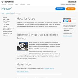
You’ll love that you can record user interactions, analyze the results, and instantly share them with anyone – all within Morae and for any type of research. Pluggable Architecture Write your own Recorder, Observer, and Manager plug-ins with Morae’s pluggable architecture, which enables you and your development team to build features specific to your testing environment. Learn more about the expanding flexibility of Morae’s pluggable architecture and about the plug-ins that partnering companies have already created on Morae's Plug-ins Page.
TobiiEyeTracking's Channel. Tobii Glasses 2 - New Generation Wearable Eye Tracker 19,450 views 2 months ago Tobii Glasses 2 is a new generation wearable eye tracker that shows exactly what a person is looking at in real time, while moving freely in any real-world environment.
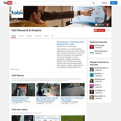
Based on a new, proprietary, wearable eye-tracking platform from Tobii that will support research and consumer applications, Tobii Glasses 2 offers unprecedented functionality including wireless live viewing and opens up new opportunities for human behavior research and discoveries in real-world environments. The applications and uses for wearable eye-tracking research span many industries, including in-store shopper marketing, user experience and psychology. The Tobii Glasses 2 Eye Tracker is capable of supporting a wide range of research projects and experience levels from first-time eye-tracking users working on one-time studies to researchers experienced in eye tracking needing advanced functionality for comprehensive analytical projects. Eye Tracking White Paper. Eye tracking commonly refers to the technique used to record and measure eye movements.
The aim of this paper is to give a brief introduction to the human visual system, and to explain how eye movements are recorded and processed by Tobii Eye Trackers. Some basic concepts and issues related to remote eye tracking and eye movement data interpretation are also briefly discussed. Heck Yes, Windows Is Still Relevant. She & Me - Creative Web Strategy and Content Development. Morae usability testing software from TechSmith. Why Distinct Icon Outlines Help Users Scan Faster. By anthony on 08/04/11 at 10:05 pm Icons are visual cues that help users use interfaces more efficiently.
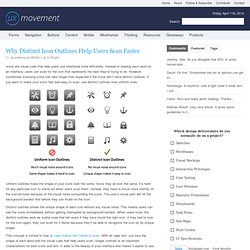
Instead of reading each word on an interface, users can scan for the icon that represents the task they’re trying to do. However, sometimes scanning icons can take longer than expected if the icons don’t have distinct outlines. If you want to make your icons fast and easy to scan, use distinct outlines over uniform ones. Uniform outlines make the shape of your icons look the same. Distinct outlines shows the unique shape of each icon without any visual noise.
This concept is similar to how all caps makes text harder to scan. 9 Rules to Make Your Icons Clear and Intuitive. By anthony on 10/31/11 at 9:09 am Have you ever looked at an icon and struggled to figure out what it meant?
Users do this all the time with icons they’re not familiar with. And there are only a small set of icons that users are universally familiar with. This is why when you use icons in your designs it’s important to make them clear and intuitive. Here are a few solid rules to follow so that your icons don’t leave users scratching their heads. 1. Unless the icons you’re using are universally recognized (i.e. play, print, close, help), you should always label them. No space for labels with multiple icons packed together. 2. To make your icon as intuitive as possible, always make sure that your icon represents both the action and object. Paper airplane icon shows a clear action and object. 3. Icons that function similarly belong together.
Icons that share a similar function are labeled and grouped together. 4. Users don’t just rely on how an icon looks to understand its function. 5. 6. Px - em - % - pt - keyword. Keyword Valid options for setting font-size in keyword are xx-small, x-small, small, medium, large, x-large, and xx-large as well as relative keywords smaller and larger.
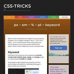
Surprisingly enough, keyword sizing is pretty consistent across browsers and platforms. Designer Myopia: How To Stop Designing For Ourselves. Advertisement Have you ever looked at a bizarre building design and wondered, “What were the architects thinking?”
Or have you simply felt frustrated by a building that made you uncomfortable, or felt anger when a beautiful old building was razed and replaced with a contemporary eyesore? You might be forgiven for thinking “these architects must be blind!” New research shows that in a real sense, you might actually be right. Is There Ever A Justification For Responsive Text?
Advertisement Depending on who you follow and what you read, you may have noticed the concept of “responsive text” being discussed in design circles recently.
It’s not what you might imagine — resizing and altering the typography to make it easier to read on a range of devices — but rather delivering varying amounts of content to devices based on screen size. One example of this is an experiment by designer Frankie Roberto. Another is the navigation menu on the website for Sifter App. Roberto and Sifter are using media queries to actually hide and display text based on screen size (i.e. not rewriting or delivering different content based on context — as one would do with mobile-focused copy, for example). Media Queries. Abstract HTML4 and CSS2 currently support media-dependent style sheets tailored for different media types.
For example, a document may use sans-serif fonts when displayed on a screen and serif fonts when printed. 10 Useful Usability Findings and Guidelines. Advertisement Everyone would agree that usability is an important aspect of Web design. Whether you’re working on a portfolio website, online store or Web app, making your pages easy and enjoyable for your visitors to use is key.
Many studies have been done over the years on various aspects of Web and interface design, and the findings are valuable in helping us improve our work. Here are 10 useful usability findings and guidelines that may help you improve the user experience on your websites. 1. Hick's law. Hick's law, or the Hick–Hyman Law, named after British psychologist William Edmund Hick and Ray Hyman, describes the time it takes for a person to make a decision as a result of the possible choices he or she has: increasing the number of choices will increase the decision time logarithmically. The Hick–Hyman law assesses cognitive information capacity in choice reaction experiments. The amount of time taken to process a certain amount of bits in the Hick–Hyman law is known as the rate of gain of information. Background[edit] Hick first began experimenting with this theory in 1951. His first experiment involved 10 lamps with corresponding Morse Code keys.
9 Common Usability Mistakes In Web Design. Advertisement By now, all good designers and developers realize the importance of usability for their work. Usable websites offer great user experiences, and great user experiences lead to happy customers. Delight and satisfy your visitors, rather than frustrate and annoy them, with smart design decisions. Here are 9 usability problems that websites commonly face, and some recommended solutions for each of them. CSS Text-Rendering. 4 Tips and Tricks for more Legible Content. These tips and tricks will help you design more readable content for screen readers. Readability & legibility are both areas of interest in accessibility and typographic design, and many resources exist that attempt to define what constitutes well designed copy.
In this post, we go over a few commonly overlooked and newer ways to implement more legible type on the web. 1. Add Text-Shadow to Custom Fonts With a growing number of web fonts to choose from, and new ways to implement custom fonts into sites using CSS instead of Javascript or Flash, it’s becoming increasingly popular to stray from traditional common fonts in exchange for fonts that help define a more unique and consistent brand. What’s the most readable font for the screen? Care With Font Size - Quality Web Tips. The Myth Of The Sophisticated User - Smashing UX Design. Social Patterns. And Sogeti Testing Services. Social Design Strategy. 4 forgotten principles of usability testing.
How Users Read on the Web. How to use multitasking gestures on your iPad. A new feature to both the iPad (iOS 5.0.1) and the iPad 2 (iOS 5.0) is the ability to use multitasking gestures.Multitasking gestures allows users to simply swipe with four or five fingers to access the multitasking menu, swipe left or right to reveal open applications and pinch to return to the home menu.This may sound a little complicated however; it really is a time saver once you learn how to activate, operate and master the multitasking gestures. User Experience Consulting. Touch Gesture Reference Guide.
The Touch Gesture Reference Guide is a unique set of resources for software designers and developers working on touch-based user interfaces. Touchscreen Braille Writer Lets the Blind Type on a Tablet. Persona-Lene.jpg (809×1156) Touchscreens UX: Godsend or disaster? The Relevance of User Experience: Using Every Opportunity to Impress Users. Touch Gesture Reference Guide.