
Hiding Content for Accessibility - Snook.ca. For years now, we've used a number of techniques for hiding content offscreen for accessibility purposes.
We do this because the content is still accessible to screenreaders while being removed from the interface for sighted users. An article over at Adaptive Themes reviews a number of techniques for hiding content that were considered for inclusion on a Drupal 7 project (but certainly applicable to any project). Here is a summary of those techniques and the pitfalls of each technique: Text Indent Unfortunately, this technique doesn't work with RTL (Right-to-Left) languages. Position Absolute and Collapsed In this case, Apple's Voice Over will not read content within an element that has zero height.
Position Absolute and Offscreen In this case, if you have focusable content within the positioned element, the page will scroll to that element, thus creating an unsettling jump for sighted users. Clip Method With the work I've been doing at Yahoo! Html - centering a div between one that's floated right and one that's floated left. Remove Whitespace Between Inline-Block Elements. I remember being a young developer during the Internet Explorer 6 days and desperately wanting IE to adopt display: inline-block.
The inline-block value is incredibly useful when wanting to control margin and padding on "inline" elements without the need to `block and float` them. One problem that arrises when you use inline-block is that whitespace in HTML becomes visual space on screen. Gross. There are a few ways to remove that space; some of them are just as gross, one is reasonably nicer. Solution 0: No Space Between Elements The only 100% solution to this issue is to not put whitespace between those elements in the HTML source code:
Difference between a pseudo-class and a pseudo-element. This site is designed for accessibility.
Content is obtainable and functional to any browser or Internet device. This site's full visual experience is available in a graphical browser that supports web standards. Please consider upgrading your web browser. :not(s) The :not(X) property in CSS is a negation pseudo class and accepts a simple selector1 as an argument.
Essentially, just another selector of any kind. :not matches an element that is not represented by the argument. The passed argument may not contain additional selectors or any pseudo-element selectors. In this example we have an unordered list with a single class on the li: Our CSS would select all the <li> elements except the one(s) with a class of .different. What’s the Difference Between “:before” and “ When using or researching CSS pseudo-elements, you may have come across different syntax for the :before and :after pseudo-elements, specifically in the form of a preceding double colon, instead of the traditional single colon.
This seems a little confusing at first, but there’s actually a pretty simple explanation. I had assumed that there would be some difference in the way each functioned, but that’s not the case, as the short and long answers below make clear. The Short Answer. Internet explorer - IE 10 + 11: CSS transitions with calc() do not work. GitHub - neilg63/viewportScale: Simple jQuery plugin that lets you apply responsive viewport size units (vw, vh, vmax and vmin) with browsers with incomplete CSS3 support.
Using vw and vh Measurements In Modern Site Design. Some CSS properties and values don’t gain a lot of developer attention, either because a particular spec is not "sexy" enough or because use-cases don’t seem immediately obvious.

Good examples of the latter include the vw, vh, vmax and vmin length measurements, which have been part of the CSS3 Values & Units Module for some time but are just now finding support in modern browsers. As we’ll see in the next article, these new measuring systems are natural fits for creating adaptive and responsive site designs; for now, let’s take at the general idea of the new units. Polyfill for vw, vh, vm units. It calcutes the values in px and apply automatically to your css. Credit for Lea Verou ( and Xandor Schiefer (
Saabi/vminpoly: A polyfill for CSS units vw, vh & vmin and now some media queries to boot. Works in IE5.5 and Opera Mini. Css - Can I add background color only for padding? CSS for <sub> and <sup> 7 CSS Units You Might Not Know About. It’s easy to get stuck working with the CSS techniques we know well, but doing so puts us at a disadvantage when new problems surface.
As the web continues to grow, the demand for new solutions will also continue to grow. Therefore, as web designers and front end developers, we have no choice but to know our toolset, and know it well. That means knowing even the specialty tools - the ones that aren’t used as often, but when they are needed, are exactly the right tool for the job. Today, I'm going to introduce you to some CSS tools you might not have known about before. These tools are each units of measurement, like pixels or ems, but it’s quite possible that you’ve never heard of them! We’ll start with something that’s similar to something you are probably already familiar with. A Complete Guide to Flexbox. A Visual Guide to CSS3 Flexbox Properties. The Flexbox Layout officially called CSS Flexible Box Layout Module is new layout module in CSS3 made to improve the items align, directions and order in the container even when they are with dynamic or even unknown size.
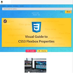
The prime characteristic of the flex container is the ability to modify the width or height of its children to fill the available space in the best possible way on different screen sizes. Many designers and developers find this flexbox layout easier to use, as positioning of the elements is simpler thus more complex layouts can be achieved with less code, leading to simpler development process. Flexbox layout algorithm is direction based unlike the block or inline layout which are vertically and horizontally based. This flexbox layout should be used for small application components, while new CSS Grid Layout Module is emerging to handle the large scale layouts.
Basics. Understanding the CSS animation-fill-mode Property. I’m sure just about all of us working in front-end development have fiddled with CSS keyframe-based animations at some point.
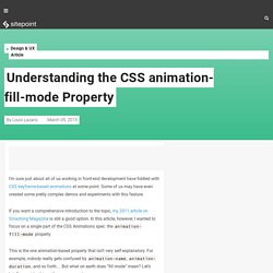
Some of us may have even created some pretty complex demos and experiments with this feature. If you want a comprehensive introduction to the topic, my 2011 article on Smashing Magazine is still a good option. Font Shorthand. Should You Use Inline-Blocks As A Substitute For Floats? When it comes to developing a site layout with css, floats do most of the heavy lifting.
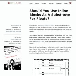
We use them for the big blocks like our main content and sidebar and we use them for the smaller blocks inside these big ones. Are floats always the answer? They generally work well, but sometimes they can be hard to work with. This is especially true when it comes to inside blocks like a grid of images that won’t line up as expected. CSS Tools: Reset CSS. The goal of a reset stylesheet is to reduce browser inconsistencies in things like default line heights, margins and font sizes of headings, and so on. The general reasoning behind this was discussed in a May 2007 post, if you're interested. Reset styles quite often appear in CSS frameworks, and the original "meyerweb reset" found its way into Blueprint, among others. The reset styles given here are intentionally very generic. There isn't any default color or background set for the body element, for example.
I don't particularly recommend that you just use this in its unaltered state in your own projects. CSS outline property - outline: none and outline: 0. A Complete Guide to Flexbox. Formas básicas con CSS: triángulos, círculos, trapecios, rectángulos, cuadrados … – CybMeta. Estoy desarrollando mi primer tema comercial para WordPress y en el diseño se utilizan algunas formas geométricas básicas como elementos decorativos. CSS tutorial - Using borders to produce angled shapes. This is a suppliment to the tutorial, and is here only for illustrative purposes. It is not part of the main tutorial. These examples will not work in Netscape 4 or WebTV, because they do not allow you to define individual borders, or Escape because it does not handle borders correctly. Internet explorer 4 and 5 may have trouble with some of the examples due to their problems with the box model.
Note that these examples are based on you using the default 'Moosified' style for this page, where the background colour of the body is #f6f6f6. If you use the other styles, the shapes may not work correctly. How to deal with :hover on touch screen devices. Are you planning a web project? Not sure what mobile strategy is right for you? Read our short educational article that can help you make the right choice. This article is a small case study about dealing with hover effects on touch screens. As you know, :hover behavior doesn’t exist on touch screen devices. So when you design a responsive website, you should carefully plan when and where to use :hover interactions. Style tooltip css. How to style the title attribute with only CSS.
Style tooltip css. How to style the title attribute with css? The title attribute on images or <a> links produces a default helptext box on mouse over, the tooltip. It is actually possible to style this helptext box. Html - How to change the style of Title attribute inside the anchor tag? Custom Scrollbar styling using CSS and Jquery. You must have noticed some websites having cool and unique scrollbars. Some might be sleek with the colors that blend perfectly with the website and others are just to enhance the user experience.
Well, it’s achieved with the help of new webkit CSS scrollbar properties (unfortunately, which only works with the webkit based browsers) and a Jquery library, for almost all web browsers out there. So, let’s hop into coding stuff and perform the scrollbar styling. Like I have already said, the CSS properties are build for the webkit based browsers and so, these include Google chrome for Desktop and mobile, Apple Safari, Flock, OmniWeb Web browsers. Even if you design only for them, I mean avoid the need to learn and implement Jquery, you could cover 72% of the web users. Not just the main window scrollbar styling Scroll bars can be found anywhere where the length of content exceeds the width of the container window. This would show the scrollbars like this (Right) Conclusion. Custom scrollbars for IE, Chrome and Firefox using CSS - Code Mug.
Using Custom scrollbars in your website can be really eye-catching and they go well with the website’s design. For web designers, it’s difficult creating them with JavaScript. CSS Animation Tricks: State Jumping, Negative Delays, Animating Origin, and More. The following is a guest post by Zach Saucier. CSS selector for first element with class. How to fix the w3c error "Sorry, the at-rule @-moz-keyframes is not implemented" - HTML & CSS - The SitePoint Forums. :required. The :required pseudo class selector in CSS allows authors to select and style any matched element with the required attribute.
Forms can easily indicate which fields must have valid data before the form can be submitted, but allows the user to avoid the wait incurred by having the server be the sole validator of the user's input. Let's say we have an input with an attribute of type="name" and make it a required input using the required boolean attribute1: Re: pointer-events from Jukka K. Korpela on 2012-11-21 (www-validator-css@w3.org from November 2012) Shorthand properties. Definition. Shorthand properties. Fontfamily - Do I need to wrap quotes around font family names in CSS? La Propiedad Box-sizing. Inheriting box-sizing Probably Slightly Better Best-Practice. I’m a big fan of resetting box-sizing to border-box, so much that we have a special day of the year around here.
But there is a little adjustment to setting it that seems like a pretty good idea. Here’s the adjusted version: Credit on the inheritence idea to Jon Neal here, who says: Perfect Full Page Background Image. What CSS prefixes should I use? Html - Clearing inline-blocks? 10 (More) CSS Tricks You Probably Overlooked. What CSS prefixes should I use? JS Bin - Collaborative JavaScript Debugging. 25 trucos CSS - exprime su capacidad al máximo - Javier Marcos. Css - Fixed position but relative to container. Change Mobile Safari Highlight Color with CSS. Playground. Edit fiddle. Html - Scroll particular DIV contents with browser's main scrollbar.
Css - SVG USE element and :hover style. Swapping Out SVG Icons. Ajaxing for your SVG Sprite. SVG `use` with External Reference, Take 2. Build Your Own SVG Icons. Icon System with SVG Sprites. CSS image replacement with pseudo-elements (NIR) Html - Change image on hover.
30+1 maneras de resaltar un enlace con hover. Css3 - How do CSS triangles work? CSS triangles made responsive. CSS triangles made responsive. Responsive CSS Shapes. Css3 - How do CSS triangles work? Animation-fill-mode. Understanding the CSS animation-fill-mode Property. Uncheck Checkboxes on Mozilla Refresh. Stuff you can do with the "Checkbox Hack" Customize Checkboxes and Radio Buttons with CSS3. WTF, forms? The Shapes of CSS. JS Bin - Collaborative JavaScript Debugging. 25 trucos CSS - exprime su capacidad al máximo - Javier Marcos. Html - Does opacity:0 have exactly the same effect as visibility:hidden. CSS3 Animation Cheat Sheet - Justin Aguilar. Understanding the CSS animation-fill-mode Property. CSS: even and odd rules.
The Shapes of CSS. Attempting to fix responsive SVGs in desktop Safari (and some WebKit browsers) - Ben Frain. How to select an element by class inside "this" in Jquery. Css3 - How to use calc() inside another function. Internet explorer - IE 10 + 11: CSS transitions with calc() do not work. CSS Animation don't accept "calc()" as property values. Css hack para Internet Explorer IE 6, IE 7, IE 8, IE 9, IE 10 e IE 11. * { box-sizing: border-box } FTW - Paul Irish. CSS Checkbox Styles. Debug ghost CSS elements causing unwanted scrolling } wernull. Inline-block y sus espacios en blanco de separación. 8 soluciones más 1 universal. Do we need box-shadow or border-radius prefixes anymore? WebKit HTML5 Search Inputs. How to create a cool and usable CSS3 search box.
CSS transition from a fixed px width to an auto width. Cross-browser kerning-pairs & ligatures. Using Custom Data Attributes and Pseudo-Elements. Navigation Effects. CSS hacks for Google Chrome web browser. Gérer les débordements de contenus grâce à CSS. Hyphenation in CSS3.