
Colours. Magic css3 animations. Pure CSS Responsive Icons. The State Of Responsive Web Design. Advertisement Meet the new Sketch Handbook, our brand new Smashing book that will help you master all the tricky, advanced facets of Sketch.
Filled with practical examples and tutorials in 12 chapters, the book will help you become more proficient in your work. Get the book now → Responsive Web design has been around for some years now, and it was a hot topic in 2012. Many well-known people such as Brad Frost and Luke Wroblewski have a lot of experience with it and have helped us make huge improvements in the field. In this article, we will look at what is currently possible, what will be possible in the future using what are not yet standardized properties (such as CSS Level 4 and HTML5 APIS), and what still needs to be improved.
The State Of Images In Responsive Web Design Link. Sequence.js and Sequence Themes. Ptb/flexgrid: a flexbox-based CSS grid in 3.6k - ptb2.me. More than 17 years ago, <table> elements were (ab)used for web page layout.
But just as using a spreadsheet isn't the best tool for desktop publishing, better ways of arranging content were developed using CSS. The best tool available in early versions of CSS was to float a <div> of content, but that had issues in that it it took those blocks out of the regular flow of the page. Over the years, several were to contain float-ed elements. Generally known as "clearfix hacks" they are used in most current CSS grid frameworks. Flexy Boxes — CSS flexbox playground and code generation tool. Flexbox browser support Three versions of the flexbox spec – each with different syntax – have been implemented in browsers.
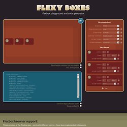
The two 2012 specs are roughly equivilant in terms of features, differing mainly in syntax. The earlier 2009 spec is less comprehensive though covers a lot of the same ground. Flexbox 2012 — W3C Candidate Recommendation, September 2012 Opera 12.1+, Firefox 22+. Chrome 21 -webkit- Flexbox early 2012 — W3C Working Draft, 22 March 2012 Internet Explorer 10 -ms- Flexbox 2009 — W3C Working Draft, 23 July 2009 Firefox 2+ -moz-, Chrome 4+ -webkit-, Safari 3.1+ -webkit-. iOS Safari 3.2+ -webkit- Double Wide Grid Block v3. Creating Intrinsic Ratios for Video. Did you ever want to resize a video on the fly, scaling it as you would an image?

Using intrinsic ratios for video, you can. This technique allows browsers to determine video dimensions based on the width of their containing block. Article Continues Below With intrinsic dimensions, a new width triggers a new height calculation, allowing videos to resize and giving them the ability to scale the same way images do. See example one. The concept#section1 The idea is to create a box with the proper ratio (4:3, 16:9, etc.), then make the video inside that box stretch to fit the dimensions of the box. The trick#section2 The padding property is the magic that styles a box with an intrinsic ratio. The CSS rules below illustrate how to style the parent and child to create a “magic wrapper”—a container that proportionally resizes itself depending on the width of its parent. Ultimate CSS Gradient Generator - ColorZilla.com.
Please, feed the Cursor Monster. 5 Step Web Design and Development Process. Jparallax – Amazing 3D Effect with Jquery Javascript Library – Smashing Web. Sponsored At Last with out flash we can do 3D in HTML.

Thanks to Jparallax. In website design it was impossible make interactive 3D elements with out a flash file. Selectivizr - CSS3 pseudo-class and attribute selectors for IE 6-8. Bolt. Bolt is designed to be flexibly sized and responsive, and to progressively enhance.
Base classes concentrate on layout techniques, and optional vertical rhythms and horizontal grids are included. Bolt does not give you any colour. Colours change between projects, where layout techniques generally do not. Bolt prefers CSS over JavaScript. It uses class changes and CSS transitions rather than JS animations. CSS3. Color Scheme Designer 3. Top Shadow. CSS3 breadcrumbs. A breadcrumb navigation allow users to know where they are in a hierarchical structure and navigate back to higher-level pages in the hierarchy.
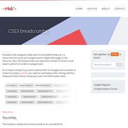
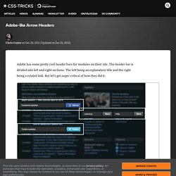
Also, the breadcrumbs can reduce the number of actions a user need to perform in order to navigate back. So, to keep it simple, if you have a website with lot of pages and sub-levels, in order to increase usability, you need to use breadcrumbs. Having said that, today you'll learn how to create your own cool CSS3 breadcrumbs. View demo The HTML Tha markup is simple and minimal, based on an unordered list. Adobe-like Arrow Headers. Adobe has some pretty cool header bars for modules on their site.
The header bar is divided into left and right sections. The left being an explanatory title and the right being a related link. But let's get super critical of how they did it. First of all, they use a non-sprited image to do it: That means an extra HTTP request just for the headers.
Idea.