
WikiLeaks drops 90,000 war docs; fingers Pakistan as insurgent ally. Turns out “Collateral Murder” was just a warmup.
WikiLeaks just published a trove of over 90,000 mostly-classified US military documents that details a strengthening Afghan insurgency with deep ties to Pakistani intelligence. WikiLeaks’ release of a 2007 Apache gunship video sparked worldwide outrage, but little change in US policy. This massive storehouse taken, it would appear, from U.S. Central Command’s CIDNE data warehouse—has the potential to be strategically significant, raising questions about how and why America and her allies are conducting the war. Not only does it recount 144 incidents in which coalition forces killed civilians over six years.
Afghan War Diaries explorer. Afghan War Diary, 2004-2010. From WikiLeaks Unless otherwise specified, the document described here: Was first publicly revealed by WikiLeaks working with our source.Was classified, confidential, censored or otherwise withheld from the public before release.Is of political, diplomatic, ethical or historical significance.
Any questions about this document's veracity are noted. Kabul War Diary. War Logs: by Le Monde Diplomatique. Afghan War Diary. The leak, which is considered to be one of the largest in U.S. military history,[5][12] revealed information on the deaths of civilians, increased Taliban attacks, and involvement by Pakistan and Iran in the insurgency.[1][13][14] Wikileaks says it does not know the source of the leaked data.[15] The three outlets which had received the documents in advance, The New York Times, The Guardian, and Der Spiegel, have all concluded that they are genuine when compared to independent reports.[1] Some time after the first dissemination by WikiLeaks, the US Justice Department were considering the use of the U.S.
Espionage Act of 1917 to prevent WikiLeaks from posting the remaining 15,000 secret war documents it claimed to possess.[16][17][18] Background[edit] Wikileaks describes itself as "a multi-jurisdictional public service designed to protect whistleblowers, journalists and activists who have sensitive materials to communicate to the public. Issues raised[edit] Pakistan[edit] Iran[edit] Afghanistan: The war logs. How our datajournalism operation worked. Wikileaks Afghanistan data: click image for the graphic.
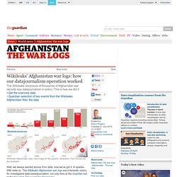
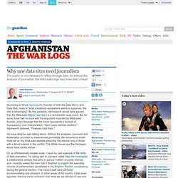
Illustration: Paul Scruton for the Guardian Well, we always wanted stories from data: now we've got it. In spades. With bells on. David Leigh. Declan Walsh. Simon Tisdall. Richard Norton-Taylor. Visualising the Wikileak’s war logs using Tableau Public. Visualizing the Wikileaks Afghanistan Casualty Data. WikiLeaks War Data Visualizations - Science and Tech. When the WikiLeaks war data was released last month, the best visualizations of the data came from the three newspapers that received it early.
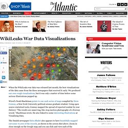
We produced our own rough visualizations, but it was only a matter of time before some serious illustrations popped up. Wired's Noah Shachtman points to one such series of maps compiled by Drew Conway, a New York University political science graduate student. Using open source statistical tools, Conway mapped the spread of reported combat by year (below).
"The results are unnerving, like stop-motion photography of a freeway wreck," Shachtman wrote. Warlogs. Motion Média team timeline AFG War Diary. Wikileaks Attack Data by Year and Type Projected on Afghanistan Regional Map. This happens to be one of those rare instances where the benefit of hindsight does not make me regret something said flippantly on a panel.
I deeply believe that in order to truly change the world we cannot simply "throw analytics at the problem. " To that end, the medical and health industries are perhaps the most primed to be disrupted by data and analytics. To be successful, however, a deep respect for both the methodological and clinical contexts of the data are required. It is incredibly exciting to be at an organization that is both working within the current framework of health care and data to create new insight for people, but also pushing the envelope with respect to individuals' relationships with their own health. The challenges are technical, sociological, and political; but the potential for innovation that exists in this space comes along very rarely. I feel lucky to have an opportunity to move into the health data space now.
Open Source Tools Turn WikiLeaks Into Illustrated Afghan Meltdown (Updated) It’s one thing to read about individual Taliban attacks in WikiLeaks’ trove of war logs.
It’s something quite different to see the bombings and the shootings mount, and watch the insurgency metastasize. NYU political science grad student (and occasional Danger Room contributor) Drew Conway has done just that, using an open source statistical programming language called R and a graphical plotting software tool. Visualisation in the news. The last 72 hours or has been fairly crazy in the land of Visualising Data, with some notable visualisation stories and discussions popping up in various news and media channels.
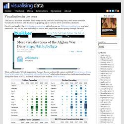
Firstly, on Sunday, the Wikileaks organisation picked up on my Tableau visualisations post and tweeted a URL to my site which led to visitor and page view counts going through the roof. Then on Monday, Wired magazine’s Danger Room section did a piece entitled “Open Source Tools Turn WikiLeaks Into Illustrated Afghan Meltdown” which also featured my tableau visualisations alongside those of NYU political science Ph.D. student Drew Conway.
Why raw data sites need journalism. According to Alfred Harmsworth, founder of both the Daily Mirror and Daily Mail, news is "what somebody somewhere wants to suppress; the rest is advertising".
By this yardstick, Harmsworth would have agreed that the WikiLeaks Afghan war diary is a remarkable news event. But he would have had no truck with the argument mounted by WikiLeaks' founder Julian Assange that the move represents a triumph of transparency over interpretation. "Hard news catches readers," Harmworth believed. "Features hold them. " He knew what he was talking about.
Media Release - Department of Defence. The War Logs - Interactive Feature. US says Wikileaks could 'threaten national security' 26 July 2010Last updated at 19:44 White House spokesman Robert Gibbs said the records contained nothing new The US has condemned as "irresponsible" the leak of 90,000 classified military records, saying their publication could threaten national security.
The documents released by the Wikileaks website include details of killings of Afghan civilians unreported until now. The records also show Nato concerns that Pakistan's ISI intelligence agency is helping the Taliban in Afghanistan, an accusation Islamabad has denied. The Pentagon said it might take weeks to ascertain what damage had been done. Calling their release a "criminal act", spokesman Col Dave Lapan said officials were reviewing the documents to determine "whether they reveal sources and methods" and might endanger US and coalition personnel.
Die Afghanistan-Dokumente bei Wikileaks: Das Rohmaterial des Krieges vor der Destillation - Fernsehen - Feuilleton - FAZ.NET. On Wikileaks & the Pakistan memos. Review of WikiLeaks docs sees no smoking gun - World news - South and Central Asia. Wikileaks: Truth and its Consequences - Potter Gold. What is the impact of the War Logs leak? I think this is best split into at least four questions. 1.
The Real Concern. What if there are no secrets? « BuzzMachine. Is no secret safe? That’s the moral to the Wikileaks war log story: you never know what might be leaked. Of course, that itself is nothing new: Whenever we reveal information to even one person, we risk it being spread. The ethic of confidentiality (and privacy) rests with the recipient of that information. So what’s new now? There are more means to get information since it is pooled and digital. I’m writing a book arguing that we are becoming more public and that’s good — and that institutions (government, companies) have no choice but to live up to our new standards of transparency and openness.
WikiLeaks and AfPak: What "Everyone" Knows - Politics. I lack the background knowledge about Afghanistan and Pakistan to put the new information in full perspective, not to mention lacking the time to read more than a little of the vast data dump. Therefore only these points about the still-emerging significance of what's now on public record: 1) "Everyone" knows this already.
People who have been very close to this story say that little of the information is "new," in a fundamental sense. WikiLeaks founder slams 'negligence on a massive scale' Secret Records Dump Stays in Legal Clear: Ann Woolner. With his prematurely white hair and his Australia-tinged English, 39-year-old Julian Assange has become the face and voice of what is surely the most massive leak of U.S. classified documents in history.
His online organization, WikiLeaks, devotes itself to government and corporate whistle-blowers and the documents they offer. It stands as a buffer between them and whomever had the secrets being bared, whether documents on Cayman Islands bank accounts, video showing Americans firing on civilians in Baghdad or Sarah Palin’s e-mail. But none of that came close to this week’s disgorgement of classified military documents. Wikileaks and the Afghan papers: Are all leaks good? Daniel Ellsberg interview: Eight questions for Daniel Ellsberg. CNNLarryKingLive WikiLeaks Founder Julian Assange – LarryKing - Assange 1) Larry King - Assange 2) To Larry King: “I’ve been waiting for this for a long time.” Video Larry King talks to Assange and the man who leaked the "Pentagon Papers" during the Vietnam war.
The National-Security State Strikes Back. WikiLeaks’ disclosure of the 91,000 U.S. government documents that it labels the “Afghan War Diary” raises a number of vital issues. VETS AND MILITARY FAMILIES SAY REACTION TO WIKILEAKS CLOUDS REAL ISSUES : Veterans Today. PBS FRONTLINE did a documentary that is now available on DVD accurately called Obama’s War. Middle East Online. The Listening Post - The ongoing WikiLeaks saga Human Rights Groups Press WikiLeaks Over Data. U.S. Urges Allies to Crack Down on WikiLeaks. For five long and very strange years, death haunted tiny Dryden, NY, a town near the Finger Lakes where a plague of car accidents, suicides, and even grisly murders involving two popular cheerleaders just kept mounting up.
Maximillian C. Forte: A War on Wikileaks? By MAXIMILIAN C. Frontline: Wikileaks founder Julian Assange. Julian Assange at the Frontline Club. 'U mag hier niet zitten' Every copy of Afghanistan war book bought and pulped by MoD. The entire print run of a highly critical and embarrassing account of Britain's role in southern Afghanistan has been bought and pulped by the Ministry of Defence at a cost of more than £150,000. A new edition, with some 50 words taken out, will be published this week despite continued opposition from within the ministry, officials said on Monday.