
Icon: web icons for rmarkdown. The icon package provides a convenient interface for adding icons from popular web fonts to R Markdown documents.
The project began at rOpenSci OzUnconf 2017, and was developed by Mitchell O’Hara-Wild, Earo Wang and Timothy Hyndman. The package currently supports icons from Font Awesome, Academicons, and ionicons. Icons can be added to your R Markdown documents using short prefixes which identify the font’s library. fa: Font Awesomeai: Academiconsii: ionicons For example, `r icon::fa("rocket")` can be used to add the rocket icon from Font Awesome. The package also provides a second interface which allows for tab completion of font names. Each icon function also provides support for modifying the attributes of the icon such as size, colour, rotation, and animation. Exploratory Data Analysis & Data Preparation with 'funModeling' This package contains a set of functions related to exploratory data analysis, data preparation, and model performance.
It is used by people coming from business, research, and teaching (professors and students). funModeling is intimately related to the Data Science Live Book -Open Source- (2017) in the sense that most of its functionality is used to explain different topics addressed by the book. 📗 The paperback version is being prepared, get notified by the newsletter or twitter. Opening the black-box Some functions have in-line comments so the user can open the black-box and learn how it was developed, or to tune or improve any of them. Introducing Joyplots. This is a joyplot: a series of histograms, density plots or time series for a number of data segments, all aligned to the same horizontal scale and presented with a slight overlap.
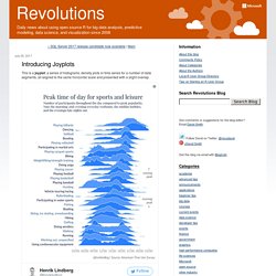
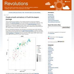
The name "Joy Plot" was apparently coined by Jenny Bryan in April 2017, in response to one of Lindberg's earlier visualizations using this style. (The community appears to have settled on 'joyplot' since then.) Create smooth animations in R with the tweenr package. There are several tools available in R for creating animations (movies) from statistical graphics.
The animation package by Yihui Xie will create an animated GIF or video file, using a series of R charts you generate as the frames. And the gganimate package by David Robinson is an extension to ggplot2 that will create a movie from charts created using the ggplot2 syntax: in much the same way that you can create multiple panels using faceting, you can instead create an animation with multiple frames. But from a storytelling perspective, such animations can sometimes seem rather disjointed.
Creating an animation using R. In this post, I will show you how to create an animation using R and ffmpeg.
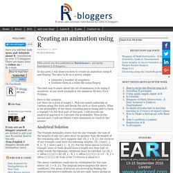
The idea to do so is pretty simple: Dual axes time series plots with various more awkward data. In my most recent blog post I introduced the dualplot() R function, which allows you to create time series plots with two different scales on the vertical axes in a way that minimises the potential problems of misinterpretation.
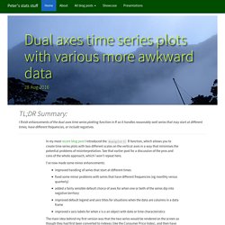
See that earlier post for a discussion of the pros and cons of the whole approach, which I won’t repeat here. Dual axes time series plots may be ok sometimes after all. Are they really as bad as all that?
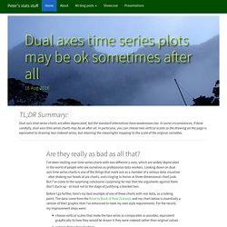
I’ve been mulling over time series charts with two different y axes, which are widely deprecated in the world of people who see ourselves as professional data workers. Looking down on dual axis time series charts is one of the things that mark one as a member of a serious data visualiser - after shaking our heads at pie charts, and cringing in horror at three-dimensional chart junk.
But I’ve come to the surprising conclusion (surprising for me) that the arguments against them don’t stack up - at least not to the stage of justifying a blanket ban. Before I go further, here’s my best example of one of these charts with real data, as a talking point. The data come from the Reserve Bank of New Zealand, and my chart below is essentially a version of their graphic that I’ve enhanced to meet my own style requirements.
Stephen Few looks at the issue of dual axes plots in a well reasoned piece and concludes cautiously that they are never justified. Explore with Shiny the impact of sample size on "p-charts" I wanted to help explore the implications of changing sample size for a quality control process aimed at determining the defect rate in multiple sites.
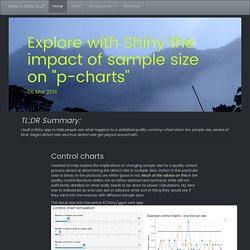
Defect in this particular case is binary ie the products are either good or not. Much of the advice on this in the quality control literature strikes me as rather abstract and technical, while still not sufficiently detailed on what really needs to be done for power calculations. My idea was to instead let an end user see in advance what sort of thing they would see if they went into the exercise with different sample sizes. Stefano-meschiari/latex2exp. Getting Genetics Done: R: single plot with two different y-axes. I forgot where I originally found the code to do this, but I recently had to dig it out again to remind myself how to draw two different y axes on the same plot to show the values of two different features of the data.
This is somewhat distinct from the typical use case of aesthetic mappings in ggplot2 where I want to have different lines/points/colors/etc. for the same feature across multiple subsets of data. For example, I was recently poking around with some data examining enrichment of a particular set of genes using a hypergeometric test as I was fiddling around with other parameters that included more genes in the selection (i.e., in the classic example, the number of balls drawn from some hypothetical urn). I wanted to show the -log10(p-value) on one axis and some other value (e.g., “n”) on the same plot, using a different axis on the right side of the plot. Here’s how to do it. First, generate some data: Call matplotlib from R. Call matplotlib from R Matti Pastell Motivation I often use Python and matplotlib for exploring measurement data (from e.g. accelerometers), even if I use R for the actual analysis.
The reason is that I like to be able to flexibly zoom into different parts of the plot using the mouse and this works well for me with matplotlib. Circular Migration Flow Plots. A article of mine was published in Science today. It introduces estimates for bilateral global migration flows between all countries. The underlying methodology is based on the conditional maximisation routine in my Demographic Research paper.
However, I tweaked the demographic accounting which ensures the net migration in the estimated migration flow tables matches very closely to the net migration figures from the United Nations. My co-author, Nikola Sander, developed some circular plots for the paper based on circos in perl. Alluvial diagrams. Parallel coordinates plot is one of the tools for visualizing multivariate data. Every observation in a dataset is represented with a polyline that crosses a set of parallel axes corresponding to variables in the dataset. You can create such plots in R using a function parcoord in package MASS.
For example, we can create such plot for the built-in dataset mtcars: This produces the plot below. The lines are colored using a blue-to-red color ramp according to the miles-per-gallon variable. What to do if some of the variables are categorical? Bullet Graph in R. Stephen Few designed the Bullet Graph as a way to display measurements vs. goals/other benchmarks or as a comparison of benchmarks. The screenshots below shows the bullet chart build by Few’s specifications in R based on the grid-package: The code and a detailed example can be found on github. Next steps are: Comparison of current measure to a future targetSome alternative designs as displaying negative and positive values reversed background filling, and reversing of colour and scaleMore than three rangesComparative measures…
Gauge Chart in R. Mathematical Annotation in R. R Core Team (R-core@R-project.org ) The R Project for Statistical Computing. Lijia Yu (yu@lijiayu.net / GitHub / Twitter) A master candidate majoring in Bioinformatics at Beijing Institute of Genomics. Karl Broman (kbroman@biostat.wisc.edu / GitHub / Twitter) Department of Biostatistics and Medical Informatics, University of Wisconsin-Madison; research in statistical genetics; developer of R/qtl (for R) Kevin Ushey (kevinushey@gmail.com / GitHub / Twitter) MSc., University of British Columbia; interested in statistical genetics and data visualization Want to write mathematical symbols and expressions in R graphics? Exporting nice plots in R.
A vital part of statistics is producing nice plots, an area where R is outstanding. The graphical ablility of R is often listed as a major reason for choosing the language. It is therefore funny that exporting these plots is such an issue in Windows. How to change the alpha value of colours in R. Often I like to reduce the alpha value (level of transparency) of colours to identify patterns of over-plotting when displaying lots of data points with R. So, here is a tiny function that allows me to add an alpha value to a given vector of colours, e.g. a RColorBrewer palette, using col2rgb and rgb, which has an argument for alpha, in combination with the wonderful apply and sapply functions. The example below illustrates how this function can be used with colours provided in different formats, thanks to the col2rgb function.
Session Info sessionInfo() R version 3.0.0 (2013-04-03) Platform: x86_64-apple-darwin10.8.0 (64-bit) locale: [1] en_GB.UTF-8/en_GB.UTF-8/en_GB.UTF-8/C/en_GB.UTF-8/en_GB.UTF-8 attached base packages: [1] stats graphics grDevices utils datasets methods base other attached packages: [1] RCurl_1.95-4.1 bitops_1.0-5. Exporting plain, lattice, or ggplot graphics.
Setting graph margins in R using the par() function and lots of cow milk. It is fairly straightforward to set the margins of a graph in R by calling the par() function with the mar (for margin!) Argument. For example, High Resolution Figures in R. As I was recently preparing a manuscript for PLOS ONE, I realized the default resolution of R and RStudio images are insufficient for publication. PLOS ONE requires 300 ppi images in TIFF or EPS (encapsulated postscript) format. In R plots are exported at 72 ppi by default. I love RStudio but was disappointed to find that there was no options for exporting figures at high resolution. PLOS ONE has extensive instructions for scaling, compressing, and converting image files to meet their standards. Unfortunately, there is no good way to go from low resolution to high resolution (i.e. rescaling in Photoshop) as my friend Liam Revell, and phytools author, pointed out with entertaining illustration from PhD comics (upper right panel).
Even if scaling up from a low resolution PDF would work, it would be better to have a direct solution in R.