

Just Starting Out with CSS & HTML - CSS-Tricks. Centering in CSS: A Complete Guide. Centering things in CSS is the poster child of CSS complaining. Why does it have to be so hard? They jeer. I think the issue isn't that it's difficult to do, but in that there so many different ways of doing it, depending on the situation, it's hard to know which to reach for. So let's make it a decision tree and hopefully make it easier. I need to center... CSS Almanac. :placeholder-shown. The :placeholder-shown pseudo-class selects the input element itself when placeholder text exists in a form input.
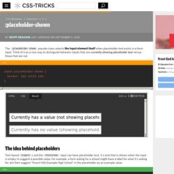
Think of it as a nice way to distinguish between inputs that are currently showing placeholder text versus those that are not. The idea behind placeholders Text-based <input>s and the <textarea> input can have placeholder text. Spinny Leaf Menu. Simple and Nice Blockquote Styling. Learn Development at Frontend Masters The blockquote displays in standards-compliant browsers with the "big quotes before" effect, and in IE with a thick left border and a light grey background.
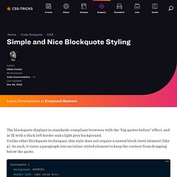
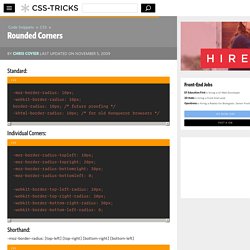
Unlike other blockquote techniques, this style does not require a nested block-level element (like p). As such, it turns a paragraph into an inline-styled element to keep the content from dropping below the quote. Rounded Corners. Standard: -moz-border-radius: 10px; -webkit-border-radius: 10px; border-radius: 10px; /* future proofing */ -khtml-border-radius: 10px; /* for old Konqueror browsers */ Individual Corners:
Ribbon. <h1 class="ribbon"><strong class="ribbon-content">Everybody loves ribbons</strong></h1> Protector This technique uses negative z-index values on some of the pseudo elements.
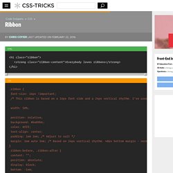
That means that they can go behind other elements that have opaque backgrounds, which ruins the effect. To fix this, you'll need to make sure the immediate parent of the ribbons does not have a background applied and has relative postioning with positive z-index. Use an additional wrapper if needed. Retina Display Media Query. For including high-res graphics, but only for screens that can make use of them.
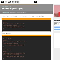
"Retina" being "2x": Orientation Lock. Multiple Borders. Using pseudo element(s) You can position a pseudo element such that it's either behind the element, and larger, making a border effect with it's own background, or smaller and inside (but make sure the content gets positioned on top).
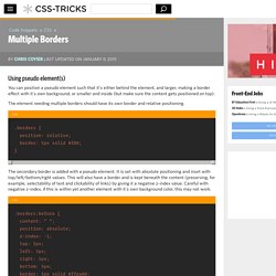
The element needing multiple borders should have its own border and relative positioning. The secondary border is added with a pseudo element. It is set with absolute positioning and inset with top/left/bottom/right values. This will also have a border and is kept beneath the content (preserving, for example, selectability of text and clickability of links) by giving it a negative z-index value. See the Pen gbgRqZ by Chris Coyier (@chriscoyier) on CodePen. You can do a third border by using the :after pseudo class as well. Multiple Backgrounds Syntax. Media Queries for Standard Devices. If you think responsive's simple, I feel bad for you son.
We got 99 viewports, but the iPhone's just one. —Josh Brewer, March 10, 2010. Make Non-Password Inputs Use Bullets (or Bullet Alternatives) Make "Pre" Text Wrap. Link Pseudo-Classes (In Order) Glowing Blue Input Highlights. Fluid Typography. Getting right to the code, here's a working implementation: That would scale font-size from a minimum of 16px (at a 320px viewport) to a maximum of 22px (at a 1000px viewport).
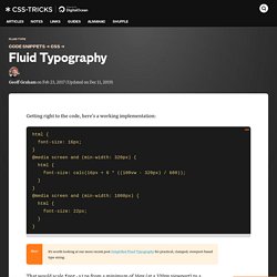
Here's a demo of that, but as a Sass @mixin (which we'll cover later). See the Pen Base Example of Fluid Type w Sass by Chris Coyier (@chriscoyier) on CodePen. Sass was used just to make that output a little easier to generate, and the fact that there is a smide of math involved. Let's take a look. Using viewport units and calc(), we can have font-size (and other properties) adjust their size based on the size of the screen. Here's the math, credit Mike Riethmuller: The reason that math is a little complicated is that we're trying to avoid type ever getting smaller than our minimum or bigger than our maximum, which is very easy to do with viewport units. See the Pen JEVevK by CSS-Tricks (@css-tricks) on CodePen.
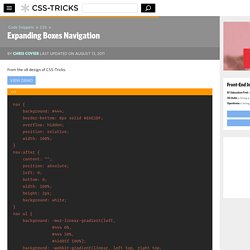
To lock in those minimum and maximum sizes, using this math within media queries helps. #In Sass. Fixed Positioning in IE 6. Fixed Footer. Fancy Ampersand. Expanding Boxes Navigation. By Chris Coyier Last Updated On From the v8 design of CSS-Tricks.
View Demo. CSS Triangle. Learn Development at Frontend Masters You can make them with a single div.
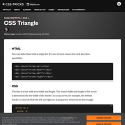
It's nice to have classes for each direction possibility. The idea is a box with zero width and height. The actual width and height of the arrow is determined by the width of the border. In an up arrow, for example, the bottom border is colored while the left and right are transparent, which forms the triangle. Demo Examples. Custom Checkboxes and Radio Buttons. The selectors here are specific to Wufoo markup, but the concepts at work can work for any form. The overall idea is that you make the default radio buttons and checkboxes invisible by setting their opacity to zero, and replace them with graphics. Then use the :checked selector to alternate the graphics between their checked and unchecked versions. Custom Radio Buttons. End Articles with Ivy Leaf. Exactly Center an Image/Div Horizontally and Vertically. CSS Only Image Preloading. One big reason to use image preloading is if you want to use an image for the background-image of an element on a mouseOver or :hover event.
If you only apply that background-image in the CSS for the :hover state, that image will not load until the first :hover event and thus there will be a short annoying delay between the mouse going over that area and the image actually showing up. Technique #1 Load the image on the element's regular state, only shift it away with background position. Then move the background position to display it on hover. Technique #2 If the element in question already has a background-image applied and you need to change that image, the above won't work. The idea create new page elements to use for this preloading technique may pop into your head, like #preload-001, #preload-002, but that's rather against the spirit of web standards. More. Corner Ribbon. Change Text Selection Color. Centering a Website. Center DIV with Dynamic Height. Browser Specific Hacks. :placeholder-shown.
Sticky Footer. Absolute Center (Vertical & Horizontal) an Image.