
Jed Carter — Eyes on The Sky. I made a book.

It documents my major self-initiated project this year: a process-based investigation into generative design and the weather. It’s a record of the sky, of the colours that change so slowly it’s almost impossible to see. A bit like a visual almanac. I linked 64 public-access web cameras across Europe, recording the colour of the sky, at each point, at regular intervals. Together, the cameras paint the weather, once every hour.
What began as a project investigating data visualisation, turned into a project exploring painting. Colour This project was inspired by a simple observation: weather conditions can be revealed by the quality and colour of light through a window. With regards to forecasting the weather, I believe that most people respond more intuitively to simple colours than to the complex units of data found in weather reports and downloadable apps. Drawing. Nicholas Felton. Emoto Topic Explorer. HERE IS TODAY. Data Visualization. Katharine Morgan Tech blogs.

They don’t agree on much. Apple Fanboys, Android Fanboys, Playstation Fanboys, Xbox Fanboys… the web is awash with people flaming each other about their choice of technology. Chris Jordan - Running the Numbers. Running the Numbers looks at contemporary American culture through the austere lens of statistics.
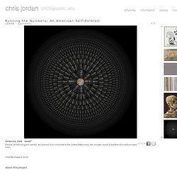
Each image portrays a specific quantity of something: fifteen million sheets of office paper (five minutes of paper use); 106,000 aluminum cans (thirty seconds of can consumption) and so on. My hope is that images representing these quantities might have a different effect than the raw numbers alone, such as we find daily in articles and books. Statistics can feel abstract and anesthetizing, making it difficult to connect with and make meaning of 3.6 million SUV sales in one year, for example, or 2.3 million Americans in prison, or 32,000 breast augmentation surgeries in the U.S. every month. This project visually examines these vast and bizarre measures of our society, in large intricately detailed prints assembled from thousands of smaller photographs.
High Altitude: Stock Market Trends as Realistic Mountain Ranges. WIRED: Selfiecity: Comparing Instagram... Going to Data Visualization School - World of Data. With the never-ending expansion of online possibilities for quality learning, I got to the can’t-see-the-woods-for-trees phase quite a while ago and tend to forget about some of the high quality stuff out there.
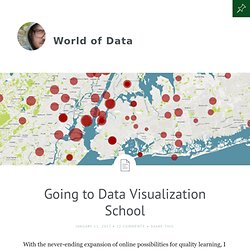
Hence, I wanted to get some sort of overview of the possibilities I needed to look into. That used to be an Evernote note. By now I have attended a few of the courses, but there is still plenty out there I should be able to combine with a busy work schedule. Anyway, I have turned the note into this post, which is mainly for my own sanity’s sake, but might be of relevance for others. Aggregator I have only come across one aggregator of university level courses, and that is Class Central. The beauty of data visualization - David McCandless. The Art of Data Visualization.
The importance of data visualisation is explored in the British Library's first science exhibition. LONDON.- In an age of rapidly advancing technologies Beautiful Science, opening tomorrow in The Folio Society Gallery at the British Library, shows that the challenge of presenting big data in innovative ways is not a new one.
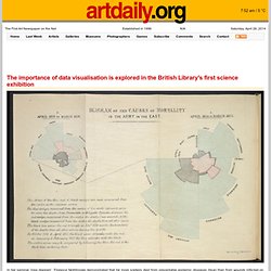
From 17th century illustrated diagrams to contemporary interactive visualisations, the exhibition explores how advances in science alongside changes in technology have allowed us to visually interpret masses of information. Beautiful Science, sponsored by Winton Capital Management, explores the work of scientists and statisticians through the ages using the Library’s own vast science collections together with new and exciting technology, focusing on three key themes – public health, weather and evolution.
Dr Johanna Kieniewicz, lead curator of Beautiful Science, says: “The British Library is home to the nation’s science collection and we’re thrilled to be opening up our fantastic collections in the Library’s first science exhibition. A Pretty Data Viz From Geneva Switzerland. If you are interested in beautiful data visualizations, you can't get much better than this one from Geneva that shows you the ebb and flow of people in that wonderful city.
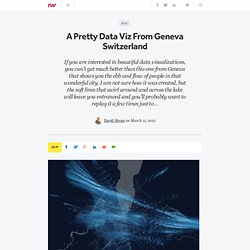
I am not sure how it was created, but the soft lines that swirl around and across the lake will leave you entranced and you'll probably want to replay it a few times just to catch all the movements. As the site states, the visualization will "allow you to explore these streams of connected people around the city, in their everyday life. " Interestingly, the site's name means "city living" in French. Here is the animated video done by Interactive Things that is posted on the site.
Switzerland had more cell phones than people, around 10 million. www.theyrule.net. The Motley Roots of Data Visualization in 19th Century Census Charts - Jeffrey Rotter. The U.S.
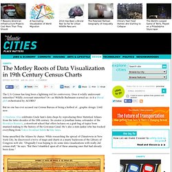
Census has long been a lightning rod for controversy. Does it wildly undercount minorities? Wildly overcount minorities? Or—as Michelle Bachmann warned us—is it a liberal plot orchestrated by ACORN? But no one has ever accused our Census Bureau of being a hotbed of…graphic design.