
Outils gratuits pour webmasters - service webmaster gratuit - Free Tools - Part 2. Tweet and Shoot, webservice pour programmer vos campagnes twitter Tweet and Shoot est un outil simple et facile d’utilisation pour monter des campagnes de buzz via Twitter.
Les solutions sur le marché n’étant pas adaptées aux besoins de Laurent (le développer du webservice); besoins basés sur l’essentiel, le ludique et une analyse professionnelle, il a décidé de développer sa propre solution et d’en offrir […] UICloud, 47 841+ Design Interface Utilisateur UICloud s’auto proclame comme « la plus grande base de données au monde d’éléments et de kits interface utilisateur ». Même si cela manque de modestie, il faut reconnaître que le site met à disposition plus de 46 608 éléments d’interface utilisateur et 1233 kits complets. Dopeless Rotate, plugin jQuery pour une visualisation à 360° Dopeless Rotate est un plugin Jquery pour visualiser vos images (comme vos produits) sur 360 degrés. Movim, script PHP pour créer votre réseau social décentralisé Photographer, communauté de partage de photos. I Have No Idea What I'm Doing with Responsive Web Design.
Over the past few months I’ve had the privilege of spending some quality time with some of the web’s most talented designers.
Whether over Skype, on the Happy Monday podcast, or on the upcoming Treehouse Chat show, I’ve been listening hard to the different angles and strategies revolving around Responsive Design. I’d like to share some of those insights with you now. We’re All Figuring This Thing Out I’m fortunate enough to co-host a podcast with the lovely and talented, Sarah Parmenter. Last week she was telling me about her experience at the annual Responsive Day Out conference that she had attended that day with the likes of Elliot Jay Stocks, Laura Kalbag, Mark Boulton, Jeremy Keith and more. I say that, to say this: Remember to keep your head up and in the game when it comes to Responsive Design because it can get complicated very quickly. Responsive Web Design: What It Is and How To Use It.
Advertisement Almost every new client these days wants a mobile version of their website.
It’s practically essential after all: one design for the BlackBerry, another for the iPhone, the iPad, netbook, Kindle — and all screen resolutions must be compatible, too. In the next five years, we’ll likely need to design for a number of additional inventions. When will the madness stop? It won’t, of course. In the field of Web design and development, we’re quickly getting to the point of being unable to keep up with the endless new resolutions and devices. Responsive Web Design Demystified. Tutorial by Matt Doyle | Level: Intermediate | Published on 30 September 2011 Categories: What exactly is responsive design, and how do you create a responsive website?
This tutorial explains the concepts, and walks you through the basic steps for creating a responsive website layout. Multi-Device Layout Patterns. Through fluid grids and media query adjustments, responsive design enables Web page layouts to adapt to a variety of screen sizes.
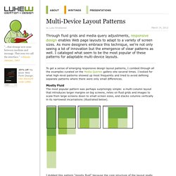
As more designers embrace this technique, we're not only seeing a lot of innovation but the emergence of clear patterns as well. I cataloged what seem to be the most popular of these patterns for adaptable multi-device layouts. To get a sense of emerging responsive design layout patterns, I combed through all the examples curated on the Media Queries gallery site several times.
I looked for what high-level patterns showed up most frequently and tried to avoid defining separate patterns where there were only small differences. Mostly Fluid The most popular pattern was perhaps surprisingly simple: a multi-column layout that introduces larger margins on big screens, relies on fluid grids and images to scale from large screens down to small screen sizes, and stacks columns vertically in its narrowest incarnations (illustrated below).
Column Drop. Responsive Web Design Resources. How to Approach a Responsive Design. So I’ve got a confession to make: When we started working on the new Boston Globe website, we had never designed a responsive site before.
This shouldn’t come as some huge shock. I mean, raise your hand if you’d built a full responsive site back in November 2010. (You can put your hand down now, Mr. Marcotte, that was rhetorical.) Since so few had done it — and certainly not on this scale — we kind’ve made things up as we went along. 85 Top Responsive Web Design Tools. As the mobile market continues to grow, demand for responsive website design intensifies.
This has introduced a new set of tools, 10 of which we've listed below, to help lay out, design, code and plan a responsive website. While some may overlap, each deserves a spot on the list; when combined, they can help you craft a website that provides an optimal viewing experience for users on all devices. (Along with each recommendation is a list of alternative tools that may be useful.) If you are a designer or developer, what are some of the indispensable tools in your responsive toolbox? Please share your recommendations with our readers in the comments, below. 1. Developed first as an internal tool that has now grown into a full-fledged product, Gridset lets web designers and developers design, prototype and build custom, responsive grid-based layouts for their projects. 2. Essential tools for every web designer.
Every web designer requires the right tools to do their job.
To create well crafted original designs you certainly need to be inspired to do so. Getting to that point is sometimes the hardest challenge in the field of web design. Luckily enough for us and our fellow design community there are tools available to assist in completing the job quicker and more efficiently. Dribbble - Popular. Kuler. Media Queries. Free textures for your next web project. Nothing like a field of beautiful flowers. Download Download These lovely water-colorful dots will make your designs pop. Download More leaves from another angle.