
Tagxedo. Processing ...

Personal $ Svg $20 ✓ Up to $75 merchandises for personal use. Merchandise $ License to use artwork in merchandises (T-Shirt, Mug, poster, etc). Single Use $ License for single-purpose non-merchandising use. Unlimited $ Unlimited personal or commercial use. Custom $TBD Custom license, with terms subject to prior arrangement. Please contact licensing@tagxedo.com for more information By accepting this license, you agree to the Tagxedo's Terms of Service, and you agree that you have acquired the right to use the source image to create the Tagxedo artwork, and that you indemnify and hold harmless Tagxedo and its employees and officers from any harm are liability that may incur.
Please contact licensing@tagxedo.com if you have any question. TagCrowd: make your own tag cloud from any text. Datawrapper. CartoDB. Tableau public. The R Project for Statistical Computing. Getting Started with Charts in R. So you want to make some charts in R, but you don't know where to begin.
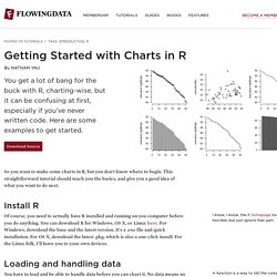
This straightforward tutorial should teach you the basics, and give you a good idea of what you want to do next. Install R I know, I know, the R homepage looks horrible, but just ignore that part.Of course, you need to actually have R installed and running on you computer before you do anything. You can download R for Windows, OS X, or Linux here. For Windows, download the base and the latest version. Loading and handling data A function is a way to tell the computer what to do. Imagine that the values 1 through 5 are data points that you want to access later. In this example, the variable name is "fakedata. " Did you try using an index greater than five?
Create another vector, morefake, of all a's. When you combine the two vectors, you get a matrix with two columns and five rows. However, in many cases (as you'll see soon), you want a structure that has all your values, but with columns of different data types. Bam. Process Trends Website. IBM Many Eyes. Infographic App & Presentation Tool. Highcharts. iCharts.
Timeline JS - Beautifully crafted timelines that are easy, and intuitive to use. In cell data bars with Excel. I was playing with ranking scores and finding a way to display the results in an immediately obvious manner, without relying on displaying the numbers themselves – this normally leads to the creation of a chart of some form.
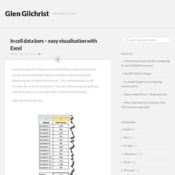
Fine, but there is a quick and easy manner to spice up your data with conditional formatting. Take the following data: Download Conditional Formatting Data Bars Excel Worksheet Highlight the test scores for the students (not including the mean), and select Conditional Formatting / Data Bars / Solid Fill: As you can see, Excel has overlaid a data bar onto each of the student scores. This will allow us to control how the bar are displayed.
This sets the scale of the bars to go from 0 to the maximum value and removes the numbers from the cells. Now, we want to change the formatting on the Mean value. This time, we want to set the minimum to 0 and the maximum to be the maximum of the data. The finished data looks like this: Interactive. Prefuse/Prefuse. Interactive. Quantum GIS. Gliffy Diagrams. Gliffy’s friendly editor, vast symbol libraries, and handy templates make it easy to communicate your thoughts and plans visually.
You’re just minutes away from all the diagrams you need: Flow Charts SWOT Analysis UML Charts Venn Diagrams Org Charts Network Diagrams Business Process Wireframes Site Maps Technical Drawings. VideoInfographs.