
University of Manchester Tree Trail. Copernicus imaging. Protected Planet: The World's Protected Areas. Cold weather person, or hot weather lover? Here in Washington, the weather has been flat-out drop-dead, absolutely, positively, 100 percent, gorgeous this past weekend.

We're talking highs in the low 70s, abundant sunshine, and no humidity to speak of. Perfection! It was the first day in several months where you could actually turn off your A/C, throw open the windows, and air out the summer funk your home has been accumulating since, oh, May or so. Which got me thinking: wouldn't it be great if the weather were like this every day? Or at least, not for just a brief sliver of time in April and again in the fall, like we have here in the mid-Atlantic? So I dug up some 30-year temperature averages maintained by the Centers for Disease Control and Prevention to find out which places in the country had the most days where the average high temperature was right around that 70 degree mark.
So that's what I built! The interesting thing is that different regions of the country see these temperatures at different times of the year. Plant life cycle shows a breathing Earth. Map of global carbon emissions. Satellite Images of Environmental Change. An animated map of global wind, weather, and ocean conditions. Wind Map. An invisible, ancient source of energy surrounds us—energy that powered the first explorations of the world, and that may be a key to the future.

This map shows you the delicate tracery of wind flowing over the US. The wind map is a personal art project, not associated with any company. We've done our best to make this as accurate as possible, but can't make any guarantees about the correctness of the data or our software. Please do not use the map or its data to fly a plane, sail a boat, or fight wildfires :-) If the map is missing or seems slow, we recommend the latest Chrome browser. Surface wind data comes from the National Digital Forecast Database. If you're looking for a weather map, or just want more detail on the weather today, see these more traditional maps of temperature and wind. Mapping perceived canopy tree cover in major cities. American Land Use Patterns. Most maps of the U.S. prioritize metropolitan areas.
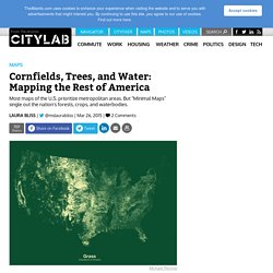
But "Minimal Maps" single out the nation's forests, crops, and waterbodies. Eighty percent of the U.S. population lives in "urban" areas, a staggering 249,253,271 souls. Yet these folks live in just 3 percent of the country's 2.3 billion acres of land. Most of America's 50 states are forestland (30 percent), pasture and ranges (27 percent), and crops (18 percent), with parks, tundra, and swamps making up the rest. These are statistics that never fail to blow my provincially urban mind—in part, perhaps, because most maps of the country visually prioritize metropolitan areas.
But London-based designer Michael Pecirno produces images of America that illuminate all land use patterns, type by type. "[C]orn fields take up 91 million acres of the American landscape," writes Pecirno in an email. All images courtesy of Michael Pecirno. Geological Investigation of the Alluvial Valley of the Lower Mississippi River, Part IV. Fisk and his endlessly fascinating geological investigations will surely return in varying permutations, recognizably or otherwise, throughout the new year.

So please visit often and stay awhile. Lower Mississippi Valley: Engineering Geology Mapping ProgramPlates 22-1 to 22-15 @ Flickr Part IIIPart IIPart I Part VAlluvial Porn. Radicalcartography.