
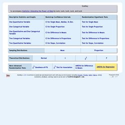
GitHub - odeleongt/flexdashboard-poster: Minimal template for a flexdashboard poster. StatKey. StatKey to accompany Statistics: Unlocking the Power of Data by Lock, Lock, Lock, Lock, and Lock Help Presentation Mode StatKey v. 2.0.1 is written in JavaScript and should work well with any current browser including Chrome, Firefox, Safari, Opera, and IE.
ModernDive. Getting Started - For Students This book was written using the bookdown R package from Yihui Xie (Xie 2016).
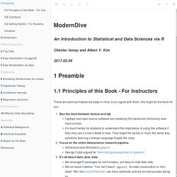
In order to follow along and run the code in this book on your own, you’ll need to have access to R and RStudio. Think & Do: Technology Pages. Analysis of Variance. In an experiment study, various treatments are applied to test subjects and the response data is gathered for analysis.
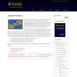
A critical tool for carrying out the analysis is the Analysis of Variance (ANOVA). It enables a researcher to differentiate treatment results based on easily computed statistical quantities from the treatment outcome. The statistical process is derived from estimates of the population variances via two separate approaches. Simple Linear Regression: A complete introduction with numeric example.
Linear regression is a predictive modelling technique that aims to predict the value of an outcome variable based on one or more input predictor variables.
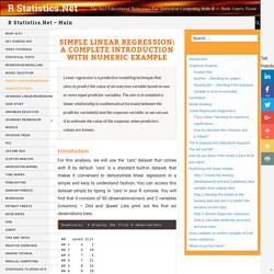
The aim is to establish a linear relationship (a mathematical formula) between the predictor variable(s) and the response variable, so we can use it to estimate the value of the response, when predictors values are known. Introduction. Flexdashboard: Easy interactive dashboards for R. RDocumentation. The R-Podcast. 5 plataformas para crear una página web gratis para usar en clase. Plataformas para crear una página web gratis para clase Una de las posibilidades de la tecnología en el s.
XXI es que cualquiera puede crear una página web gratis. En educación esto es especialmente interesante como actividad para nuestros alumnos, ya sea como trabajo individual o en grupo, permitiéndoles volcar el contenido y aprender durante el proceso. Además de todas estas plataformas para crear un blog gratis, a continuación os dejamos con las plataformas más interesantes para crear páginas web de una forma sencilla y asequible para todos los públicos. SiteW Con varios modos de suscripción, el gratuito puede valernos más que perfectamente para un uso escolar: SiteW es una plataforma para crear webs de una forma sencilla, a través de numerosas plantillas disponibles que podemos tomar como punto de partida y que también personalizaremos a nuestros gustos e intereses. Top 50 ggplot2 Visualizations - The Master List (With Full R Code) Advanced R Stats. Archive. Bookdown: Easy Book Publishing with R Markdown. Authoring Books and Technical Documents with R Markdown.
This short book introduces an R package, bookdown, to change your workflow of writing books.
It should be technically easy to write a book, visually pleasant to view the book, fun to interact with the book, convenient to navigate through the book, straightforward for readers to contribute or leave feedback to the book author(s), and more importantly, authors should not always be distracted by typesetting details. The bookdown package is built on top of R Markdown ( and inherits the simplicity of the Markdown syntax (you can learn the basics in five minutes; see Section 2.1), as well as the possibility of multiple types of output formats (PDF/HTML/Word/…).
It has also added features like multi-page HTML output, numbering and cross-referencing figures/tables/sections/equations, inserting parts/appendices, and imported the GitBook style ( to create elegant and appealing HTML book pages. The R Trader » Blog Archive » BERT: a newcomer in the R Excel connection. A few months ago a reader point me out this new way of connecting R and Excel.
I don’t know for how long this has been around, but I never came across it and I’ve never seen any blog post or article about it. So I decided to write a post as the tool is really worth it and before anyone asks, I’m not related to the company in any way. BERT stands for Basic Excel R Toolkit. It’s free (licensed under the GPL v2) and it has been developed by Structured Data LLC. At the time of writing the current version of BERT is 1.07. The R-Podcast. Learning Path - Data Science, Analytics, BI, Big Data. We live in a world of Information overload!
Google throws 1,270,000,000 billion in 0.39 seconds, when I search it for “Learn R”! This still does not reveal the entire picture – it probably hasn’t searched through all the YouTube videos, the GitHub repos, the presentations on SlideShare, numerous blogs and discussions happening on the topic! LeaRning Path on R - Step by Step Guide to Learn Data Science on R. One of the common problems people face in learning R is lack of a structured path.
They don’t know, from where to start, how to proceed, which track to choose? Though, there is an overload of good free resources available on the Internet, this could be overwhelming as well as confusing at the same time. To create this R learning path, Analytics Vidhya and DataCamp sat together and selected a comprehensive set of resources to help you learn R from scratch. This learning path is a great introduction for anyone new to data science or R, and if you are a more experienced R user you will be updated on some of the latest advancements. This will help you learn R quickly and efficiently. Step 0: Warming up. OnePageR – Togaware. Sci-Hub: removing barriers in the way of science. Statistical Analysis of List Experiments. The validity of empirical research often relies upon the accuracy of self-reported behavior and beliefs.
Yet, eliciting truthful answers in surveys is challenging especially when studying sensitive issues such as racial prejudice, corruption, and support for militant groups. List experiments have attracted much attention recently as a potential solution to this measurement problem. Many researchers, however, have used a simple difference-in-means estimator without being able to efficiently examine multivariate relationships between respondents' characteristics and their answers to sensitive items. Importing Data into R – RStudio. Plotting background data for groups with ggplot2. This tweet by mikefc alerted me to a mind-blowingly simple but amazing trick using the ggplot2 package: to visualise data for different groups in a facetted plot with all of the data plotted in the background. Here’s an example that we’ll learn to make in this post so you know what I’m talking about: Credit where credit’s due Before continuing, I’d be remiss for not mentioning that the origin of this ingenious suggestion is Hadley Wickham.
The tip comes in his latest ggplot book, for which hardcopies are available online at places like Amazon, and the code and text behind it are freely available on Hadley’s Github at this repository. Some motivating examples. Plotting individual observations and group means with ggplot2. @drsimonj here to share my approach for visualizing individual observations with group means in the same plot. Here are some examples of what we’ll be creating: I find these sorts of plots to be incredibly useful for visualizing and gaining insight into our data.
We often visualize group means only, sometimes with the likes of standard errors bars. Alternatively, we plot only the individual observations using histograms or scatter plots. Separately, these two methods have unique problems. BlogR. Understanding Pie Charts. Pie charts are perhaps the most ubiquitous chart type; they can be found in newspapers, business reports, and many other places. But few people actually understand the function of the pie chart and how to use it properly. In addition to issues stemming from using too many categories, the biggest problem is getting the basic premise: that the pie slices sum up to a meaningful whole. The Part-Whole Relationship. Analytics Discussions. Creating a Treemap in R. Embedding R-generated Interactive HTML pages in MS PowerPoint. By Richard Pugh – Commercial Director, UK. Usually when I create slide decks these days I used markdown and slidy. However, I recently was asked to present using an existing Revolution Microsoft PowerPoint template.
The importance of self-care. Tim Urban: Inside the mind of a master procrastinator. Datacamp. Package pxR. MicroDatosEs. Ejercicios de mi clase de R – datanalytics. Ya conté que participo (como profesor) en el Experto en Data Science de la U-tad. Voy a copiar aquí los ejercicios que propuse en la asignatura de preparación de datos con R.
Por si alguien les quiere hincar el diente. En lo que sigue he eliminado algunos detalles que no vienen a cuento. He dejado el resto. Son así: Los ejercicios tienen que resolverse individualmente. No es necesario que envíes código. A pesar de que hay 12 puntos en juego, las prácticas se evaluarán sobre 10, que es la máxima nota. Clases S4 y mapas (2 puntos) Obtén shapefiles de, p.e., provincias españolas (el INE los proporciona).
TrelliscopeJS with Plotly. Computing Sample Size for Variance Estimation. Inspiration and Help concerning R graphics. Exploratory Data Analysis Using R (Part-I) Explore R and ScaleR in 25 functions. Top 10 TED Talks for the Data Scientists. R for Data Science. 7 Visualizations You Should Learn in R. With ever increasing volume of data, it is impossible to tell stories without visualizations. Data visualization is an art of how to turn numbers into useful knowledge. R Programming lets you learn this art by offering a set of inbuilt functions and libraries to build visualizations and present data. What data patterns can lie behind a correlation coefficient?
In this post, I want to, first, help you to improve your intuition of what data patterns correlation coefficients can represent and, second, hammer home the point that to sensibly interpret a correlation coefficient, you need the corresponding scatterplot. Jan Vanhove.