

Build a Modular Dashboard Interface With Pure. Today, we will be making a beautiful, minimal dashboard using Pure (view the project on GitHub), the new mini-CSS module library from Yahoo!.
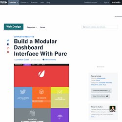
We will be talking about and using some of the principles of SMACSS (Scalable and Modular Architecture for CSS). We'll also be using icons from WeLoveIconFonts.com. Note: Before we go any further, there is a minimum emphasis on graphs for the dashboard we will be creating. Graphs are best executed with something more JavaScript heavy, and in order to keep the focus on CSS and minimal JavaScript, this tutorial will generally avoid graph drawing techniques. A Bit About Pure Pure was built by the team at Yahoo! How To Use Animate.css. In a recent battle with the “Just-add-water CSS Animations” plugin, Animate.css, I was a little distressed to find no documentation on the site.
It got to the point where I was flipping through multiple Google searches just looking for something basic. With that in mind, I thought we’d just start the process here to get you started using the Animate.css plugin. Step 1: Download/Upload the plugin This one is pretty simple. Click on the “Download on Github” link on the page, or click this link to visit the animate.css github page.
Rework-pure-css on NPM - Libraries. Libraries Login with GitHub rework-pure-css 0.0.4 Subscribe to updates.
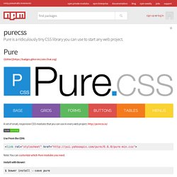
Purecss. Pure is a ridiculously tiny CSS library you can use to start any web project. !
[Gitter]( Chat.svg) Myth - CSS the way it was imagined. Rework-pure-css on NPM - Libraries. Build a Modular Dashboard Interface With Pure. How To Just Ship: An Interview With Amy Hoy. JFS is an ebook that makes food related analogies on how to escape the constant rut of A/B testing landing pages.

Allow me to propose this hypothetical scenario: You’re a creator. Maybe you create digital designs, or code apps, or make pottery. Perhaps you’re a writer, or a musician. Heck, maybe you sculpt balloon animals. Regardless of the field in which you wield your exceptional talent, undoubtedly you can think of a few instances in which you had a great idea to leverage your many gifts: a startup idea, a YouTube channel, a perfect balloon twisting formation to capture a flowing, unicorn mane. Think back on some of those fantastic, industry disruptive ideas you have had. So, did you end up making it? …Oh. Don’t fret. Why Don’t We Ever Just Ship? We all have either been there or know someone that’s been there: stuck in a rut of a half finished project, hell bent on customizing every last piece, meanwhile the project eventually gets set aside for something else entirely.
Trello Can Help. Compass Documentation. Susy 2.1.2 — Susy 2.1.2 documentation. Selector Specificity with CSS Preprocessors. Selector specificity is a real problem for most medium and large-sized projects, and as any other frequently recurring coding problem it needs to be addressed carefully.
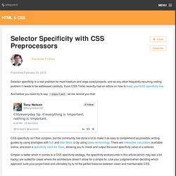
Even CSS-Tricks recently had an article on how to keep your CSS specificity low. And before you even try to say ! Important let me remind you that: CSS specificity isn’t that complex, but the community has done a lot to make it as easy to comprehend as possible, writing guides by using analogies with fish and Star Wars, or by using poker terminology. There are interactive calculators available online, and even a specificity mixin for Sass, allowing you to check and output the exact specificity value of a selector.
Simpler is better when in comes to a CSS specificity strategy, the specificity workarounds in this article (which may feel a bit hacky) are suited for cases where the architecture doesn’t allow for a simple fix. Approach #0 – BEM Specificity of Rules When BEM isn’t the answer. CSS, Sass, SCSS, Compass, Less, BEM, SMACSS, OOCSS, ACSS, CCSS, WTFSS? I’ve been thinking a lot about my CSS authoring, its current state and how it has changed over the years.
Typically when I start a new project I’ll use my own framework Motherplate. It uses SCSS and Compass. Most of the class names were’t originally based on any other framework. Not deliberately anyway. Most developers I know now use Bootstrap. OOCSS/Atomic CSS are Responsive Web Design 'anti-patterns' For many months now, in response to many failed attempts to find a suitable approach to scaling the CSS on the projects I work on, I have been using ‘ECSS’, my own Frankenstein approach to large-scale CSS architecture.
It’s detailed more fully in the post, Enduring CSS: writing style sheets for rapidly changing, long-lived projects. Subsequently, in this post, I’m about to argue that an OOCSS architectural approach to a large scale, rapidly changing responsive web site or application is an ‘anti-pattern’. With such a ‘link-bait’ title I need to get some caveats out of the way first: This isn’t an attack on OOCSS, Atomic CSS or any related single responsibility principle (SRP) approaches. It’s merely my argument that a different approach, depending upon your goals can offer a preferential outcome.I’m not suggesting that the approach I advocate is a panacea to all CSS scaling problems. Writing CSS is easy.
It’s therefore important to consider the problems that you have. Responsive issues. Upcoming Web Design Events (Dec. 2014 – June 2015) Advertisement The year may be slowly coming to an end, but there are still so many exciting conferences to keep in mind before we turn our calendars over to 2015.

Our industry’s indefatigable speakers aren’t quite done yet! We have to admit though, 2014 was a truly exciting year! With so much happening in the industry, conference organizers have done their best to keep you up to date. Take a look at some of the amazing events that are about to close this year’s conference season and, of course, get an early start on next year’s schedule.
Conferences are about gathering information and knowledge, but also about opportunities to get to know other like-minded folks in the web design community. I’d like to thank everyone for leaving comments in the previous round-up1 — they were truly helpful! The list is quite lengthy, so let’s dive in.
December 2014. Smashing Magazine — For Professional Web Designers and Developers. How To Write Mobile-first CSS — Zell Liew. Building responsive websites is a must-have skill for front-end developers today.
When we speak about responsive websites, the term mobile-first pops into mind immediately. We know the importance of designing from a mobile-first perspective. Refining The Way We Structure Our CSS At Trello. Have you been reading all the blog posts about the CSS architecture at various companies out there? No? Check out the ones for GitHub, CodePen, Lonely Planet, Medium, and Buffer. I can’t get enough of them.
We’ve slowly been refining the way we structure our CSS at Trello. I can firmly say it’s pretty okay now, nearing on good. The ToolsFile StructureModulesWhat about JavaScript? Warning: this post assumes you make websites and know some things about CSS. CSS Guidelines (2.2.2) – High-level advice and guidelines for writing sane, manageable, scalable CSS. Davidtheclark/scalable-css-reading-list. Home - Scalable and Modular Architecture for CSS. Mastering CSS Principles: A Comprehensive Guide. This overview features a hand-picked and organized selection of the most useful and popular Smashing Magazine’s articles related to CSS and published here over the years.
Quick Overview Years ago, when developers first started to make the transition to HTML layouts without tables, one CSS property that suddenly took on a very important role was the float property. The reason that the float property became so common was that, by default, block-level elements will not line up beside one another in a column-based format. Since columns are necessary in virtually every CSS layout, this property started to get used — and even overused — prolifically. The CSS float property allows a developer to incorporate table-like columns in an HTML layout without the use of tables. In this article, we’ll discuss exactly what the float property is and how it affects elements in particular contexts. Read more… Read more… “What? Read more…