

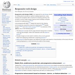
Responsive web design. Responsive web design (RWD) is an approach to web design aimed at crafting sites to provide an optimal viewing experience—easy reading and navigation with a minimum of resizing, panning, and scrolling—across a wide range of devices (from desktop computer monitors to mobile phones).[1][2][3] A site designed with RWD[1][4] adapts the layout to the viewing environment by using fluid, proportion-based grids,[5][6] flexible images,[7][8][9] and CSS3 media queries,[3][10][11] an extension of the @media rule, in the following ways:[12] Related concepts[edit]
Responsive CSS Framework Comparison: Bootstrap, Foundation, Skeleton. Bootstrap 4.0.0-alpha is a fairly large update to the framework.
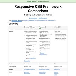
It has dropped Less support in favor of Sass, converted from px-based to rem-based sizing, improved its grid system, and dropped IE8 support. Also, all its JS plugins were re-written in ES6, it now uses a customized reset CSS file called Reboot, and offers flexbox support via a Sass boolean variable. In addition to this update, Bootstrap now offers themes at themes.getbootstrap.com.
Also, Bootstrap will continue supporting version 3, unlike the dropping of version 2 support after the release of version 3. You can read more here. Foundation 6 is a fairly major update which includes more grid flexibility, custom breakpoints, optional flexbox, and more. Like Bootstrap 4, Flexbox is now toggleable via Sass in Foundation 6.
The Sass/CSS has been reworked and consolidated, and there are fewer default styles to override on common elements. Skeleton 2 was updated in December 2014 after remaining mostly unchanged for about three years. Responsive Images Community Group. Meeting report On Tuesday, the 10th September, 2013 various W3C members and folks from the developer community got together at Mozilla’s Paris offices to try to agree on a way forward for responsive images.
As no official minutes were taken during the meetup, this meeting summary is based on the following unofficial notes and blog posts from attendees: Many thanks to the authors above for allowing their text to be reused here. Meeting outcomes Browser vendors agree that srcset + DPR-switching is the right initial step forward (i.e., the 2x, 3x, etc. syntax). What the meeting was about Responsive Images can be broken down into three main use-cases: DPR Switching: Serving higher res images only to devices with higher device pixel ratio (aka Retina devices).Viewport Switching: Serving smaller images to smaller or lower-resolution screens.Art Direction: Serving a different (often cropped) version of an image to a smaller screen, highlighting the important parts given the smaller space.
20 Best Responsive Web Design Examples of 2012. The Boston Globe The largest responsive website to date, The Boston Globe handles loads of content effortlessly, keeping the site intuitive and the content easily accessible on the device of your choice.
Smashing Magazine I love this site. I really do. Smashing takes advantage of horizontal screen real estate like few responsive sites do. Food Sense. Web design. Web design encompasses many different skills and disciplines in the production and maintenance of websites.

The different areas of web design include web graphic design; interface design; authoring, including standardised code and proprietary software; user experience design; and search engine optimization. Often many individuals will work in teams covering different aspects of the design process, although some designers will cover them all.[1] The term web design is normally used to describe the design process relating to the front-end (client side) design of a website including writing mark up.
Web design partially overlaps web engineering in the broader scope of web development. Web designers are expected to have an awareness of usability and if their role involves creating mark up then they are also expected to be up to date with web accessibility guidelines. History. User experience design. In most cases, user experience design (UXD or UED) fully encompasses traditional human-computer interaction (HCI) design, and extends it by addressing all aspects of a product or service as perceived by users.[1] User experience is any aspect of a person's interaction with a given IT system, including the interface, graphics, industrial design, physical interaction, and the manual.[2] History[edit] The field of user experience design has roots in human factors and ergonomics, a field that, since the late 1940s, has focused on the interaction between human users, machines, and the contextual environments to design systems that address the user's experience.[3] With the proliferation of workplace computers in the early 1990s, user experience became an important concern for designers.
Website wireframe. A wireframe document for a person profile view A website wireframe, also known as a page schematic or screen blueprint, is a visual guide that represents the skeletal framework of a website.[1] Wireframes are created for the purpose of arranging elements to best accomplish a particular purpose.
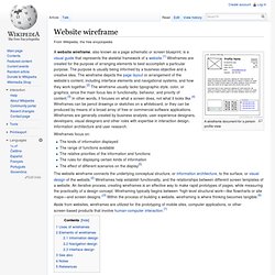
The purpose is usually being informed by a business objective and a creative idea. Mockup. In manufacturing and design, a mockup, or mock-up, is a scale or full-size model of a design or device, used for teaching, demonstration, design evaluation, promotion, and other purposes.
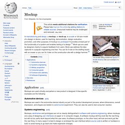
A mockup is a prototype if it provides at least part of the functionality of a system and enables testing of a design.[1] Mock-ups are used by designers mainly to acquire feedback from users. Mock-ups address the idea captured in a popular engineering one-liner: You can fix it now on the drafting board with an eraser or you can fix it later on the construction site with a sledge hammer.[2] Applications[edit] Mockups are used virtually everywhere a new product is designed. A few specific examples are the following: Mockups. Take a second. Let it sink in. The first impression might be disorienting. There are very few interface elements on the screen.
Start exploring however, and you'll find out that Mockups is filled with powerful yet only-visible-when-you-need-them features. Getting your ideas out should be effortless. Our sweet spot: the ideation phase Mockups really shines during the early stages of designing a new interface. Mockups is zenware, meaning that it will help you get "in the zone", and stay there. Mockups offers the same speed and rough feel as sketching with pencil, with the advantage of the digital medium: drag & drop to resize and rearrange elements, make changes without starting over, and your work is clear enough that you'll make sense of them later. See what you can build with Mockups Download the samples above, or find more on Mockups To Go, our community-contributed stencils site.
Designed for collaboration Your whole team can come together around the right design using Mockups. Maqetta. Designer - *./project1/file1.html. Create a new Fiddle - jsFiddle. Ergonomie & Design d'intéraction. Attoma - agence experte en design de services et expérience utilisateurs. IHM Visuels & Graphiques - EADS – CASSIDIAN. IHM Visuels & Graphiques - THALES RAYTHEON SYSTEMS. Touchscreen Software for Retail.