
Le journalisme de données. Making Maps: DIY Cartography. Looking 4 data visualization. Datavisualization. DataArt - Visualisations. Nieman Journalism Lab. Information aesthetics. Information Is Beautiful. Visual.ly Blog. Content alone does not make a great video; you need a great video design that make a visual statement combining design and data visualization to deliver a story.

Designers often get a little excited and put too much fancy design to fill in the space. The best content marketing brands are the ones that know how use content to drive conversions and pushing the boundaries. Keep in mind, quality = attention span. “Bosch Envision 360 VR” – Bosch Auto Parts The new Bosch Envision windshield wiper blade sharpens night visibility and offers extreme weather safety. “Morton Salt Girl’s 100th Birthday” – Morton Salt For 100 years, we’ve celebrated life’s moments with the Morton Salt Girl — from birthdays to holidays to the everyday. “Autodesk Forge” – Autodesk Autodesk came to Visually to help translate the features of their new Forge platform into vignettes with fantasy machinery... keep reading. Data Journalism Blog. Chart Porn. FlowingData. Des traces et des liens.
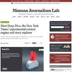
Journalistiques. Data News. Datablog. Meet Deep Dive, the New York Times’ experimental context engine and story explorer. Thinking about the sheer volume of information — stories, images, videos, data — available from The New York Times can evoke a simultaneous glee and terror.
Skimming Times Wire gives you an idea of the hundreds of pieces of content they produce each day. For readers, it’s a tip-of-the-iceberg thing: Yes, on a day-to-day basis you have access to the news and a decades-spanning archive, but you’re not seeing anything close to all of it. The task (or, more accurately, one of the tasks) for beta620, the Times experimental projects group, is to find a better way to make the newspaper’s information more readily available — both to readers and to the Times itself.
Their latest stab at the problem is something they’re calling Deep Dive, a project that aims to give readers a richer, more nuanced understanding of stories. Deep Dive uses the Times’ massive cache of metadata from stories to go, as the name suggests, deeper into a news event by pulling together related articles. The user interface. Amphibia. Journalisme graphique. Libérons les bureaux de votes ! Il est très difficile de connaître l’emplacement de tous les bureaux de vote.

Nous nous en sommes aperçus lors de notre travail sur l’étude du redécoupage électoral. Le ministère de l’intérieur ne centralise pas ces données. Il s’agit pourtant d’informations nécessaires à notre travail citoyen. Le seul moyen de les obtenir : contacter les 36 000 mairies ou les 100 préfectures départementales. Nous avions donc décroché nos téléphones, et contacté une quarantaine de villes et préfectures pour obtenir les adresses des 1 400 bureaux de vote impliqués dans le redécoupage. Une fois le bon interlocuteur identifié, le défi consiste à obtenir le document recensant les adresses des différents bureaux de vote. En parlant de ce travail, nous avons découvert que des acteurs comme 22mars, La Netscouade ou BureauDeVote.fr rencontraient les mêmes problèmes.