
Data visualisation: in defence of bad graphics. Are most online data visualisations, well, just not very good?
It's an issue we grapple with a lot - and some of you may have noticed a recent backlash against many of the most common data visualisations online. Poor Wordle - it gets the brunt of it. It was designed as an academic exercise that has turned into a common way of showing word frequencies (and yes, we are guilty of using it) - an online sensation. There's nothing like ubiquitousness to turn people against you. In the last week alone, New York Times senior software architect Jacob Harris has called for an end to word clouds, describing them as the "mullets of the Internet".
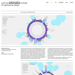
While on Poynter, the line is that "People are tired of bad infographics, so make good ones" Awesomely bad infographics from How to Interactive Design Photograph: How To Interactive Design Grace Dobush has written a great post explaining how to produce clear graphics, but can't resist a cry for reason. What's the big deal? A little extreme, no? MapGuide Project Home. D3 Workshop. Weave (Web-based Analysis and Visualization Environment) Weave Data Tutorial. Weave Data TutorialTutorial for Weave Magazine 03.10 about visualizing network data Client: Weave Magazine / Page publisher We all use twitter, write emails, skype and blog all day long.
There isn’t a single day we are not going to visit websites like google, youtube, the website of our favorite newspaper or social network and browse through the web. Despite that, or actually because of it, everybody tends to use the web in a different manner. Even if you are not using your computer at all, it is heavily communicating with the internet by sending and receiving so called IP-packets from all different kind of software that is installed on your PC. By analyzing your personal internet traffic logfile using the custom written software you get a distinctive and unique visualization of your online activities. Collecting the Data To collect the needed data we wrote a little packet sniffing tool using processing and the open source carnivorePE library. Weave Article How to read kiefer_100224.
Data journalism and data visualization from the Datablog. 10 Awesome Free Tools To Make Infographics. Advertisement Who can resist a colourful, thoughtful venn diagram anyway?

In terms of blogging success, infographics are far more likely to be shared than your average blog post. This means more eyeballs on your important information, more people rallying for your cause, more backlinks and more visits to your blog. In short, a quality infographic done well could be what your blog needs right now. Designing An Infographic Some great tips for designing infographics: Keep it simple! Ideas for infographic formats include: Timelines;Flow charts;Annotated maps;Graphs;Venn diagrams;Size comparisons;Showing familiar objects or similar size or value. Here are some great tutorials on infographic creation: Creating Your Infographic Plan and research.If required, use free software to create simple graphs and visualisations of data.Use vector graphic software to bring these visualisations into the one graphic. Data/Information. OS OpenSpace, the quality mapping API from Ordnance Survey. GeoVation » Enter the Challenge.
Entrepreneurs, developers, community groups, innovators – enter the GeoVation Challenge for a chance to win a slice of innovation funding to help you develop your idea.

There will be funding for ideas that make best use of Ordnance Survey data, including OS OpenData. How can we encourage active lifestyles in Britain? Enter the Challenge This challenge has now closed. It ran from 7 November 2013 to 15 January 2014 (12 noon). See who won our previous challenges on the winners page. How does the GeoVation Challenge Programme work? The GeoVation Challenge process works like this: 1. 2. Setup your profile, describing your background, motivation, skills you offer and skills you are looking forPost ideas, comment on and rate others ideasConnect with people that share the same passions as you? These questions may help you submit your idea What problem are you solving?
3. See feedback from previous GeoVation Camps. 4. Other awards may be introduced associated with all, or specific challenges. Visual Thinking. Data Visualization. Data visualization 2. Open Data.