
Discover a better way to ask questions online. Website dimensions - exact pixels - live check. Stop designing for screen width, design for content. 320, 768 and 1024.
Do these numbers mean anything to you? No, it’s not the Da Vinci code, they are the widths in pixels that many designers associate with mobile, tablet and desktop screen widths. The problem I have with this is that my mobile isn’t 320 pixels wide, my tablet isn’t 768 pixels wide and my desktop screen certainly isn’t 1024 pixels wide. There are hundreds of different screen sizes out there on a variety of different devices and yet we still think of responsive web design as 320, 768 and 1024.
What happens to all those screen sizes in between? I have seen many sites that use these three breakpoints for their designs and simply create 3 static layouts that centre within the nearest width. This is better than having an old fashioned, static, desktop only site as they are at least serving a one column, simplified version for mobile and a touch friendly version for tablet but then why would you alienate all other screen sizes by not taking them into consideration?
Content is king. Principles of User Interface Design. Clarity is job #1 Clarity is the first and most important job of any interface.
To be effective using an interface you've designed, people must be able to recognize what it is, care about why they would use it, understand what the interface is helping them interact with, predict what will happen when they use it, and then successfully interact with it. While there is room for mystery and delayed gratification in interfaces, there is no room for confusion. Clarity inspires confidence and leads to further use.
One hundred clear screens is preferable to a single cluttered one. 20 Mobile User Interface Design for Your Inspiration. Designers of mobile interfaces are becoming more prominent in today’s faced-paced web space.
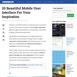
While mobile-optimized sites may lighten the burden on a site developer, some prefer building a full featured app instead. App designers and developers are in high demand now particularly in user interface. UI design focuses on user experience and interaction, and while being easy-to-use is important, an attractive yet still practical design is essential to the success of an app. Today I’d like to show you some mockups, sketches, buttons, tables, splash screens, and many more examples of iPhone app (UI) designs for your inspiration.
If you’re familiar with iPhone or iPad designing, you’ll recognize all these terms above. Recommended Reading: Design Killer Mobile App Websites: Tips And Examples 1. iOS 7 UI Components by GraphicBurger 2. 3. 4. 5. 6. iOS7 inspired UI kit by Kreativa Studio 7. iPhone Chat App by Ramotion 8. 9. 20 Free PSDs to Mockup Your App Interface Designs. Ten Things To Think About When Designing Your iPad App. Advertisement Like most well-designed things, the magic of an iPad app comes from a union of usefulness, usability and meaning.
Games aside, the app must be useful by solving a problem that people actually have through the right set of functionality at the right time. It must be easy to use and, just as importantly, easy to get started using, without a lot of pesky setup and learning steps. And it must hold meaning for the user through visual beauty, an emotional connection, personal insights, etc. In this article, we won’t outline the entire design process for creating an iPad app, but we will explore 10 of the key things to think about when designing your app (and planning the design process). We’ve excluded tips that have already been mentioned in every single iPad design article ever written (such as, “Invite users to touch by presenting real-world metaphors in a skeuomorphic interface” —look it up!).
Take A Goal-Oriented Approach To Simplify Functionality. Huffington Post: top right. 10 User Interface Design Fundamentals. It’s no great mystery that truly great user interfaces are the ones that are engineered to stay out of the way.
Free trial on Treehouse: Do you want to learn more about web design? Click here to try a free 14-day trial on Treehouse. ‘Staying out of the way’ means not distracting your users. Rather, good UIs let your users complete goals. The result? Check out our other design courses at Treehouse. When getting started on a new interface, make sure to remember these fundamentals: 1. “Obsess over customers: when given the choice between obsessing over competitors or customers, always obsess over customers. App Design DOs & DON’Ts.
App Design DOs & DON’Ts Apps are taking over the world and with the continual growth of the App market, it is important to keep in mind some of the basic rules to live by when designing and developing a mobile app.
Here are some important things to keep in mind. Simplify Functionality The easier the app is to use, the more the user will want to use it. It’s not about including as many features as you can, it’s about including meaningful and useful tools to accomplish a target goal. Consider the Thumb Range and Size When designing an app, keep in mind the range of the thumb. Touch, not Click Always keep in mind touch and gesture functionality when designing for an app.
Visual Consistency As in any brand design project, make sure you maintain visual consistency across the board. Mobilize not Minimize Designing for a mobile app doesn’t mean you are designing a miniature website. Don’t Start with Low Resolutions. App Icon Template.