
HybridAuth - Overview. 2.

What is HybridAuth? The main goal of HybridAuth library is to act as an abstract api between your application and various social apis and identities providers such as Facebook, Twitter, MySpace, LinkedIn, Google and Yahoo. HybridAuth enable developers to easily build social applications to engage websites vistors and customers on a social level by implementing social signin, social sharing, users profiles, friends list, activities stream, status updates and more. Basicly, HybridAuth main tasks are to performs two types of actions: i) user Authentication step, the user is redirected to his identity provider authentification page to enter their login and password and be asked for approval. Ii) access Autorisation, Once a user has authenticated, HybridAuth move to the next step and requires that the identity provider give your web site a temporary Autorisation to read the user account information (profile, contacts list, etc.). 3.
iPhone 3G/4G tester - online website test emulator with flip. Affiliate Links Manager. Dive Into HTML5. Pingdom Tools. Reformulation automatique de textes pour webmasters. Search Engine Land: Must Read News About Search Marketing & Search Engines. ThinkUp: Social Media Insights Engine. Responsive Web Design.
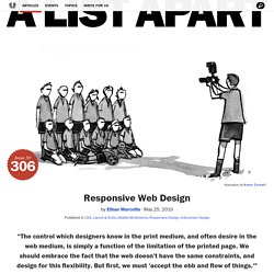
The English architect Christopher Wren once quipped that his chosen field “aims for Eternity,” and there’s something appealing about that formula: Unlike the web, which often feels like aiming for next week, architecture is a discipline very much defined by its permanence.

Article Continues Below A building’s foundation defines its footprint, which defines its frame, which shapes the facade. Each phase of the architectural process is more immutable, more unchanging than the last. Creative decisions quite literally shape a physical space, defining the way in which people move through its confines for decades or even centuries. Working on the web, however, is a wholly different matter. But the landscape is shifting, perhaps more quickly than we might like. In recent years, I’ve been meeting with more companies that request “an iPhone website” as part of their project. Fluid Grids. Early last year, I worked on the redesign of a rather content-heavy website.

Design requirements were fairly light: the client asked us to keep the organization’s existing logo and to improve the dense typography and increase legibility. So, early on in the design process, we spent a sizable amount of time planning a well-defined grid for a library of content modules. Article Continues Below Over the past few years, this sort of thinking has become more common.
Thanks to the advocacy of Mark Boulton, Khoi Vinh, and others, we’ve seen a resurgence of interest in the typographic grid, and how to use it on the web. However, our client had one last, heart-stopping requirement: the design had to be fluid and resize with the browser window. Minimum screen resolution: a little white lie#section1 Instead of exploring the benefits of flexible web design, we rely on a little white lie: “minimum screen resolution.” As it turns out, it’s simply a matter of context. The 99 Percent. Définition css overflow-y (feuille de style css) et compatiblité navigateurs.