
User Interface of 2020. Web Design Trends in 2011. There is a thin line between design and development, and as we move into a new decade, this line is becoming extremely blurry.
Is it enough to draw beautiful mock ups in Photoshop? Maybe 5 years ago. These days, the average internet user requires more. All beauty, with no substance, gets boring after a while. If your only goal is to impress a community of fellow designers with your flashy designs, you’ll find yourself quickly beneath the tide. 2011 is not about beauty, it’s about function. 11 Trends in Web Logo Design: The Good, the Bad and the Overused. This series is brought to you by the Intel AppUp℠ Developer Program, which provides developers with everything they need to create and then sell their applications to millions of Intel Atom™ processor-based devices.
Learn more here. Designing and critiquing logos for web-based companies and startups is a pursuit of endless fascination for many of us. Over the years, we've seen enough startups come and go (and rebrand and merge) to fill a volume with how and how not to develop and execute a logo for a web company. We've also picked up some knowledge about trends in this field. Some of the trends are good; others, regrettable. In this article, we've identified 11 trends in web company logo design. Take a look, and let us know what you think of these trends — and what trends we should have included — in the comments. 1. We've moved away from the once-ubiquitious BETA! 2. 3. Remember the first time you discovered Multiply and Overlay blend modes in Photoshop? 4. 5. Trapcode - Blog.
The Best of 2009 in Flash Web Design - Flash Web Design and Desi. Posted by Paulo P. on 12/29/2009 in Web Design | ∞ The year of 2009 has seen some of the most amazing changes in science society and technology ever seen. Although we have fortunately escaped epic disaster, I can’t remember a year with so many shifts in the way the world works. Online, things are nearly always a direct reflection of what had been, is going on now, and what is next before the masses can figure it out. Flash design may have started a long time ago in the digital timespan, but it has breached yet another plateau. Now Flash has not only a foot hold, but a serious comeback in the mainstream. To cap off the year I have rounded up some of the most interesting. amazing and inspired flash creations. 40 High-Quality InDesign Tutorials - Web Design Blog – DesignM.ag.
Universal principles of design. Color / B7AC82 / Earth Tone Tan. Web Design Resources Links. Kuler. Vista Window Effect Photoshop Tutorial. Vista users are quite familiar with “Aero” Theme effects in the new Windows Operating System.
In this tutorial, I’ll show you how you can recreate some of the Transparent Window Effects using Adobe Photoshop. I mentioned this effect in my “Pixel Popping Techniques Tutorial” a few days ago, so I thought it would be a good idea to go into a bit more detail for replicating the same design. You may also be interested in our photoshop tutorial that teaches you how to create the Windows Vista Aurora Look. The Vista Window at a Glance Before you try to design something, it’s almost always a good idea to examine the way something should look first. The Use of Grids in Website Design. When creating a website one of the most important things to get right is the layout, the UI – user interface as you would call it, is something that is crucial to conveying the information and point of your website.
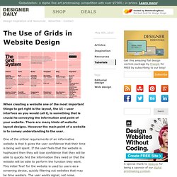
There are many kinds of website layout designs. However the main point of a website is to convey understanding to the user. One of the critical requirements of an informative website is that it gives the user confidence that their time is being well spent. If the user feels that the website is haphazard then they will lose confidence that they will be able to quickly find the information they need or that the website will be able to perform the function they want.
This initial ‘feel’ for the website is used by users as a screening device, quickly filtering out websites that may be time wasters. So why use grids? If a website is designed with a structured layout, then that feeling of structure comes through to the user in their first impression. What are you working on? The Grid System. 18 Dos and Don’ts Of Usability On The Web. Are you a web designer or do you run a website? Good, because this article is for you. If you’re designing websites for a living or running your business online, there are 18 tips in this article that you should definitely read and remember. You can have the best visual design skills on the planet, but if you build a website that works like crap and doesn’t allow the visitor to feel comfortable going from item to item and page to page, you are missing the very core of a good website design.
So in today’s article I’m going to go over some of the dos and don’ts of usability on the web. Do utilize a grid for your website structure Before you get upset and start screaming that a grid is a box for creativity, I’m not saying to ensure your entire site is boxed in. Do Not forget your search form. We Love Sexy Footers. Fusebox Creations - The online portfolio of Juan Camilo Estela. Drop-Shadows and Gradients: Be Consistent in Your Visual Metapho. Drop-shadows and gradients are two of the most common design elements on the web.
You’ll find them accompanying many different styles. They’re handy effects for web designers because they’re attractive, useful and easy to create with any graphics program. But they have a dark side: they’re frequently abused. Using amateurish drop-shadows or gradients is almost as bad as affixing a scarlet letter to your shirt to let the world know you’re a beginner or a hack. Even subtle, barely noticeable mistakes can create tensions that undermine otherwise beautiful and effective designs. In this article, we’ll look at what drop-shadows and gradients do, we’ll talk about how to use them effectively and we’ll look at some examples of mistakes and how to fix them.