
Visualization Lab. FlowingData. The Miseducation of the Doodle. In the winter of 1969, Virginia Scofield faced a daunting challenge.

It was a recurring challenge—more like a nightmare—and she had already failed miserably at her first attempt. This particular obstacle was one that most people consider themselves lucky to never face: undergraduate organic chemistry. Article Continues Below At the time, Virginia was a biological sciences student at the University of Texas. Her career plan bumper sticker could have read “Ph.D. or Death!” Having exhausted traditional learning methods such as highlighting, note-taking, and rote memorization, Virginia chose to unleash a powerful, primitive tool that ultimately turned out to be her savior: The Doodle. So what exactly does it mean “to doodle?”
Doodling may be better described as ‘markings to help a person think.’ That last benefit of the doodle is no slouch. The strategic doodle#section1 Overturning decades of semantic disgrace won’t happen overnight, hence my term the strategic doodle. Visualizations. Lifehacker - MultiScape Spans a Single Image Across Multiple Des. @Eruanno: Just tried on my setup (1280x800 Macbook + 1680x1050 external).
The images looked OK on the Macbook, but were stretched out on the external. It treats both monitors as a single huge monitor, and the different resolutions seem to be confusing it. Right now, I don't see a way to set preferences for different sized monitors. Just switched the orientation of my monitors - with the big monitor on the left, the images are proportioned correctly, but very large (but I was using a very large image). So it looks like you can play around with Display Preferences to tweak it. With the 1680x1050 monitor on the left, it interprets my setup as one 2960x1666 monitor.
Information aesthetics - Information Visualization & Visual Communication. 50 Great Examples of Data Visualization. Wrapping your brain around data online can be challenging, especially when dealing with huge volumes of information.

And trying to find related content can also be difficult, depending on what data you’re looking for. But data visualizations can make all of that much easier, allowing you to see the concepts that you’re learning about in a more interesting, and often more useful manner. Below are 50 of the best data visualizations and tools for creating your own visualizations out there, covering everything from Digg activity to network connectivity to what’s currently happening on Twitter. Music, Movies and Other Media Narratives 2.0 visualizes music.
Liveplasma is a music and movie visualization app that aims to help you discover other musicians or movies you might enjoy. Tuneglue is another music visualization service. MusicMap is similar to TuneGlue in its interface, but seems slightly more intuitive. Interaction design portfolio. Narrative 2.0 visualises music.
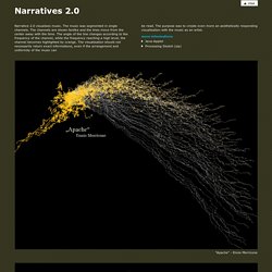
The music was segmented in single channels. The channels are shown fanlike and the lines move from the center away with the time. The angle of the line changes according to the frequency of the channel, while the frequency reaching a high level, the channel becomes highlighted by orange. The visualisation should not necessarily return exact informations, even if the arrangement and uniformity of the music can "Apache" - Ennio Morricone "Axel F" - Harold Faltermeyer "Symphonie No.5" - Beethoven "Familie Feeling" - Moloko "Full Chemical Gear" - Jarhead OST "Galvanize" - Chemical Brothers "The Emperor" - Star Wars OST "We will rock you" - Queen.
Visual Thinking. Data Visualization. Ideas, issues, knowledge, data - visualized! Data Visualization. Data Visualisation References « CrisisMaven's Blog. Data Visualization: Modern Approaches - Smashing Magazine. About The Author Vitaly Friedman loves beautiful content and doesn’t like to give in easily. When he is not writing or speaking at a conference, he’s most probably running … More about Vitaly Friedman … Data presentation can be beautiful, elegant and descriptive. There is a variety of conventional ways to visualize data - tables, histograms, pie charts and bar graphs are being used every day, in every project and on every possible occasion.
However, to convey a message to your readers effectively, sometimes you need more than just a simple pie chart of your results. Data presentation can be beautiful, elegant and descriptive. So what can we expect? Let’s take a look at the most interesting modern approaches to data visualization as well as related articles, resources and tools. 1. Trendmap 2007 Informationarchitects.jp presents the 200 most successful websites on the web, ordered by category, proximity, success, popularity and perspective in a mindmap.