
Une sélection d'illustrations scientifiques, de l'antiquité à nos jours ~ Sweet Random Science. J'imagine mesquinement qu'aujourd'hui, la plupart des scientifiques n'ont ni le temps ni le talent pour produire leurs propres illustrations, et que le métier d'illustrateur scientifique est bien souvent découplé de celui du chercheur.
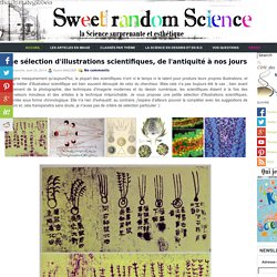
Mais cela n'a pas toujours été le cas ; bien avant l'avènement de la photographie, des techniques d'imagerie modernes et du dessin numérique, les scientifiques étaient à la fois des observateurs minutieux et des artistes à la technique irréprochable. Je vous propose une petite sélection d'illustrations scientifiques, présentée sous forme chronologique. Elle n'a rien d'exhaustif, au contraire, j'espère d'ailleurs pouvoir la compléter avec les suggestions de lecteurs et, cela transparaitra sans doute, je n'avais pas de critère de sélection particulier :) La carte de Dunhuang est un des premiers exemples connus de cartographie du ciel étoilé.
Elle fut réalisée en Chine et date de la Dynastie Tang (618 – 907). Une chouette illustration d'oursin. A Multiverse of Exploration: The Future of Science 2021. Cartographies des connaissances scientifiques. Visualisation. Cool visualization reveals how the number Pi looks. Molécules en 3D. The Best Scientific Visualizations of 2013 - Wired Science. The Mathematics of Familiar StrangersWe live in an image-dominated age, and popular science abounds with visuals: eye-popping photographs, gorgeous graphics and slick information design.
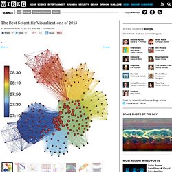
Amidst all this eye candy, not much attention is paid to figures accompanying articles in scientific journals and white papers.Even if they're utilitarian and low-resolution, though — or perhaps because of that — these figures are a sort of scientific folk art. They convey complex findings or principles with simplicity and grace, and sometimes even beauty.On the following pages are Wired Science's favorite research graphics of 2013. They're in no particular order, except that the first are particular favorites. Sorting algorithms visualization. 12 Steps To A Cosmic Orgasm – Follow The Astronauts And Experience The Overview Effect. Once a photograph of the Earth, taken from the outside, is available, a new idea as powerful as any in history will be let loose.— attributed to Sir Fred Hoyle, 1948.Tweet After Astronaut Edgar Mitchell had spent a whopping 9 hours and 17 minutes on the moon he was suddenly overcome with a sense of timelessness, bliss and absolute interconnectedness.
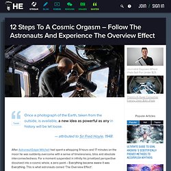
For a moment suspended in infinity his privatized perspective dissolved into a cosmic whole, a zero point – Everything became aware it was Everything. This is what astronauts coined ‘The Overview Effect’. The overview effect is a altered state of consciousness in which every petty thought that normally distracts us from realizing that we are one with everything shrivels up. When seeing ourselves “on a mote of dust suspended in a sunbeam” every goal other than taking care of our home pales in comparison. NASA Goddard Scientific Visualization Studio. Scientific Data Visualization. Scientific data is an essential component of research.
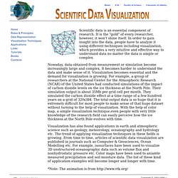
It is the "gold" of every researcher, however, it won't shine itself. In order to gain insight into the data, people have to analyze it using different techniques including visualization, which provides a very intuitive and effective way to understand data no matter the data is simple or complex. Nowaday, data obtained from measurement or simulation become increasingly large and complex. It becomes harder to understand the data and make sense of it. Visualization becomes essential and the demand for visualization is growing. Wind Map.
An invisible, ancient source of energy surrounds us—energy that powered the first explorations of the world, and that may be a key to the future.

This map shows you the delicate tracery of wind flowing over the US. The wind map is a personal art project, not associated with any company. We've done our best to make this as accurate as possible, but can't make any guarantees about the correctness of the data or our software. International Science & Engineering Visualization Challenge. The Visible Universe, Then and Now. Before the telescope was invented in 1608, our picture of the universe consisted of six planets, our moon, the sun and any stars we could see in the Milky Way galaxy.
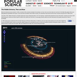
But as our light-gathering capabilities have grown, so too have the boundaries of the visible universe. Our interactive map shows how the known universe has grown from 1950 to 2011. In the late 1700s, William Herschel, an English astronomer using a telescope with an 18.7-inch aperture, made the first systematic surveys of the skies, revealing more than 2,000 distant galaxies, nebulae and other objects invisible to the naked eye. C'est beau une goutte d'eau qui gèle (en anglais) What topics science lovers link to the most. Hilary Mason, chief scientist at bitly, examined links to 600 science pages and the pages that those people visited next: The results revealed which subjects were strongly and weakly associated.
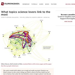
Chemistry was linked to almost no other science. Canvi & Temps: An Exploration of Science Over Time. Bestiario, the group behind 6pli and a number of other network projects, released their most recent project - Canvi & Temps - that explores the complexity of science since the early 1920s.
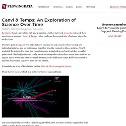
The first part, Temps, is two linked charts stacked on top of each other. On top are individual articles and on bottom are tags that provide context to those articles. New project: Canvi & temps. Canvi & temps are two network browsing spaces built from a compilation of articles, pages, persons and links, all related with complexity in science.
The research was carried out by Pau Alsina, Josep Perelló, Michele Catanzaro, Pere Monràs, Carles Tardío, Oriol Vallès, Irma Vilà and Santiago Ortiz. The project is in display at Arts Santa Mónica, in the context of a Cultures of Change exhibit. This historical (it includes citations since 1927) and transversal (it contains more than 30 categories of fields of knowledge) research offers and ample vision of the collection of aproaches, strategies and tactics, reseach methods and interests known as complexity science. Étienne-Jules Marey. ThevisualMD.com - Bringing Health to Life. Female Orgasm Captured In Brain Scan Animation. Scientists have created the world's first video animation of the female orgasm, using a series of brain scan images.
To capture the brain activity, researchers monitored a woman's brain as she lay in a functional magnetic resonance imaging (fMRI) scanner and stimulated herself. Psychologists at Rutgers University in New Jersey, where the study was conducted, hope the research will help them to understand the reasons why some men and women cannot reach sexual climax. Researcher, Professor Barry Komisaruk, who presented the findings at the Society for Neuroscience annual meeting in Washington DC on Monday, told the Guardian: "The general aim of this research is to understand how the orgasm builds up from genital stimulation and what parts of the brain become recruited and finally build up into an orgasm.
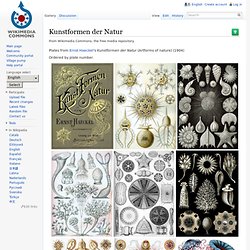
" Cartographies des connaissances scientifiques. Places and Spaces. Jacques HONVAULT - pilote. Animations and images featuring NOAA's remotely-sensed data. Nouvelle éruption du Mont Saint Helens... en 3D. Kunstformen der Natur. Plates from Ernst Haeckel's Kunstformen der Natur (Artforms of nature) (1904) Ordered by plate number. 2.
Thalamphora 8. Discomedusae 37. Siphonophorae 42. Dataviz. Photos/Vidéos Sciences. Data Visualization, Infographics, and Statistics. Chris Harrison's Homepage. Victorian Infographics. A time table indicating the difference in time between the principal cities of the World and also showing their air-line distance from Washington. Visualizations of Space.