
Infographic: “How much of the world is online?” Infographic: “Mad about St. Patrick’s Day” Does Texting Hurt Your Grammar? The Psychology of Music. Infographic: “If the World were 100 People” How Technology Is Messing Up Our Sleep (INFOGRAPHIC) Can Tablets Take the Place of Teachers? (Infographic) The year in graphics, 2012. How Video Games Are Changing Education. How Students Actually Use their Smartphones. Veterans Day Infographic. Blog - Cool Infographics. Infographics: Real World Integration of Standards, Design and Informational Text. Let’s face it.

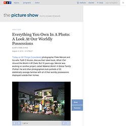
I have a problem. I’ve joined the obsessed and need to find some sort of Infographics Geeks Anonymous support group. I am totally fascinated with the amazing world of infographics. 20+ years ago when I was teaching high school social studies, I thought charts and graphs were good ways to help students understand complex topics. The Election and Mobile: Dialing For Democratic Dollars [INFOGRAPHIC] During this year's U.S. election, candidates channeled the power of apps and text messaging to appeal to voters, promote their party platform and fundraise.
![The Election and Mobile: Dialing For Democratic Dollars [INFOGRAPHIC]](http://cdn.pearltrees.com/s/pic/th/democratic-infographic-43570283)
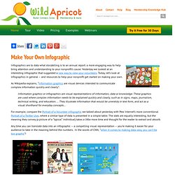
CallerSmart analyzed how much telephones — smartphones, texts and anonymous phone banks — are bringing democracy to a digital environment. As it turns out, President Barack Obama or Republican presidential candidate Mitt Romney could thank cellphones for being elected on Nov. 6. Here’s How College Students See the World [INFOGRAPHIC] Everything You Own In A Photo: A Look At Our Worldly Possessions : The Picture Show. Today on All Things Considered, photographer Peter Menzel and his wife, Faith D’Aluisio, discuss their latest book, What I Eat: Around the World in 80 Diets.
But 16 years ago, Menzel was working on another project, called Material World: A Global Family Portrait. He and other photographers took portraits of 30 statistically average families with all of their worldly possessions displayed outside their homes. Hide caption The Ukita family in front of their home in Tokyo. Tomorrow’s College Will Be Free. Edtechdigest.com © 2010-2014 EdTech Digest.

Data Visualized: More on Teaching With Infographics. EdTech Cheat Sheet. Edtechdigest.com © 2010-2014 EdTech Digest.

Skip to content ← Education Transformed Through IT (Intervention Technology) Smart Teachers → Infographic: The Digital Promise. Ed Tech Start Ups Group News. Infographic: Is Social Media Ruining Students? - Nicholas Jackson - Technology. Online Diagram Software and Flowchart Software - Gliffy.
The Anatomy Of An Infographic: 5 Steps To Create A Powerful Visual. Information is very powerful but for the most bit it is bland and unimaginative.

Infographics channel information in a visually pleasing, instantly understandable manner, making it not only powerful, but extremely beautiful. Once used predominantly to make maps more approachable, scientific charts less daunting and as key learning tools for children, inforgraphics have now permeated all aspects of the modern world. I designed a couple of infographics back in college, the need arising especially around the time Soccer World Cup fever spiked.
It was a fun process representing the different groups, predicting winners in each group at each stage and creating a mock pairing of teams that would clash all the way leading upto the finals. I was a devout Argentinian supporter at the time. Infographics can appear daunting to some with the sheer amount of data they present, but designed in the right manner and step by step, they can actually be one of the most fun things you will ever create. 1. 2. Make Your Own Infographic. Infographics are to data what storytelling is to an annual report: a more engaging way to help bring attention and understanding to your nonprofit’s cause.
Yesterday we looked at an interesting infographic that suggested a new way to view your volunteers. Today, let’s look at infographics in general – and resources to help your nonprofit get started on making your own. As Wikipedia explains, “Information graphics are visual devices intended to communicate complex information quickly and clearly”: Information graphics or infographics are visual representations of information, data or knowledge.
These graphics are used where complex information needs to be explained quickly and clearly, such as in signs, maps, journalism, technical writing, and education. ... For example, compare the Portrait of a Volunteer infographic we talked about yesterday with Pew Internet’s more conventional Portrait of a Twitter User, where a similar type of data is presented in a simple table. How To Create Outstanding Modern Infographics. In this tutorial you will learn that data doesn't have to be boring, it can be beautiful!

Learn how to use various graph tools, illustration techniques and typography to make an accurate and inspiring infographic in Adobe Illustrator. Start by using the Rectangle Tool (M) to draw a shape. Give it a subtle radial gradient too. The entire design is based on a grid of four columns. To make the columns first select the rectangle and drag a guide onto the centre of the shape. Condense the shape so it fits within the left-most guide and centre guide. 10 Awesome Free Tools To Make Infographics. Advertisement Who can resist a colourful, thoughtful venn diagram anyway?

In terms of blogging success, infographics are far more likely to be shared than your average blog post. This means more eyeballs on your important information, more people rallying for your cause, more backlinks and more visits to your blog.