
Geography 130, 001 - Spring 2015 - Download free content from UC Berkeley. School of Geography and the Environment Podcasts - Download free content from Oxford University. Africa. Middle east. Europe. Asia. North America. Antarctica. Geography. Geography. Geography. Here's what Pangea looks like mapped with modern political borders. World Map 3500 BC. A Physical Map of the World. 40 maps that explain the world.
By Max Fisher By Max Fisher August 12, 2013 Maps can be a remarkably powerful tool for understanding the world and how it works, but they show only what you ask them to.
So when we saw a post sweeping the Web titled "40 maps they didn't teach you in school," one of which happens to be a WorldViews original, I thought we might be able to contribute our own collection. Some of these are pretty nerdy, but I think they're no less fascinating and easily understandable. A majority are original to this blog, with others from a variety of sources. I've included a link for further reading on close to every one. 40 Maps That Will Help You Make Sense of the World. If you’re a visual learner like myself, then you know maps, charts and infographics can really help bring data and information to life. 40 more maps that explain the world.
Maps seemed to be everywhere in 2013, a trend I like to think we encouraged along with August's 40 maps that explain the world.
Maps can be a remarkably powerful tool for understanding the world and how it works, but they show only what you ask them to. You might consider this, then, a collection of maps meant to inspire your inner map nerd. I've searched far and wide for maps that can reveal and surprise and inform in ways that the daily headlines might not, with a careful eye for sourcing and detail. I've included a link for more information on just about every one. Enjoy. 1. Data source: Oak Ridge National Laboratory, World Bank. Those dots represent people: the brighter the dot, the more people. 2.
Click to enlarge. 12 Maps That Changed the World - Uri Friedman. "All cultures have always believed that the map they valorize is real and true and objective and transparent," Brotton, a professor of Renaissance studies at Queen Mary University of London, told me.
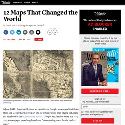
"All maps are always subjective.... Even today’s online geospatial applications on all your mobile devices and tablets, be they produced by Google or Apple or whoever, are still to some extent subjective maps. " There are, in other words, no perfect maps—just maps that (more-or-less) perfectly capture our understanding of the world at discrete moments in time. In his new book, A History of the World in 12 Maps, Brotton masterfully catalogs the maps that tell us most about pivotal periods in human history. I asked him to walk me through the 12 maps he selected (you can click on each map below to enlarge it). 1. 2. We Have Been Misled By An Erroneous Map Of The World For 500 Years.
22 Gorgeous Maps That Define The United States Of America. COOL MAPS. Mapping Global Human Activity. Air traffic routes between North America and Europe It is absolutely astonishing that our world has reached a population exceeding 7 billion, as of this past Sunday.
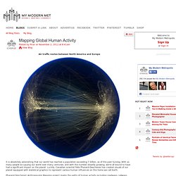
With so many people occupying our world over many centuries, and with the number steadily growing, we're all bound to have had a significant impact on the planet. Luckily, Canadian scientist Felix Pharand-Deschenes has created visuals of our planet equipped with statistical graphics to represent various human influences on this home we call Earth. Pharand-Deschenes' Anthropocene Mapping project marks the paths of human activity including roadways, railways, airway traffic, internet cables, electricity transmission lines, and underwater data cables.
He acquired all his factual information from various US government agencies. Population pyramids: Powerful predictors of the future - Kim Preshoff. If your selected country was not represented by a population pyramid in the lesson, you may wonder what it looks like.

The U.S. Census Bureau has an International Data Base that can help you create one. Is your country a fast, slow or no growth pyramid? The current world population can be seen ticking on the World Population Clock. Factors such as better water, food, medicine, industry, and health care have caused the world population to grow exponentially. The ‘America’ Map - Review of ‘A Renaissance Globemaker’s Toolbox’ The Beauty of Maps: A Documentary. Here we bring you the 4 part BBC series, The Beauty of Maps.

Released almost a year ago the documentary takes us through the staggering four million map collection of the British Library in London. Through the ages the story of the worlds landscape and population has been told through the creative and colorful use of maps. Often that tale has been destorted or idealized by the map maker, adding layers of history and revealing the society behind the maps making. Some examples are simply informational, the layout of streets and their names… others are highly beautiful, displaying a careful hand and creative mind. Piri Reis map. Surviving fragment of the Piri Reis map showing Central and South America shores.
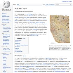
In his notes appended to it is written "the map of the western lands drawn by Columbus"[1] The Piri Reis map is a world map compiled in 1513 from military intelligence by the Ottoman admiral and cartographer Piri Reis (pronounced [piɾi ɾeis]). Approximately one-third of the map survives; it shows the western coasts of Europe and North Africa and the coast of Brazil with reasonable accuracy. Various Atlantic islands including the Azores and Canary Islands are depicted, as is the mythical island of Antillia and possibly Japan. The historical importance of the map lies in its demonstration of the extent of exploration of the New World by approximately 1510, and in its claim to have used Columbus's maps, otherwise lost, as a source.
Description[edit] History[edit] After reading about the map's discovery in The Illustrated London News, United States Secretary of State Henry L. Analysis[edit] See also[edit] Finaeus Map. Maps & Graphs - Nordregio. Carte de l'activité volcanique en direct des volcans du monde. Colima, Mexique, 3860 mDépêche n°6980 du 07-04-2014Un point sur l'activité en cours sur le...Suite de cette dépêche pour le volcan Colima Etna, Italie, 3330 mDépêche n°6975 du 02-04-2014Une activité est de retour.
Source :Suite de cette dépêche pour le volcan Etna Dépêche n°6964 du 27-03-2014Plus d'effusion ce matin. Source :Blog...Suite de cette dépêche pour le volcan Etna Fuego, Guatemala, 3763 mDépêche n°6962 du 22-03-2014Une hausse de l'activité est constatée. Merapi, Indonésie, 2911 mDépêche n°6966 du 27-03-2014Puissante explosion aujourd'hui. The Historical Evolution of Europe's Borders. Caricature Map of Europe 1914. The Clanker Powers: Germany is a massive military machine with weapons aimed outwards to all surrounding countries.
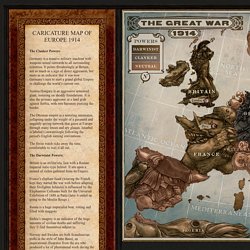
It points threateningly at Britain, not so much as a sign of direct aggression, but more as an indicator that it was now Germany’s turn to start a grand global Empire to challenge the world’s current one. Austria Hungary is an aggressive armoured giant, teetering on shoddy foundations. It is also the primary aggressor in a land grab against Serbia, with two bayonets piercing the border.
Marvelous Maps and Curious Cartography, Part Three. "QUANTUM SHOT" #817 Link - article by Simon Rose and Avi Abrams "I have an existential map.
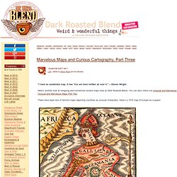
It has 'You are here' written all over it. " -- Steven Wright Here’s another look at intriguing and sometimes bizarre maps here at Dark Roasted Blend. Mapping. 3-Visualizations & mapping. Demographics & Migration.