
Tutorials. The Shapes of CSS. Learn Development at Frontend Masters CSS is capable of making all sorts of shapes.
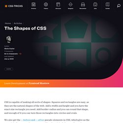
Squares and rectangles are easy, as they are the natural shapes of the web. Add a width and height and you have the exact size rectangle you need. Add border-radius and you can round that shape, and enough of it you can turn those rectangles into circles and ovals. We also get the ::before and ::after pseudo elements in CSS, which give us the potential of two more shapes we can add to the original element.
Square Rectangle Circle Oval Triangle Up Triangle Down Triangle Left Triangle Right Triangle Top Left Triangle Top Right Triangle Bottom Left Triangle Bottom Right Curved Tail Arrow via Ando Razafimandimby Trapezoid Parallelogram Star (6-points) Star (5-points) via Kit MacAllister Pentagon Hexagon Octagon Heart via Nicolas Gallagher Infinity via Nicolas Gallagher Diamond Square via Joseph Silber Diamond Shield via Joseph Silber Diamond Narrow via Joseph Silber Cut Diamond via Alexander Futekov Egg Pac-Man Talk Bubble TV Screen Lock.
CSS3 Menu. Fluid layouts for your website. Fluid layouts for your website Maybe you have noticed that sometimes it is pretty difficult to adjust website content width in order to fit all the various devices (from small resolution mobile platforms to high resolution personal computers).
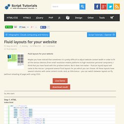
I think that you have faced with this problem before. But it does not matter – fluid (or liquid) layout will come to the rescue. I prepared several fluid layouts for you which you can choose. All these layouts have several columns with some content inside. Live Demo download result So, lets start: Step 1. Index.html You can see here little panel with variant switcher, and after – three columns with demo content. Step 2. Now we will stylize our page. As you can see – by default left and right column have certain width (in percentages), but central column doesn’t have certain width. Everything is easy as you can see – just colored boxes. For the first variant – all the columns are fluid. Conclusion. HTML5 y CSS3: técnicas y tips para crear un blog de vanguardia. En esta nota vamos a contarte como construir un blog utilizando las técnicas de la próxima generación, mediante HTML 5 y CSS3, para estar siempre actualizado y listo para recibir a las nuevas tendencias.
Paso por paso explicaremos cómo construir cada uno de los sitios una vez que hayan sido finalizadas las especificaciones y todos los navegadores hayan implementado los cambios. Lo que vamos a construir Así lucirá nuestra página al terminarla: Algo bastante similar al diseño de tu blog de cada día. Cabecera con título, navegación horizontal, área de contenido con comentarios y formulario, sidebar y pie de página. HTML 5 es la siguiente versión mejorada de HTML. Estructura básica. Tutorials. Prendiendo la semántica del HTML5 a través de un diagrama de flujo.
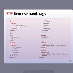
En Blog — Diseño Web inShare3 Una de las principales características de HTML5 son sus posibilidades semánticas.
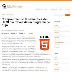
Si antes usábamos DIV para dividir las diferentes unidades de información sin importarnos muchos sobre el tipo de contenido que había dentro, HTML5 nos ofrece un abanicio bastante más amplio: NAV, ARTICLE, ASIDE, SECTION, FIGURE y más. La semántica es importantes porque ayuda a definir la naturaleza del contenido que se está mostrando. Si bien visualmente no hay grandes diferencias -podemos usar DIVs y modelarlo con CSS- desde el punto de vista lógico es mucho mejor que un intérprete como el el navegador pueda detrminar si lo que estamos mostrando es un menú para acceder a diferentes secciones, el artículo principal de una nota, una información complementaria o la sección de una monografía. El problema para los diseñadores web es que a veces no está demasiado claro qué etiqueta utilizar en función del contenido que irá dentro.
HTML5 Presentation. In March 1936, an unusual confluence of forces occurred in Santa Clara County.
A long cold winter delayed the blossoming of the millions of cherry, apricot, peach, and prune plum trees covering hundreds of square miles of the Valley floor. Then, unlike many years, the rains that followed were light and too early to knock the blossoms from their branches. Instead, by the billions, they all burst open at once. Seemingly overnight, the ocean of green that was the Valley turned into a low, soft, dizzyingly perfumed cloud of pink and white. Uncounted bees and yellow jackets, newly born, raced out of their hives and holes, overwhelmed by this impossible banquet.
Then came the wind. It roared off the Pacific Ocean, through the nearly uninhabited passes of the Santa Cruz Mountains and then, flattening out, poured down into the great alluvial plains of the Valley. HTML5 Doctor, helping you implement HTML5 today. The HTML5 test - How well does your browser support HTML5? HTML5 Fácil.