
Bootstrap 4 Cheat Sheet. Visible-print-inline-block <div class="visible-print-inline-block"> This will be printed as "inline-block" and hidden in the browser </div> This will be printed as "inline-block" and hidden in the browser text-*-left text-xs-left <p class="text-xs-left">Left aligned text on all viewport sizes.
Left aligned text on all viewport sizes. A grouped pure CSS parallax demo by Keith Clark. Designing with Hue Saturation and Lightness. As someone who designs and builds projects for mobile and the web, I've always found working with RGB and Hexadecimal to be confusing and a bit counterintuitive.
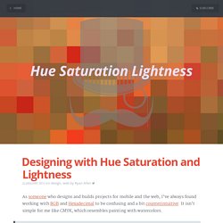
It isn't simple for me like CMYK, which resembles painting with watercolors. RGB is presentational. HSL is Semantic. With the addition of HSL to most major browsers and preprocessors, designers and devlopers can start to use a system that makes much more sense. Especially if you don't want to switch over to a visual color picker all the time (which is how I work with HEX and RGB).
The amount of time you can save by taking a few minutes to learn about HSL is nothing compared to the time you will save during prototyping and development. We are going to walk through the process of building a color to help illustrate how to use HSL in your every-day work. Let's build the color $dapper-purple. Pretend a designer just showed you this color and asked for you to represent it in code.
Well, we know that it has a hue we would call purple Hue. CSS Gradient Animator. Wobbly Slideshow Effect. Sidebar Transitions. A Gentle Introduction to CSS3 Animation. Hiding Vertical Scrollbars with Pure CSS in Chrome, IE (6+), Firefox, Opera, and Safari - John Kurlak's Blog. I just spent the past day trying to figure out the best way to hide scrollbars using pure CSS in the latest versions of every browser.
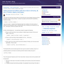
I wanted to be able to still scroll within the element, however, so using: was not an option. I looked at how Facebook hides their scrollbars in the chat window, I looked at recommendations made on StackOverflow, and I invented a lot of solutions on my own. Eventually, I arrived at a solution that I like. So first, a little background... my preliminary research revealed the following: The StackOverflow-recommended approach was to give my element scrollbars, wrap it in a containing element, and make the containing element element smaller, and give it: overflow: hidden; This is the approach Facebook uses for their chat window. This approach: See this screenshot from Facebook, after I clicked and dragged to the right: I searched StackOverflow to see if there were any fixes to the clicking and dragging issue.
A Complete Guide to Flexbox. CSS Fixed Positioning and Mobile Zoom – David Bushell – Web Design & Front-end Development – David Bushell make websites. I help small businesses, start-ups, individuals, and fellow web agencies make the most of their web presence. The follow demo is a quick experiment!
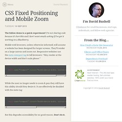
I’m not sharing code because it’s horrible and I don’t want emails asking if I’ve got it working on a Blackberry. Mobile web browsers, unless otherwise informed, will assume a website has been designed for larger screens. They’ll render on a large canvas and zoom out. Responsive websites use the meta viewport tag to tell browsers: “Hey, render at the device width and don’t scale please.” While the user no longer needs to zoom & pan they still have this ability should they desire it. But this degrades accessibility for no good reason. Fixed positioning A casualty of this set up is CSS fixed positioning. Screens 1 & 2 below show the navigation element fixed to the viewport as the page scrolls. Screen 3 shows the disaster that is user zooming and fixed elements.
Technically what mobile browsers are doing is not a bug. How my prototype works Future merit Update: after Googling I see PPK on Quirks Mode gave this a shot a few years ago. Equal Height Columns with Cross-Browser CSS and No Hacks. By Matthew James Taylor on 17 October 2008 Creating equal height columns with CSS is not as easy as it may first seem.
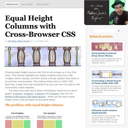
This tutorial highlights the display problems that occur with multiple column layouts, and then shows a simple solution that works in all common web browsers. The method shown here is 100% CSS hack-free, image-free and JavaScript-free so it can even be used on the most strictly coded websites. For those who want some action immediately check out my demo pages: 2 column, 3 column, 4 column and 5 column. Also see my Perfect multi-column CSS liquid layouts - these use the same equal height column CSS principles as discussed below. The problem with equal height columns In the example above we have three columns each with a different amount of content. Separating the column content from it's background colour The first step to solving the equal height problem is to break it into smaller pieces that can be solved separately.
Three column HTML div structure.