
Veterinary devices. Correlation and dependence. In statistics, dependence is any statistical relationship between two random variables or two sets of data.
Correlation refers to any of a broad class of statistical relationships involving dependence. Familiar examples of dependent phenomena include the correlation between the physical statures of parents and their offspring, and the correlation between the demand for a product and its price. Correlations are useful because they can indicate a predictive relationship that can be exploited in practice. For example, an electrical utility may produce less power on a mild day based on the correlation between electricity demand and weather.
In this example there is a causal relationship, because extreme weather causes people to use more electricity for heating or cooling; however, statistical dependence is not sufficient to demonstrate the presence of such a causal relationship (i.e., correlation does not imply causation). Pearson's product-moment coefficient[edit] Correlation. When two sets of data are strongly linked together we say they have a High Correlation.
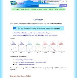
The word Correlation is made of Co- (meaning "together"), and Relation Correlation is Positive when the values increase together, and Correlation is Negative when one value decreases as the other increases Like this: Correlation can have a value: 1 is a perfect positive correlation 0 is no correlation (the values don't seem linked at all) -1 is a perfect negative correlation The value shows how good the correlation is (not how steep the line is), and if it is positive or negative.
Example: Ice Cream Sales The local ice cream shop keeps track of how much ice cream they sell versus the temperature on that day, here are their figures for the last 12 days: And here is the same data as a Scatter Plot: We can easily see that warmer weather leads to more sales, the relationship is good but not perfect. In fact the correlation is 0.9575 ... see at the end how I calculated it.
COEFFICIENT.CORRELATION. Calculating Growth Rates. 1.
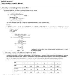
Calculating Percent (Straight-Line) Growth Rates The percent change from one period to another is calculated from the formula: Where: PR = Percent Rate VPresent = Present or Future Value VPast = Past or Present Value The annual percentage growth rate is simply the percent growth divided by N, the number of years. VPresent = 280,000 VPast = 250,000 N = 10 Years The population of Lane County grew 12 percent between 1980 and 1990 or at an rate of 1.2 percent annually. 2. Another common method of calculating rates of change is the Average Annual or Compound Growth Rate (AAGR). This can also be written algebraically as: (((((100 * (1.05) * 1.05) * 1.05) * 1.05) * 1.05) A.
Italy. Germany. Compet. Hunter farmer ....a sales model… or competences needed within every b… Does the "Hunter-Farmer" sales model really work? 6_final_ia_translucency_nov_09_(copy-1).pdf. Résultats Google Recherche d'images correspondant à. Present your data in a combination chart. To emphasize different types of information in a chart, you can combine two or more chart types in that chart.
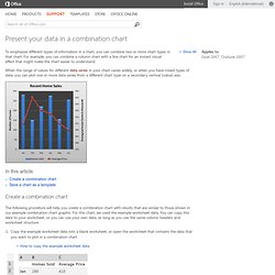
For example, you can combine a column chart with a line chart for an instant visual effect that might make the chart easier to understand. When the range of values for different data series (data series: Related data points that are plotted in a chart. Each data series in a chart has a unique color or pattern and is represented in the chart legend. You can plot one or more data series in a chart. Pie charts have only one data series.) in your chart varies widely, or when you have mixed types of data, you can plot one or more data series from a different chart type on a secondary vertical (value) axis.
In this article Create a combination chart The following procedure will help you create a combination chart with results that are similar to those shown in our example combination chart graphic. How to copy the example worksheet data Create a blank workbook or worksheet. Top of Page. COMMENT COMBINER 2 TYPES DE GRAPHIQUES. Par Sophie Marchand Récemment, un client me demandait comment faire pour combiner deux types de graphiques.
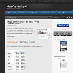
Son but était plutôt simple, il souhaitait voir ses ventes mensuelles représentées par des colonnes dans son graphique et ses objectifs de ventes par une courbe avec des marqueurs. Voici donc ce que je lui ai répondu! Inscrire les données de ventes et les objectifs dans un tableau comme celui-ci: Sélectionner les données du tableau, se rendre dans le menu "Insertion" (Insert) et choisir "Colonnes" (Columns) dans les types de graphiques. Choisir le type "Courbes avec marques" (Line with markers).
Voici une vidéo qui illustre la procédure dans son ensemble. Sales PowerPoint Templates and PPT Slides. Our sales Powerpoint templates are perfect for a variety of Business Plan presentations.

Any Business Presentation includes Sales and Marketing Strategy plan for it to depict business growth. Designing a Sales and Marketing Plan and then implementing it acts as the stepping stone to the ladder a business would like to climb. Sales Presentations are held every new month in most of the organizations. So Sales Power Point templates are very helpful when it’s required to prepare your next sales presentation. It’s very critical to position, brand and message the proposal about your business sales strategy in the template. 14 Tips To Present Awesome Charts.
Switzerland. Medical websites. Memoire IMIS. Business Plan notions. Turkey. Spain.