
Color Hex - ColorHexa.com. Material Design. Quick Tip: The Simplest Way To Center Elements Vertically And Horizontally. Danny Markov Flexbox is a relatively new addition to the CSS world and we keep finding more and more excellent applications for it.
We can even solve the age-old problem with centering an element both vertically and horizontally with CSS. It is easier than you can imagine – it is only three lines of code, doesn’t require you to specify the size of the centered element and is responsive-friendly! This technique works in all modern browsers – IE10+, Chrome, Firefox and Safari (with the -webkit- prefix). See the full compatibility table here. Slide And Push Menus With CSS3 Transitions - Call Me Nick. Form Follows Function. Textures et motifs de qualité pour le web design - Ressources & Outils.
30 Websites To Download Free Vector Images. While the current technology allows one to do wonders and the Internet is also another useful tool, allowing one to gain access to all sorts of information and materials for ones work.
However, there are still times when searching for a particular information or material prove to be difficult when you do not get the result that you hope for. Among the many different type of problems that a web or graphic designer face is the lack of free vector images, one just cannot get enough of a good source that supplies high quality vector images and for free as well. One of the reasons why designers prefer vector images or standard JPEG images was also due to the flexible nature of vector images. Vector images are images without fixed resolution; hence it allows its user to adjust it to any dimension without losing the quality of the original images.
Web Design is 95% Typography. By Oliver Reichenstein 95% of the information on the web is written language.
It is only logical to say that a web designer should get good training in the main discipline of shaping written information, in other words: Typography. Back in 1969, Emil Ruder, a famous Swiss typographer, wrote on behalf of his contemporary print materials what we could easily say about our contemporary websites: Today we are inundated with such an immense flood of printed matter that the value of the individual work has depreciated, for our harassed contemporaries simply cannot take everything that is printed today. It is the typographer’s task to divide up and organize and interpret this mass of printed matter in such a way that the reader will have a good chance of finding what is of interest to him.
With some imagination (replace print with online) this sounds like the job description of an information designer. Typography has one plain duty before it and that is to convey information in writing. 25 Beautiful Responsive Web Design Examples for Inspiration. Six Revisions Menu Main Categories CSS HTML JavaScript Web Design WordPress Web Development Design Inspiration UX Design UI Design.
Ididthat.ca – I really did that. CSS3 gradients - Adobe - The Expressive Web - Beta. Goban Club – Responsive Web Design par Ethan Marcotte : une traduction française. Fluid Grids. Early last year, I worked on the redesign of a rather content-heavy website.
Design requirements were fairly light: the client asked us to keep the organization’s existing logo and to improve the dense typography and increase legibility. So, early on in the design process, we spent a sizable amount of time planning a well-defined grid for a library of content modules. Article Continues Below Over the past few years, this sort of thinking has become more common. Fluid Images — Unstoppable Robot Ninja. (Hello!
If you think this article’s interesting, you might check out my ALA article on responsive web design.) I’ve always hated publishing. I don’t mean the industry, but the act. Hitting “print,” sending an email, pressing that “Publish” button on the CMS: at some point, you relinquish your ability to smooth down some of the sharper edges, fill in the holes of your argument, and just generally fix whatever’s broken. At some point, you just accept what’s on the page, tousle its hair a bit, and send it off into the world at large to be judged, poked, and prodded. To wit: Inspirez-vous des grands maîtres de la peinture : 5 palettes de couleur pour la rentrée 2012. Miguel Covarrubias, “Offering of Fruits for the Temple” (huile sur toile, 1932) Miguel Covarrubias (22 novembre 1904, Mexico – 4 février 1957) est un peintre, caricaturiste mexicain, mais également un ethnologue et historien de l’art autodidacte.
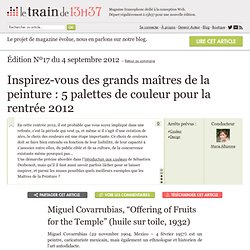
Peint au cours de sa lune de miel à Bali, ce tableau empreint de fantaisie montre des jeunes femmes à demi-nues, à la peau mordorée et portant des jupes rouge et vert citron et des paniers de fruits triangulaires au sommet de leurs têtes. La palette résultante est harmonieuse et majoritairement chaude, avec une pointe de vert pour amener de la fraîcheur.Elle pourrait ainsi très bien convenir à un site orienté “vacances”, “voyages”… Designing the Dreaded Form: Getting Creative. In this follow-up article about designing forms we'll dig into how to actually become creative and apply some interesting design concepts to spice up your form. In my first article “Designing the Dreaded Form” I discussed planning your forms ahead time by selecting proper UI patterns and handling the dreaded long forms. But the generic title for the article completely left out the “design” part of the form.
Although planning ahead is a hugely important part of any design process — the focus on the previous article, this article aims directly at the visual design aspects of the dreaded form. Animated Profile Popover CSS Snippet. Coding a Responsive Resume in HTML5/CSS3. Almost everybody in the business section has created a resume at some point.
When working as a freelancer you are always vying to land new projects. Because of this transitory work cycle it helps to offer potential clients a brief peek into your past experience. Creating Stylish Responsive Form With CSS3 and HTML5. #buttons #submitbtn {
Initial-scale=1, le pour et le contre. Creatiq.fr - Handcrafted by @jeijones. Martin Karásek – One-man show user interface and icon designer. 100 Greatest Free Fonts Collection for 2012. Today we'd like to delight you with an extensive list of The Best Free Fonts for 2012.
We've made a collection in which you can find Sans Serif, Slab Serif, Rounded, Modern, Display , Art Deco, Geometric, Urban, Futuristic and even abstract style types. Free web resources - Theme & Template. Web Design & Development News: Collective #4. Vision - Hanzell Vineyards - Established 1957 - Sonoma, California. The Responsinator. Loft Resumes. [WEBDESIGN] Comment bien choisir ses couleurs pour créer un site. Vous êtes nombreux à créer des sites internet, ou des supports de communications avec des choix de couleurs judicieux. Mais nous ne sommes pas tous experts, et certains ne savent pas comment allier les couleurs entre elles. Nous allons voir quelques exemples qui seront illustrés à l’aide d’un cercle chromatique.