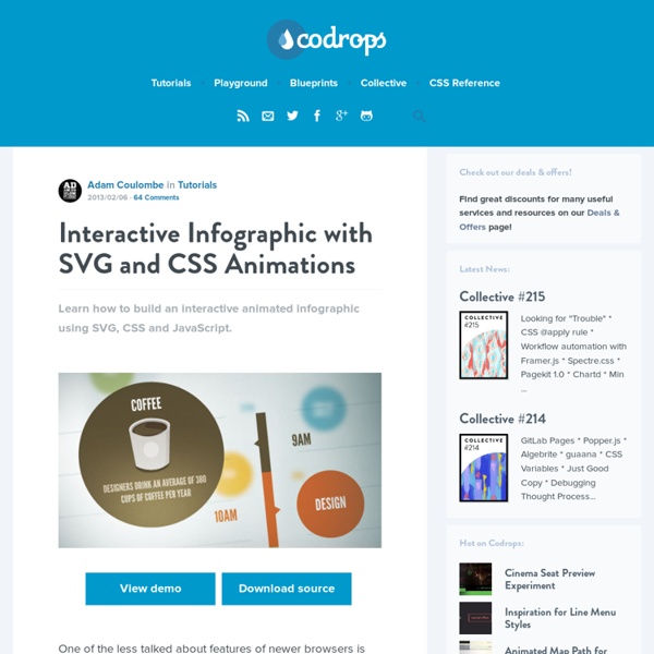
background preloader

Infographic with SVG and CSS Animations

Infographic with SVG and CSS Animations
Learn how to build an interactive animated infographic using SVG, CSS and JavaScript. View demo Download source One of the less talked about features of newer browsers is increasing support for the SVG file format. But one of the really cool things that some developers do not realize is that SVG is built on the XML specification, which at the end of the day means that its plain old markup, and can be worked with in a similar manner to HTML. With the right techniques and modern browser support, developers can now produce some pretty impressive animations, effects and interactions using SVG. Preparing an SVG file There are tons of ways to create SVG graphics, and while it is possible to do some SVG coding “by hand”, for more complex graphics we will want to have some type of vector editing software that can export as SVG. Whatever software you choose, it is essential to have the ability to group objects together, and be able to name those groups (assign the id attribute). The HTML The CSS

Encoding Video for Android Warning This article was written over six months ago, and may contain outdated information. In my previous post, Making HTML5 Video work on Android phones, I said that you have to encode your videos as .m4v in order for them to work in Android. This isn’t actually correct. The suffix can be either .mp4 or .m4v, what matters is the way the video is encoded. Now, there are loads of blog and forum posts which give differing advice on presets and parameters, and I’m no expert — so what I’ll do is just show you two quick ways that worked for me (I have a Samsung Galaxy S). A couple of things to note: this post refers specifically to video embedded in web pages with the video element, so the other two requirements from my previous blog post still stand; also, the methods shown below should mean your videos play on iOS too, so you don’t have to encode for different platforms. The first is cross-platform, using Handbrake. With all that done, hit Start to encode your video.

The 15 best tools for data visualisation | Design tools It's often said that data is the new world currency, and the web is the exchange bureau through which it's traded. As consumers, we're positively swimming in data; it's everywhere from labels on food packaging design to World Health Organisation reports. As a result, for the designer it's becoming increasingly difficult to present data in a way that stands out from the mass of competing data streams. Get Adobe Creative Cloud One of the best ways to get your message across is to use a visualization to quickly draw attention to the key messages, and by presenting data visually it's also possible to uncover surprising patterns and observations that wouldn't be apparent from looking at stats alone. As author, data journalist and information designer David McCandless said in his TED talk: "By visualizing information, we turn it into a landscape that you can explore with your eyes, a sort of information map. There are many different ways of telling a story, but everything starts with an idea.

PowToon - créer des présentations vidéos animées 15 Effective Tools for Visual Knowledge Management Since I started my quest a few years ago searching for the ultimate knowledge management tool, I’ve discovered a number of interesting applications that help people efficiently organize information. There certainly is no shortage of solutions for this problem domain. Many tools exist that offer the ability to discover, save, organize, search, and retrieve information. However, I’ve noticed a trend in recent years, and some newer applications are focusing more on the visual representation and relationship of knowledge. 15. Link: Platforms: Win, Mac, Linux Cost: Free (Open Source) DeepaMehta is a “networked semantic desktop” that replaces the traditional computer desktop. 14. Link: Platforms: Mac Cost: $179 Tinderbox stores and organizes your notes, plans, and ideas. 13. Link: Platforms: Win, Mac, Linux Cost: Free (Open Source) 12. eyePlorer Link: Platforms: Web Cost: Free

The Best Data Visualization Projects of 2014 It's always tough to pick my favorite visualization projects. I mean, it's a challenge to pick and rank your favorite anything really. So much depends on what you feel like at the time, and there's a lot of good work out there. Nevertheless, I gave it a go. These are my favorites for the year, roughly in order of favorite on down and based on use of data, design, and being useful. One unintentional theme: All of my picks are interactive or animated or both. The Upshot Last year, Nate Silver took his ball to play elsewhere, so the New York Times had a data-centric hole to fill, and they came out better for it with the Upshot. If I didn't cluster the Upshot visualization projects into this one section, the individual works would dominate the list. Where We Came From and Where We Went No doubt feeding off the popularity of the dialect quiz map from the end of 2013, the state-by-state migration charts were also fun and playful. The Most Detailed Maps You'll See From the Midterm Elections

Literature and Latte - Scapple for Mac OS X and Windows Rough It Out Scapple doesn’t force you to make connections, and it doesn’t expect you to start out with one central idea off of which everything else is branched. There’s no built-in hierarchy at all, in fact—in Scapple, every note is equal, so you can connect them however you like. It’s Scapple Simple Creating notes is as easy as double-clicking anywhere on the canvas and then typing; making connections between ideas is as painless as dragging and dropping one note onto another. What is Scapple? Scapple is an easy-to-use tool for getting ideas down as quickly as possible and making connections between them. Scapple’s nonlinear approach to the process of creative thinking is similar to what Gabriele Rico calls “clustering” in her popular book, Writing the Natural Way. *Local taxes may apply. Features Write notes anywhere on the virtual paper Connect notes using drag and drop Completely freeform Stack notes in columns of related ideas Drag notes directly into Scrivener Video Tutorial The Details

Créer capsule vidéo, présentation interactive, affichages animés… | - Utilisez Moovly pour créer une vidéo pédagogique, une présentation de projet, un tutoriel intéressant ou une démonstration de manière simple et directe. Ajouter la voix, le son et la musique et synchroniser tout en utilisant l'interface simple chronologie. Publiez votre vidéo sur YouTube, Facebook, mettez-le sur votre site web ou télécharger pour une utilisation hors ligne. - Oubliez les diapositives : Concentrez-vous sur votre sujet et ajouter des effets visuels dans une séquence convaincante soutenu par des transitions et des animations attrayantes qui retiennent l'attention de votre auditoire. Soutenez vos présentations d'une manière totalement nouvelle, mais simple. Excellent tutoriel : Créer des vidéos et des animations pédagogiques avec Moovly Cet article de Creg académie de Versailles est dédié à l’utilisation de Moovly qui permet de créer des vidéos ou des animations pédagogiques. What is Moovly?

Large-scale RDF Graph Visualization Tools AI3 Assembles 26 Candidate Tools The pending UMBEL subject concept “backbone” ontology will involve literally thousands of concepts. In order to manage and view such a large structure, a concerted effort to find suitable graph visualization software was mounted. A subsequent post will present the surprise winner of our evaluation. Starting Resources See Various Example Visualizations For grins, you may also like to see various example visualizations, most with a large-graph bent: Software Options Here is the listing of 26 candidate graph visualization programs assembled to date: Cytoscape – this tool, based on GINY and Piccolo (see below), is under active use by the bioinformatics community and highly recommended by Bio2RDF.org GINY implements a very innovative system for sub-graphing and allows for stunning visuals. headline: Large-scale RDF Graph Visualization Tools alternativeHeadline: author: Mike Bergman image: description: articleBody: see above

Mapping Social Networks The growth of social networks such as Facebook and MySpace has introduced the idea of the 'social graph' into common parlance. the social graph is Watch this short video describing the proof of concept Vizter social network browser visualisation: Vizter explanatory video. How does vizter allow you to identify friends you have in common with other people? How does vizter help the user identify possible communities in the social graph? If you have a Facebook account, there are several tools that you can use to visualise your friends network on there (requires adding the visulisation as a Facebook application). Touchgraph frinds'n'photos browser;Nexus social graph browser;FriendwheelFacebook Mutual Friend Network Visualization in FlashFriends visulisation in Many Eyes: this application will mine your friends network and produce a data output that will let you visualise your friends network using the Many Eyes network visualisation tool. There are a couple of things to note about this graph.

Hive Plots - Linear Layout for Network Visualization - Visually Interpreting Network Structure and Content Made Possible Vizster: Visualizing Online Social Networks VizsterVisualizing Online Social Networks Jeffrey Heer – jheer@cs.berkeley.edu Professor Marti Hearst InfoSys 247 – Information Visualization University of California, Berkeley Spring Semester, 2004 Vizster is an interactive visualization tool for online social networks, allowing exploration of the community structure of social networking services such as friendster.com [4], tribe.net [12], and orkut [10]. Vizster provides a visualization of such services, providing an interactive sociogram for exploring the links between network members. Vizster currently limits itself to ego-centric social networks, or network views centered on a single individual and her direct linkages. The social network data being visualized is the structure and content of friendster.com [4], the most popular online social networking service. In addition to friendship linkage, the database contains the profile data for each crawled user. The basic Vizster visualization is shown below in Figure 1. Figure 6. 1.

Data Visualization Software | ADVIZOR Solutions The Internet map The map of the Internet Like any other map, The Internet map is a scheme displaying objects’ relative position; but unlike real maps (e.g. the map of the Earth) or virtual maps (e.g. the map of Mordor), the objects shown on it are not aligned on a surface. Mathematically speaking, The Internet map is a bi-dimensional presentation of links between websites on the Internet. Every site is a circle on the map, and its size is determined by website traffic, the larger the amount of traffic, the bigger the circle. Users’ switching between websites forms links, and the stronger the link, the closer the websites tend to arrange themselves to each other. Charges and springs To draw an analogy from classical physics, one may say that websites are electrically charged bodies, while links between them are springs. Also, an analogy can be drawn from quantum physics. Anyway, the real algorithm of plotting The Internet map is quite far from the analogies given above. Semantic web The Internet Phenomenon

Related: