
Dependency Graph. Visualisation Zoo. Related Content Visualizing System Latency Heat maps are a unique and powerful way to visualize latency data.

Explaining the results, however, is an ongoing challenge. Wolfam Research. Systat. Data Visualization. Improving visualisation - Gallery. "Spike" map Interactive United States population density map.

Average rating: 7.5 (23 votes) 2D histogram An extension of the concept of histogram to display the colour image content. Average rating: 4.8 (5 votes) 3D graphic An example of a 3D visualisation, used in this case to represent an object. Average rating: 2.2 (11 votes) 3D Infographic. Cool Data Visualization Techniques - Information Visualization. A Periodic Table of Visualization Methods. Data Visualization, Graphical Analytic Techniques.
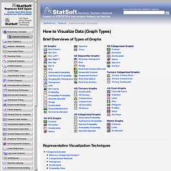
Brief Overviews of Types of Graphs Representative Visualization Techniques.
A visual exploration on mapping complex networks. Browsing visualizations. Tabi's Blog. Milestones in the History of Thematic Cartography, Statistical Graphics, and Data Visualization. Visipedia. Accident Reconstruction diagrams are visual recreations of a vehicle accident which has occurred.

They normally depict the accident and the surrounding area, as well as the vehicles and people involved and the location of each at the time based on eyewitness reports and physical evidence. They can be pictorial diagrams, 3D images, or even animated representations. In any case, Accident Reconstruction diagrams assist in the imagination of exactly what occurred in a vehicular accident through the use of symbols and pictures. Typical Uses When discussing an accident after it has occurred, an Accident Reconstruction diagram can be used to express a viewpoint of the accident as an aid in describing what happened. Best Practices. Infographics & data visualization gallery. Places and Spaces. Search Information Visualization Database. Appropriate use of color for data display allows interrelationships and patterns within data to be easily observed.

The careless use of color will obscure these patterns. When color is used 'appropriately,' the organization of the perceptual dimensions of color corresponds to the logical ordering in the data. Brewer develops a color scheme typology which matches the ways in which data are organized with corresponding organizations of hue and lightness. Four types of color schemes are represented. The image also illustrates how they can be used in combination for two-variable maps or visulizations. * diverging-- when the coloring variable has a meaningful midpoint (e.g., 0) * sequential-- for a continuously increasing series of values. We Love Datavis. Map the time! ChartDirector Chart Gallery - Meters and Gauges. Data Visualization Controls. Dundas Dashboard is a web-based platform that enables development of custom, interactive dashboards.
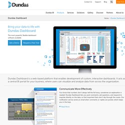
It acts as a central BI portal for your business, where users can visualize and analyze data from across the organization. Communicate More EffectivelyYou know that numbers don’t always tell the full story; sometimes an explanation is needed. Dundas Dashboard lets you post comments, ask questions, and respond to inquiries directly on the data, so that important facts don’t slip through the cracks. Our notification service sends an email when comments or replies are posted, which keeps you in the loop.Read More Data Analytics for EveryoneWith the suite of analytical tools that Dundas Dashboard offers, you’ll be able to create dashboard reports at the drop of a hat and receive up-to-the-minute analysis of all areas of your business.
Dundas Dashboard Version 5.0 releasedThis release features support for big data sources. Chart Gallery - See animated charts in action! FusionCharts Suite XT is a comprehensive charting solution offering 90+ chart types and 965 maps.

The Suite consists of 4 products each of which has a specific purpose and contains different chart types, a selection of which is shown below. FusionCharts XT FusionCharts XT is our flagship product that consists of the 45 most commonly used chart types. Click on a chart to see it in action. Examples of Flowcharts, Organizational Charts, Network Diagrams and More. Edraw provides a wide variety of examples such as flowcharts, organizational charts, business charts, UML diagrams, database and ERD, directional map, network diagrams and lots more.

Please choose any examples you are interested in, alternatively download them for free. You will need to install Edraw to view them. As you will see, Edraw is very powerful because you can use more than 6000 symbols, examples, and many pre-drawn templates to create your own spectacular flowcharts, business diagrams, network diagrams and lots more, effortlessly, and in no time at all. The following examples were created using Edraw and are included as part of the software installation. Gallery - View Examples of Images, Gauges, Etc. Available with Corda. Domo is an executive management platform, delivered as a service, that changes the business intelligence (BI) user experience from an incomplete and complex process to a consumer-friendly and real-time interaction with all the information users need and want to know about their business -- to run their business.

As a SaaS solution, we are built from the ground up for the Web, delivering a much simpler and connected experience than traditional enterprise software. 28 Rich Data Visualization Tools - DevelopRIA. Tools on Datavisualization. A Carefully Selected List of Recommended Tools 07 May 2012 Tools Flash, JavaScript, Processing, R. Chart Porn. GALLERY of INFORMATION VISUALIZATIONS. Les Tontons Flingueurs" (scène de la cuisine sans coupures)
Gallery of Data Visualization - Bright Ideas. R Graphical Manual. Management tool: Which management tools are the most helpful? How do they work? Charting Components by Steema, Chart for .NET, VCL, ActiveX, Java, PHP and Mobile. Data Visualization Charts. Visual Gadgets. Visualizing.org. Visual.ly - Create, Share, Explore Great Visualizations. Information aesthetics - Information Visualization & Visual Communication. Chart Chooser ? Juice Analytics. Chart Advisor. Visualization Options. Download "BeGraphic Lite Version" Only two charts exist in Microsoft Excel « BeGraphic, the data visualization tool.
View topic - Adequately scaling maps. Hi, Thanks for your prompt and clear reply (you didn't include the link to more information...

I'm still a bit dubious about safely resizing maps to compare characteristics (like GDP or population) across countries. If I get it right, the scaling applies to the frames around the maps and to the maps themselves –which is ok. However I still have the problem of countries having different shapes and therefore filling different areas within the frame. Le « Camembert » : Par-delà la polémique, quand peut-on utiliser ce graphique ? 22 free tools for data visualization and analysis.
You may not think you've got much in common with an investigative journalist or an academic medical researcher. But if you're trying to extract useful information from an ever-increasing inflow of data, you'll likely find visualization useful -- whether it's to show patterns or trends with graphics instead of mountains of text, or to try to explain complex issues to a nontechnical audience. There are many tools around to help turn data into graphics, but they can carry hefty price tags. The cost can make sense for professionals whose primary job is to find meaning in mountains of information, but you might not be able to justify such an expense if you or your users only need a graphics application from time to time, or if your budget for new tools is somewhat limited. Examples. Enjoy these sample visualizations built with Protovis.
For any example, use your browser to view the source or the backing dataset. Protovis is no longer under active development.The final release of Protovis was v3.3.1 (4.7 MB). The Protovis team is now developing a new visualization library, D3.js, with improved support for animation and interaction. D3 builds on many of the concepts in Protovis; for more details, please read the introduction and browse the examples. Conventional While Protovis is designed for custom visualization, it is still easy to create many standard chart types. Area Charts Bar & Column Charts. 8 more free tools for data visualization and analysis. Posting a roundup of useful data visualization tools invariably means leaving out more than you can include. JavaScript libraries alone number considerably more than the 22 free tools for data visualization and analysis I reviewed last week.
I knew I'd hear from Computerworld readers -- in comments, by email and via social media -- and I expected you'd have some great additions to my initial list. Google Data Viz Challenge. Highcharts demo Gallery.