
Bookstore – Malofiej · Infographic World Summit · Infographic awards. Bookstore is SND-E online bookshop.

We offer every tittle published by SNDE from 1993 till nowadays. Buy here the guide of your favourite Malofiej’s Summit and enjoy real infographics. For more SND-E publications, visit the SND-E website. Bookstore es la tienda de libros de la SND-E. Aquí se ofrecen los títulos que todos los años editan la SND-E y la Universidad de Navarra de cada cita Malofiej, y que Index Book distribuye en todo el mundo. Malofiej 21 Publishing house SND-EYear 2014Pages 284Size 250×300 mmPrize 30 € The annual opens with the chapter What’s Next? Malofiej 20 Publishing house SND-EYear 2013Pages 273Size 250×300 mmPrize 25 € The annual opens with a chapter dedicated to “La ballena franca” ( the southern right whale), chosen by the public as the most influencial inforgafic of the last 20 years. Wordless Diagrams: Nigel Holmes: 9781582345222: Amazon.com: Books. Instructor's guide. Design a great infographic for class and win a prize. Infographics with Adobe Illustrator. My infographics-with-Illustrator video course is already available on DVD.

I have just received the author's complimentary copies. There are now several options to access this 12-hour tutorial: ◙ Getting the DVD. ◙ Buying a monthly subscription to Creative Edge, which is cheaper if you think that you'll just need a few weeks to complete the course. Here's the direct link to the tutorial; it includes a preview. ◙ Purchasing the online video, which will let you access the tutorial whenever you wish. ◙ For bulk purchases (libraries, educational institutions, companies) visit this link. If you need to see more information, see this older post. Download the exercise files here. 10 Things You Can Learn From the New York Times’ Data Visualizations. The Malofiej 20 awards, known as the Pulitzers of the infographics world, recognize the finest infographics published across the globe.
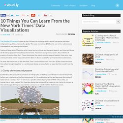
This year, more than 1,500 print and online submissions competed for the prestigious awards. National Geographic Magazine, which won best print map and two gold awards, and Internet Group do Brasil iG (gold) were notable achievements. However, as in previous years, the portfolio of graphics from the New York Times dominated the event, winning six gold medals (four print, two online), the best online map and both the ‘Best in Show’ awards for print and online submissions. So what are the secrets to the New York Times’ continued success? Here are 10 key characteristics that, when brought together in a synthesised design process, helps to separate their work from the rest. New Jersey's Changing Population - Graphic. HAVING FUN WITH NUMBERS AT ÉPOCA. Last Updated on Tue, 07 Feb 2012 20:46 Since I started being infographics director at the weekly magazine Época, the flagship of Editora Globo, biggest media group in Brazil, my team and I have produce a reasonable amout of work.

I´ve written about some pieces at the official blog of the design and infographics departments, called "Faz Caber! " ("Make it fit! ", which is a commonly heard sentence down here when a designer suggests a reporter he or she should edit text down a bit---). If you understand Portuguese, here you have some posts: 1, 2, 3, 4, 5, and 6. I decided to translate the last one I wrote because I think it is a good example of the changes I am trying to bring to the magazine. Anyway, let´s get started. Information design. Information design is the practice of presenting information in a way that fosters efficient and effective understanding of it.
The term has come to be used specifically for graphic design for displaying information effectively, rather than just attractively or for artistic expression. Information design is closely related to the field of data visualization and is often taught as part of graphic design courses.[1] Etymology[edit] The term 'information design' emerged as a multidisciplinary area of study in the 1970s. Vis.stanford.edu/files/2010-Narrative-InfoVis.pdf. Www.elartefuncional.com/images/Intro_chapter1.pdf. Storytelling with infographics and visualization. The human brain is a wondrous, quirky, and unpredictable meaty machine.

Most of the time, it acts on its own, free of conscious constraints, linking sparks of thought that randomly wander through its synapses like drunkards in a labyrinth of narrow alleys. Last night, while reading Spillover: Animal Infections and the Next Human Pandemic, by David Quammen, I had one of those fleeting moments of accidental insight. Nothing particularly profound, but still useful, I guess.Spillover is an inspiring piece of storytelling, carefully structured and very well written (1). Maybe that's why it made me think about several things related to my own book. First, the reviews by Nathan Yau and Nick Diakopoulos, which highlight that its main focus is graphics storytelling, not data visualization per se, although there's plenty of that as well, as Robert Kosara has gently written.
The contrast between John's and Moritz's approaches is revealing. What are those skills?