background preloader

Responsive

Facebook Twitter

Foundation: The Most Advanced Responsive Front-end Framework from ZURB. Less Framework 4. I called Less Framework "a CSS grid system for designing adaptive websites". 
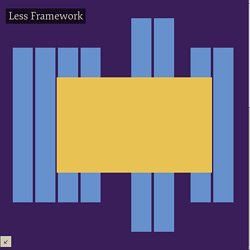
It was basically a fixed-width grid that adapted to a couple of then popular screen widths by shedding some of its columns.

It also had matching typographic presets to go with it, built with a modular scale based on the golden ratio. The resources it was originally published with are still available on GitHub. Contrary to how most CSS frameworks work, Less Framework simply provided a set of code comments and visual templates, instead of having predefined classes to control the layout with.

This is how I still work today and definitely a method I advocate. /* Default Layout: 992px. Less Framework was popular in the early days of responsive design. Eventually, I moved on from fixed-width grid systems and worked on a fully fluid-width one, in the form of Golden Grid System. Less Framework's popularity was helped by the following contributions and the lovely people behind them (dead links crossed off): Quels choix de navigation en responsive design ? Faire le bon choix dans la navigation sur un site est primordial et depuis l’arrivée du responsive design, les choses se compliquent. Il faut garder un accès à l’information sans pour autant gâcher l’expérience utilisateur. Heureusement, Brad Frost a rédigé un excellent article sur son blog à ce sujet que je retranscris ici en français. Si d’emblée, le terme de responsive design vous est étranger, je vous recommande de lire cet article paru il y a quelques temps sur le blog : Responsive design : définition, fonctionnement, ressources et tutoriels Cet article (tout ce qui va suivre) est une traduction de l’article « Responsive Navigation Patterns » rédigé par Brad Frost, consultant et intégrateur pour mobiles, rédigé avec son approbation, et même avec ses encouragements.

Je vous conseille chaudement de suivre son blog qui est une mine d’or pour le design sur mobiles. Introduction Voici quelques unes des techniques les plus populaires pour gérer la navigation en responsive design : Pour. Io. Sencha Space is an advanced platform for securely deploying mobile apps and delivering a consistent, elegant, mobile user experience to end-users. 
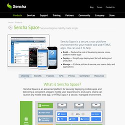
Users can launch any mobile web app, or HTML5 app in a secure, managed environment. Your users will have secure access to mission critical applications and data regardless of their mobile platform or location. Unlike Mobile Device Management (or MDM), Space provides fine-grained direct management of applications, data, and user identity.

Sencha Space simplifies your mobile strategy Improve Efficiency Reduce the time, cost, and complexity of developing and deploying secure mobile apps Centrally manage users, apps, and data Manage access to critical data and user privileges from one centralized administrative console Secure sensitive data Protect mission critical data on individual devices and on the network Sencha Space Mobile Workspace Administration application Adding your organization’s applications to Sencha Space is easy. Adaptive Images in HTML. Responsive Web Design Sketch Sheets » Jeremy P Alford.