
EZ-CSS: An easy to use, lightweight, CSS framework. CSS 101: Section 8.1 Box dimensions. CSS Grid Layout. Abstract This CSS module defines a two-dimensional grid-based layout system, optimized for user interface design.
In the grid layout model, the children of a grid container can be positioned into arbitrary slots in a flexible or fixed predefined layout grid. CSS is a language for describing the rendering of structured documents (such as HTML and XML) on screen, on paper, in speech, etc. Status of this document This is a public copy of the editors’ draft. The (archived) public mailing list www-style@w3.org (see instructions) is preferred for discussion of this specification. This document was produced by the CSS Working Group (part of the Style Activity). This document was produced by a group operating under the 5 February 2004 W3C Patent Policy.
Table of Contents 1 Introduction and Overview Grid layout contains features targeted at web application authors. 1.1 Background and Motivation The capabilities of grid layout address these problems. 1.2 Adapting Layouts to Available Space In. Instant Documentation Search. Cross-Browser CSS Development Workflow. Most good developers by now accept the fact that pixel-perfect cross-browser CSS is not only unnecessary, but also totally impossible.

Of course, when we speak of the challenge of “cross-browser” CSS, we’re really saying “How can I make this work in Internet Explorer versions 6-8?” — because those are really the most problematic browsers. Although I’ve written before about cross-browser CSS, and I still stand by just about every word in that article, I thought I’d reiterate my feelings on this subject by providing what I feel is the best workflow for getting your CSS to be as efficient, hack-free, and maintainable as possible while providing as similar an experience in all supported browsers. Keep in mind that the recommendations here would likely only apply if you are developing projects with a high number of users on older versions of Internet Explorer. CSS3 Browser Support and Information. CssFx.js - CSS3 property polyfill - It's So Futuristic, Baby!
CssFx cssFx adds vendor-specific prefixes to your stylesheets.
How it works When the document has finished loading, internal (<style>) and external (<link>) stylesheets are processed, fetching any @import stylesheets as well. It's recommended to bundle stylesheets into one file to minimize request overhead. Once processing is done, a new <style> tag is appended to the <head> with processed properties. Box-sizing. Normalize.css: Make browsers render all elements more consistently. Docs · necolas/normalize.css Wiki. The Art & Science of Folding CSS Code. One of the joys of working with CSS is that you can basically write the code any way you want.
Sure there are some basic rules you have to follow (like using brackets), but for the most part you can format your CSS code as elaborately or as plainly as you see fit. You can use this vast flexibility to improve the organization and usability of your working stylehseets before compressing them for production use. Regular Show It’s common to see CSS that looks like this: ..and the CSS file will just go on and on for miles like that, with everything on its own line, all properties tabbed once, and everything else lined up against the left side of the stylesheet, sort of like chain links or railroad tracks.
CSS Reset – All the most common CSS Resets in one place with one-click copy/paste, documentation and tutorials. CSS. Crunch! - The tastiest LESS editor. A Whole Bunch of Amazing Stuff Pseudo Elements Can Do. It's pretty amazing what you can do with the pseudo elements :before and :after.

For every element on the page, you get two more free ones that you can do just about anything another HTML element could do. They unlock a whole lot of interesting design possibilities without negatively affecting the semantics of your markup. Here's a whole bunch of those amazing things. A roundup, if you will1. Как браузеры отображают различные стили CSS border? Все мы часто пользуемся свойством CSS border-style, и, думаю, что не ошибусь, предположив, что чаще всего мы используем значение solid — сплошная линия.
Она и выглядит сплошной линией во всех браузерах, абсолютно одинаково. Остальные значения этого свойства используются веб-мастерами довольно редко, а многие, хоть и знают об их существовании, в жизни никогда их не применяли — как-то незачем. Ну, от силы значения “dashed” или “dotted”, и то не часто. Работа с изображениями при помощи CSS3. 6 Useful CSS Button Recipes You Can Copy & Paste. CSS3 is completely changing the game for creating buttons on the web.
Techniques that were once only possible with images are now easily executable with just a few lines of code. For this post we custom built six attractively styled CSS buttons for you to copy and paste right into your projects, zero attribution required. As with anything good in CSS3, the buttons below work great in Webkit and Mozilla browsers, but various versions of IE will fall short. A Quick Note About Semantics The examples below are a bit heavy on HTML markup and many of them could easily be leaner. CSS хаки. Браузеры и стандарты.
3 Rock Solid Website Layout Examples: Coded. Recently on Design Shack we featured an article titled “10 Rock Solid Website Layout Examples“, which broke down some common layouts into simple silhouette wireframes so you could easily apply them in your work.
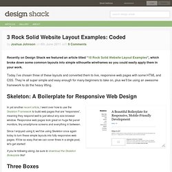
Today I’ve chosen three of these layouts and converted them to live, responsive web pages with some HTML and CSS. They’re all super simple and easy enough for many beginners to take on, plus we’ll be using an awesome framework to do the heavy lifting. Skeleton: A Boilerplate for Responsive Web Design In yet another recent article, I went over how to use the Skeleton Framework to build web pages that are “responsive”, meaning they respond well to just about any size browser window. Responsive web pages look great on huge flat panel monitors, tiny smartphone screens and everything in between. Since I enjoyed using it, we’ll be using Skeleton once again today to turn these simple layouts into fully responsive web pages. CSSDesk - Online CSS Sandbox. How To Add Images To Your CSS Borders.
The last few posts I’ve been working through the background and borders module for css3.
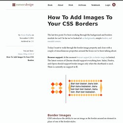
So far we’ve looked at css backgrounds, simple borders, and rounded corners. Today I want to walk through the border-image property and close with a couple of miscellaneous properties around the boxes we’ve been talking about.Browser support: At the moment browser support for css border images is limited. The latest version of Chrome should support everything here. Safari, Firefox, and Opera should support border images only when the shorthand is used.