
Showcasing & discussing the world of typography, icons and visual language. Free fonts! Font squirrel is a site dedicated to finding only the best commercial-use free fonts...
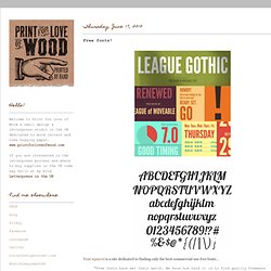
"Free fonts have met their match. We know how hard it is to find quality freeware that is licensed for commercial work. We've done the hard work, hand-selecting these typefaces and presenting them in an easy-to-use format. " Pictured are a couple of my favourites League Gothic and Lobster there are some great looking retro fonts, scripts and many more and best of all you can use them for commercial work.
Love to hear which are your favourites... Letterhead Fonts / Rare & Unusual Letters For The Professional Artist. Browse Fonts. The Walden Font Co. - Purveyors of old and historic fonts and clip-art. Welcome!
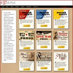
We resurrect old typefaces of historical importance and make them available to you. Each font package includes typefaces unique to their period, plus printer's ornaments, borders, and symbols. It's everything you need to create period pieces for advertising, business use, book design, educational, and recreational purposes.
You've seen our fonts featured in National Geographic Books, ESPN Magazine, book covers, in-store ads, concert posters and many other places. Browse our selection below and see for yourself why for over 10 years Walden Font Co. is the premier source for historical fonts! 32 authentic 1940s fonts as seen in period posters, including Dickie WF, plus a handy bullet font. 30 more 1940s American poster fonts. Buy both and save! 47 bold and grungy Wild West advertising fonts with 300+ clip-art images, border and bullet fonts, including the whimsical "Cattle Brands" 14 authentic Civil War Era fonts from recruitment posters and other printed material of the time.
Typegoodness. Sex Drugs & Helvetica 10 alternatives to Helvetica. Periodic Table of Typefaces on the Behance Network. Large original English version HERESpanish version HEREPortuguese version HERE PRINTS, SOURCE FILES, and other Periodic Table of Typeface related goodies are available HERE The Periodic Table of Typefaces is obviously in the style of all the thousands of over-sized Periodic Table of Elements posters hanging in schools and homes around the world.

This particular table lists 100 of the most popular, influential and notorious typefaces today. As with traditional periodic tables, this table presents the subject matter grouped categorically. Black & White Typography–Wonders of Graphic Design. The Personal Disquiet of Mark Boulton. – April 13th, 2005 – Typography, I find, is still a bit of mystery to a lot of designers.
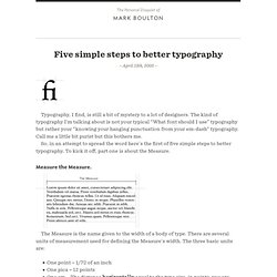
The kind of typography I’m talking about is not your typical “What font should I use” typography but rather your “knowing your hanging punctuation from your em-dash” typography. Call me a little bit purist but this bothers me. So, in an attempt to spread the word here’s the first of five simple steps to better typography. To kick it off, part one is about the Measure. Measure the Measure. The Measure is the name given to the width of a body of type. One point = 1/72 of an inchOne pica = 12 pointsOne em = The distance horizontally equal to the type size, in points, you are using. But, with the advent of DTP packages and the website design the following are also now used: MillimetresPixels There is an optimum width for a Measure and that is defined by the amount of characters are in the line.
CSS and fluid? What is interesting here is fluid designs on the web. So-you-need-a-typeface-infographic.png (PNG Image, 2000 × 1440 pixels) - Scaled (63%) Letterheady. A history and some revival fonts < The Fell Types. The Fell Types took their name from John Fell, a Bishop of Oxford in the seventeenth-century.
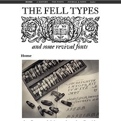
Not only he created an unique collection of printing types but he started one of the most important adventures in the history of typography. You will find here a non-exhaustive history and a modern digitization of some of them. SORT ~ Letterpress Printers & Purveyors of Typographic Design. Mota Italic Gallery. Friends of Type. Typewolf → Typography Inspiration for the Modern Web. Showcasing & discussing the world of typography, icons and visual language. UK Freelance Logo Designer & Brand Identity Designer.
Nick Sherman. Worthe Numerals. Worthe Numerals come out of a time-tested development cycle where House Industries employees ask “What if this could be just a little more...”.
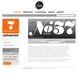
After pushing traditional didot forms to the limit, these digits were originally applied to a set of wood blocks. But, who says replenishable Michigan-grown basswood should have all the fun? So we added everything one needs to stylishly set their current currency and credit default swap hedges, while also being able to set the appropriate fractional take from their blog’s micropayment structure. Made to be large, attract attention, and —when needed— drop a shadow, Worthe Numerals brighten the daily drumbeat of numerical gloom. Accountant saying the numbers don’t add up?