
Towards A Retina Web. Advertisement With the recent announcement and release of the Retina Macbook Pro, Apple has brought double-density screens to all of the product categories in its current lineup, significantly paving the way for the next wave of display standards.
While the fourth-generation iPhone gave us a taste of the “non-Retina” Web in 2010, we had to wait for the third-generation iPad to fully realize how fuzzy and outdated our Web graphics and content images are. In the confines of Apple’s walled garden, popular native apps get updated with Retina graphics in a timely fashion, with the help of a solid SDK and a well-documented transition process. By contrast, the Web is a gargantuan mass whose very open nature makes the transition to higher-density displays slow and painful. In the absence of industry-wide standards to streamline the process, each Web designer and developer is left to ensure that their users are getting the best experience, regardless of the display they are using.
An Infographic to Help You Learn Responsive Web Design. Don’t you agree it’s a bit irritating when the website you’re browsing does not adapt to the screen size you’re viewing it on?
To avoid this more and more designers consider responsive approach and create multi-device and multi-platform web pages. Of course, it would not be possible without them knowing the basics of responsive web design, but what books should you read, what tutorials should you follow to build websites that would not only fit computers, but also laptops, tablets and smart phones? You can either spend hours, if not days, to find helpful tips on responsive web design on the net, or you can scroll down and see an awesome infographic that has all you need to know about responsive design as well as information on how to easily build responsive websites.
And if you click on the image you’ll be taken to the dynamic version of the infographic which is like an exciting game. About the Author Helen Bailey is a Marketing Assistant at TemplateMonster. Le W3C valide le standard CSS Media Queries, pour l'affichage dynamique des pages Web en fonction des tailles d'écran. Avec la prolifération des terminaux de différentes tailles d’écran (tablettes, téléphones mobiles, etc.), les développeurs Web faisaient face à un problème d’adaptation de l’affichage de leur site en fonction de la taille de l’écran du dispositif d’exécution. Les CSS Medias Queries introduits par CSS 3, ont permis de résoudre ce problème en définissant des techniques pour l'application de feuilles de styles en fonction des périphériques de consultation utilisés. Cette fonctionnalité offre aux développeurs des moyens permettant de définir des règles d’affichage personnalisées en fonction du type de média, de la taille de la fenêtre, de la résolution de l’écran, etc.
Bien que très utilisées pour les versions mobiles des sites Web, les spécifications du CSS Medias Queries n’avaient pas encore été cependant validées par le W3C. L’organisme en charge de la normalisation des standards du Web vient d’approuver officiellement les CSS Medias Queries comme une recommandation du W3C. Device-Agnostic Approach To Responsive Web Design. Advertisement This is a different take on Responsive Web design.
This article discusses how we can better embrace what the Web is about by ignoring the big elephant in the room; that is, how we can rely on media queries and breakpoints without any concern for devices. The Challenge Let’s start our journey by looking at these online tools: Those pages let people check websites through a set of pre-built views based on various device sizes or orientations. Now check the-great-tablet-flood of 20116. Do you get my drift? I don’t want to go the "consider it to be harmful7" route, but I want to point out that tools like these, or articles promoting a device approach (i.e. To me, it seems more realistic to check our layouts through viewports of arbitrary dimensions and shapes. The Goal The goal is to surface content, to style boxes as columns so they bring sections above the fold. Content Is King!
The Principle The content of a box dictates its width. Hardboiled CSS3 Media Queries. Showcase of Outstanding Responsive Web Designs. This showcase rounds up a collection of the most inspiring and outstanding examples of responsive web design.
These websites not only look great at full scale monitor resolution, but are designed to gracefully scale according to the user’s screen size. Resize you browser, view the site on a smartphone, tablet or netbook and you’ll see the same design in a range of well presented formats. Websites are no longer viewed only on a computer monitor. Smartphones, tablets and netbooks throw a range of resolutions and different screen sizes into the mix for designers to now worry about. The idea of catering for various resolutions isn’t anything new. Ready for some examples? Alsacréations. Free HTML5/CSS3 WordPress 3.1 Theme With Responsive Layout: Yoko - Smashing Magazine. Advertisement In this post we are glad to present to you yet another freebie: a responsive WordPress theme Yoko which was designed by talented designers Ellen and Manuel from Elmastudio and released for the Web design community.
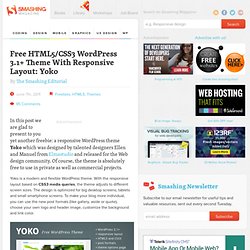
Of course, the theme is absolutely free to use in private as well as commercial projects. Yoko is a modern and flexible WordPress theme. With the responsive layout based on CSS3 media queries, the theme adjusts to different screen sizes. The design is optimized for big desktop screens, tablets and small smartphone screens. Download the Theme for Free! The theme is released under GPL. Features The theme requires WordPress 3.1+ to run. Screenshots Three-Column-Layout. Two-Column-Layout. One-Column-Layout. Comments area. Custom Header. Post Format Gallery.